Content marketers know how important and effective data visualization can be, no matter what business or trends it is focused on. In the online world, success is all too often relying on data, and this data can be enormous.
This is where these visualizations kick in and make everything comprehensible. Since these tools are an essential component of content marketing, we are going to look at 5 compelling and excellent data visualization examples.
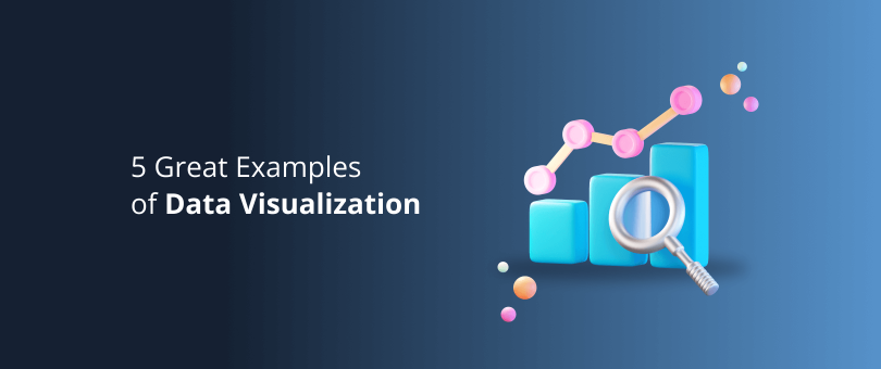
5 Great Examples of Data Visualization
- Think With Google
- KISSMetrics
- Castlight
- OK Cupid
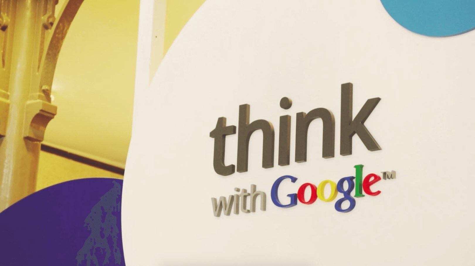
Think With Google
Google is one of the world’s biggest companies. It is remarkably innovative, and “Think with Google” is nothing but proof of their idea of marketing and the future. This data visualization section of Google produces information for marketers in the travel industry.
They produce detailed yet simple visuals for customers’ travel preferences, but the way they spread it on social media is incredible in its own way. They have a team of dedicated Twitter users who push out graphs and maps so that marketers around the world can benefit.
What makes their visualizations great? They highlight information in the best way one can grasp it visually. For instance, when talking about the most searched for travel routes, they use a map instead of simple destination names along with numbers.
Another reason why their stuff stands out is because they give some background perspective too. When presenting data trends today regarding search queries from travelers, they would also present the stats from the previous year. What this does is help understand the trajectory in people’s attitude and preferences.
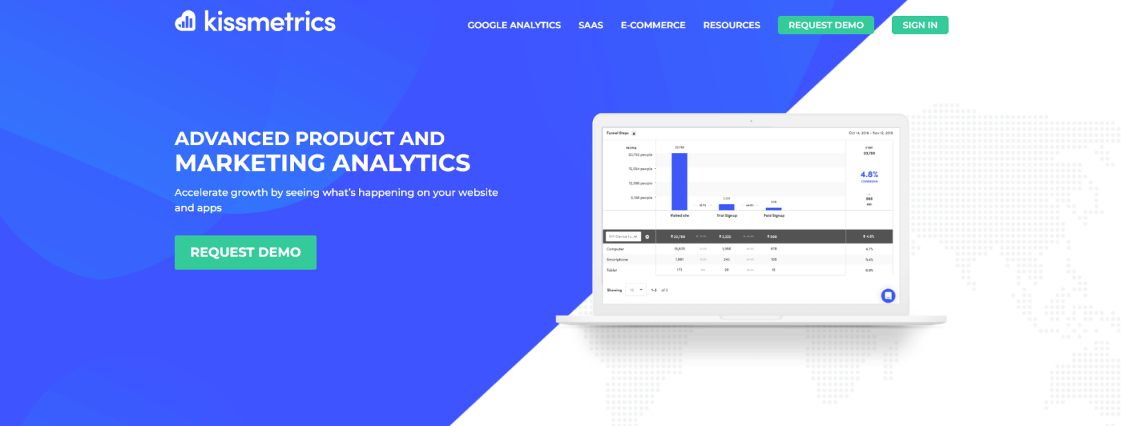
KISSMetrics
Marketers all around the world know this name pretty well, and they have earned this reputation through their faultless infographics regarding popular marketing trends.
The secret to their success in this particular area is their creativity to make big data readable and interesting. This is not an easy task and requires a lot of hard work both in terms of thinking and doing.
They not only create infographics that capture interest, but condense it to suggestions that are understandable and achievable.
They also take into account every aspect of data and how it may be used in the best way possible. For instance, their section Science of Social Timing focuses on the time people spend on social media in the United States.
Now, in presenting this info, they also show the different time zones within the US. It is so easy to forget the time difference, but thanks to the complete visualization, any marketer would remember to post stuff at the most accurate time.
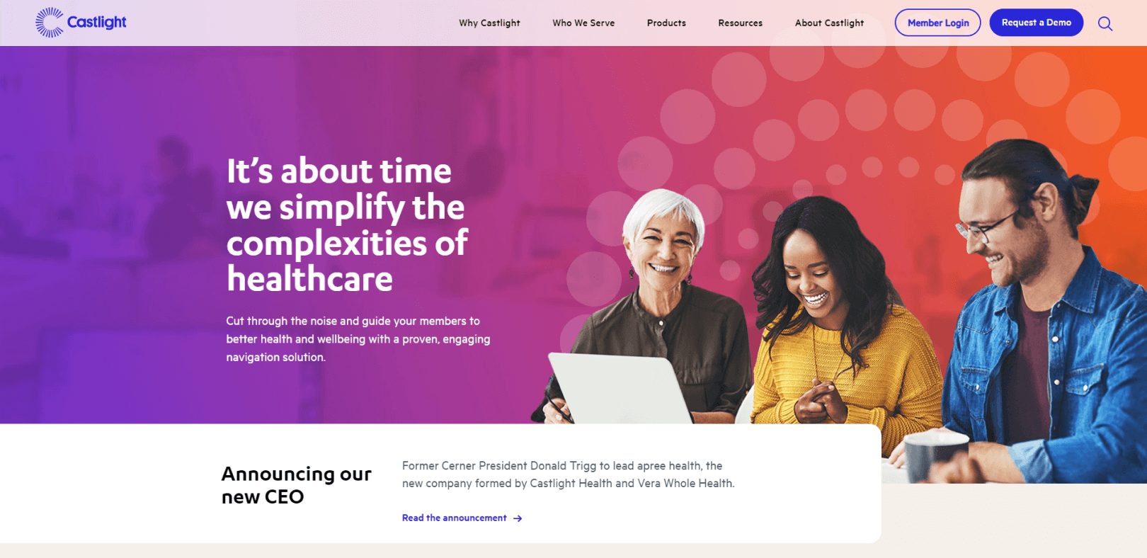
Castlight
This is a pretty interesting data visualization example, as it goes to show how useful it can be to learn from people’s search queries online.
Castlight produces infographics regarding people’s health-related searches and distinguishes them based on gender, age, or area.
The purpose is to help employers understand what health concerns their employees have and through that information, help save money on insurance.
The way the information is presented is optimized to engage the viewer and allow them to quickly find the information relevant to them. They provide a slider for age, where you can drag it to see the search topics for a particular age group.
The best thing in their visuals is an icon ‘i’ which basically gives a definition of the term. This is because not everyone knows all medical terms, so you do not have to run your own search to know the meaning, the information is right there in the picture.
This emphasizes the need to make the visual representation wholesome, i.e., the reader should not have to search for meanings to terms. Everything should be clear and present there on the graphic you just produced.
Readers Also Enjoy: Tools and Techniques to Visualize Data Like a Pro – DevriX
LinkedIn has a clear competitor advantage when it comes to data visualization for businesses, as there is no one really like them that caters specifically to corporations.
It essentially uses data that is most relevant to businesses and does that at the right time. They are smart in this division and use the visuals to brand their own products, so to speak.
Their detailed SlideShare infographic show off data visualization and branding combined. SlideShare is LinkedIn’s own property and is very popular for slides.
Besides their smart content behind, the visuals themselves are pretty cool too. Their graphics can be used as a model to show the aesthetics and formatting of such data.
They highlight the important number through big fonts and highlight significance through the hierarchy of different data.
OK Cupid
The charts and graphs at OK Cupid are anything but boring. This infographic site takes data about people’s relationships and sex lives and turns them into something meaningful and often times very surprising.
They revealed that a higher amount of time spent on Twitter results in short-lived relationships. To what extent this is actually the case, we do not know, but what we do know is that visualizations like these capture a lot of interest and prove very functional to increase engagement.
Readers Also Enjoy: Your Complete Data Analytics Guide to Help Improve Your Business – DevriX
Conclusion
Creating diversified content is necessary, and data visualization is a part of that. Through these graphics, not only do you create something of value for many but you also engage your audience.
No matter what the scope of your content strategy is, you will find some kind of data pertaining to your audience.
Through your own creativity, these can be converted into something beneficial. In doing so, here are some pointers to remember, which is basically a takeaway from the above examples:
- Think carefully when choosing data, decide what it could mean for different kinds of people.
- Make it interesting without being complex.
- Use the most appropriate representation for the data you are presenting.
- Make icons and use different colors for emphasis.
- Use it as a way to brand your own business.
Team DevriX
This article is crafted by DevriX's seasoned marketing team, boasting over four decades of collective expertise in crafting sophisticated marketing funnels, devising comprehensive content frameworks and pillars, implementing engaging email campaigns, and creating impactful social media content designed for scalability.
Our marketing experts specialize in the complete spectrum of inbound marketing strategies. As an accredited HubSpot Agency Partner and a Semrush Partner, we engage in meticulous research, blending our extensive experience with the unique insights of our highly skilled team.
We set benchmarks in content creation by incorporating cutting-edge marketing trends, leveraging in-depth industry research, and utilizing state-of-the-art AI tools for data segmentation and captivating content hooks. Our proficiency extends across a diverse range of sectors, including working with SMEs, Fortune 1000 companies, global B2B brands, major publishing entities, WooCommerce platforms, business directories, and affiliate networks.