You want to increase the ROI that you get from your content marketing efforts, right? But, it’s not as easy as it sounds. First, you need to get people to view your content. Second, you need to make the readers take action towards your offer.
When people think of a call to action, most often they think of the tacky “Come on, let’s do it!” or “10 for the price of 5!” and so on. Those are the type of lines that you would hear on the flea market. However, that’s not the case when it comes to website call-to-action buttons.
A call-to-action (CTA) is a beneficial instruction, a calling that you give to your target audience. In most of the cases, it sounds imperative, such as Subscribe Now, Get in Touch, etc. CTA buttons are pretty much everywhere and that’s why the users often feel overwhelmed and don’t know whether to click or not.
CTA buttons are the main motivating factor that completes the goal of your targeted call-to-action. They make the difference between conversion and losing the user from the page. CTA buttons are not just about shape, they’re also about words, size, contrasting color, positioning, and much more.
When creating a CTA button, there’s not a unified approach. Each of your pages can have a different conversion goal, and therefore, a different kind of call-to-action button.
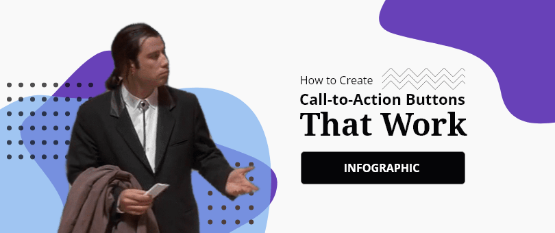
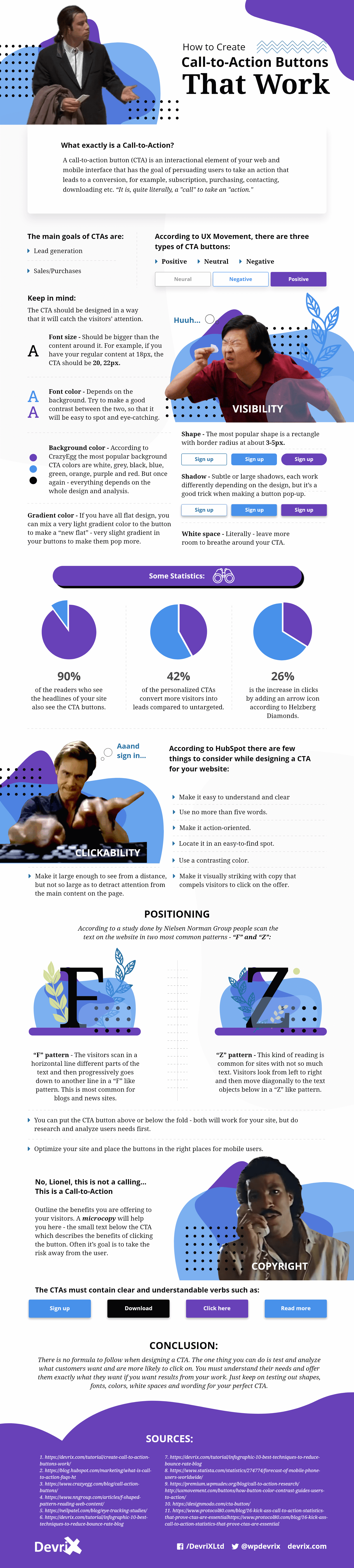
To make the job of creating and placing CTA buttons much easier for you, in the following infographic, we outlined the best tips that you can use to create call-to-action buttons that work and help you to encourage your audience to take the action towards the desired goal.
Embed This Infographic On Your Site (copy code below):
Click this link to access the full article.
Team DevriX
This article is crafted by DevriX's seasoned marketing team, boasting over four decades of collective expertise in crafting sophisticated marketing funnels, devising comprehensive content frameworks and pillars, implementing engaging email campaigns, and creating impactful social media content designed for scalability.
Our marketing experts specialize in the complete spectrum of inbound marketing strategies. As an accredited HubSpot Agency Partner and a Semrush Partner, we engage in meticulous research, blending our extensive experience with the unique insights of our highly skilled team.
We set benchmarks in content creation by incorporating cutting-edge marketing trends, leveraging in-depth industry research, and utilizing state-of-the-art AI tools for data segmentation and captivating content hooks. Our proficiency extends across a diverse range of sectors, including working with SMEs, Fortune 1000 companies, global B2B brands, major publishing entities, WooCommerce platforms, business directories, and affiliate networks.

![[Infographic] 24 Fundamental Email Marketing Stats](https://devrix.com/wp-content/uploads/2018/01/Infographic-24-Fundamental-Email-Marketing-Stats-380x160.png)