
When you design a site with a grid-based format, media queries and pictures that can seamlessly adapt to the screen size of any device, you’re essentially developing a website with a responsive design. Responsive designs are gaining popularity not only because more than half of the world’s website traffic is generated by mobile devices, but also because mobile eCommerce is now a 3.56 trillion industry. So, if you want to grow your business and give it a competitive edge, you need to implement a mobile-first mindset to web design and adopt the right frameworks.
Generally, there are two types of responsive frameworks: back-end and front-end. The difference between them is whether the framework is used for the application or presentation layer of a site. In this post, we will discuss responsive front-end frameworks in more detail.
Responsive front-end frameworks are a combination of HTML, CSS and JavaScript. Essentially, these are themes that set a standards-compliant, accessible, and adaptive foundation onto which you can build your website.
A considerable number of these frameworks are open-source, free to download and rapidly customizable. We have prepared a pretty exhaustive list of the best 30 you can use, however, keep in mind that there are still many open source frameworks to work with that you can consider.
As we dive into the myriad of HTML5 and CSS3 frameworks, it’s important to recognize the evolving trends in responsive design. The shift towards more interactive and dynamic user interfaces, coupled with the increased focus on mobile-first designs, has shaped the development of these frameworks.
Understanding these trends not only aids in selecting the right tool but also ensures that your web projects stay ahead in the rapidly changing digital landscape.
Related: Top 5 WordPress PayPal Plugins That Make Accepting Payments Easier
HTML5 Responsive Frameworks
Mobile devices have now become the primary means through which users access the online space, and it’s no surprise that responsive HTML5 front-end frameworks are in high demand. In fact, according to Search Engine Watch, nine out of ten people judge websites based on how responsive their design is.
If you have not done it already, now is the time to make mobile design a top priority in your web strategy. The following are some of the most popular responsive HTML5 front-end frameworks that can make this task simpler.
#Number 1: Foundation
Foundation is the most developed responsive front-end structure. Utilizing this HTML5 system, one can begin by building sites for small-screen devices first. It is utilized for adaptable and responsive sites.

#Number 2: HTML5 Boilerplate
It helps you assemble quick and versatile web applications and sites. It conveys superb site execution and freely keeps up server arrangement. It helps you to begin with new ventures.

#Number 3: UIKit
UIkit is a lightweight and secluded front-end structure for growing quick and intense web interfaces. UIkit gives you a far-reaching accumulation of HTML, CSS, and JS segments which is easy to utilize, simple to redo, and extendable.

#Number 4: Base
It is a semantic, lightweight and extensible structure to power the up-and-coming era of responsive sites.

#Number 5: Gridiculo.us
It is a lightweight fully responsive boilerplate. It offers a variety of features, including maxing out your site width, advanced columns and nested columns control, and others.

#Number 6: HTML KickStart
One of the freshest children on the square, HTML5 KickStart is an incline and a mean bundle of HTML, CSS, and JavaScript documents that guarantee to spare UI designers hours of work.

#Number 7: Skeleton
Skeleton is a straightforward and easy responsive front-end framework to use for creating HTML5 sites and versatile applications. It has a gathering of CSS records that can help you quickly create locales that look wonderful on any screen size. It takes a shot at three center standards: Responsive network down to versatile, quick to begin and style freethinker.

#Number 8: Crea

CSS Responsive Framework
Generally, responsive CSS Frameworks are added to the front-end framework of any sites and website. These CSS structures have numerous elements like responsive designs, clean code, and responsive slider, cross-program similarity, inbuilt catches, animations and more which are utilized by originators. With the assistance of these free CSS frameworks building projects inside the website, pages turns out to be a significantly more suitable and simple undertaking. Furthermore, if you incorporate JavaScript and jQuery plugins in these frameworks, it is possible to create many effects.
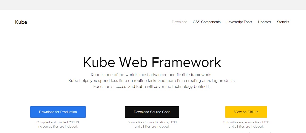
#Number 9: Kube
The best thing about Kube is that it is very easy to use and customize. You can easily make a site with lots of inbuilt options; it doesn’t mess with the pixels and is perfectly adaptable with all tablets and smartphones.
#Number 10: Ionic Framework
Ionic Framework diminishes the site improvement time by offering simple-to-utilize matrices, flawless textual style styles and helpful plugins. There are instruments, editors and layouts to help you in every progression of planning the site. There is a reset choice to dispense with any inconsistencies in programs.
#Number 11: Semantic-UI
Semantic-UI is the best structure to make a 3D movement site. It offers flexibility to creators by offering unique state variables and making a legacy framework with just a couple of lines. There are right around 3000+ CSS variables for any sort of system.
#Number 12: Pure
It offers little CSS modules for making the system; particularly for mobiles. It has insignificant styles and responsive formats for frameworks, tables, or menus. It expands on Normalize.css and is ideal for any screen size. You can make quick and hearty sites utilizing it.
#Number 13: Bootflat
Bootflat is an open-source CSS system that is fabricated with the effective Bootstrap 3. It is intended to make a dazzling level web plan in a quicker, less demanding and less dreary way. Thus, its UI Kit accompanies an excellent PSD client interface pack that you can use on your site, iOS or Android venture.
#Number 14: Inuit.css
Inuit.css is another awesome CSS responsive framework that concentrates on a mobile-first approach to web design and leaves all configurations to you. While numerous other structures accompany their own particular inherent outline CSS, Inuit.css does not. Instead, it meets expectations in the (Object Oriented CSS)OOCSS way which is a quick, adaptable and viable technique for composing reusable CSS.
#Number 15: 960 Grid System
It is a responsive front-end structure that can streamline your web improvement work process in light of a 960px wide holder. The compartment is then can be cut up into 12, 16 or even 24 sections for less demanding laying out substance.

#Number 16: Materialize
In light of Google’s Material Design standards, Materialize has come as a present-day responsive front-end solution. This system is exceptionally suitable for individuals who need to actualize the Material Design look and feel of their site with no intricacy. It includes a card outline, progressively outstretching influence activity, dragging out the versatile menu, and some more.
#Number 17: Jeet
Jeet is a quick and adaptable responsive front-end framework accessible today. It helps you construct matrices on the fly in an extremely instinctive, clean, way, and it underpins all current and old programs.

#Number 18: Susy
Susy is a computerized network framework that can help you assemble a responsive website design in any sort of section you need. It gives you flexibility and adaptability to manufacture configuration of your decision. It’s ready to handle whether your outline has 5, 12, 24, 48, or unequal segments.

#Number 19: Metro UI
Metro UI is a twelve grids based structure that is propelled by the Windows 8 Metro style interface. It’s anything but difficult to utilize and has style with a cluster of regular segments like catch, tile, menu, datepicker and substantially more. There is additionally a News Portal format to kick you off effortlessly.

Additional Responsive Frameworks
Following are some useful responsive frameworks from 2015, that will help you to experience better.
#Number 20: Jam.py
Jam.py is an occasion-driven and object-oriented system with a progressive structure. This, in the mix with tight DB/GUI coupling, is the basis for the DRY rule that is hidden in the system. So only a few hundred lines of code is sufficient to make very unpredictable database applications. Jam.py has client confirmation that gives a safe approach to overseeing client records and passwords. And also consents and parts security works that offer managers the utmost functionality of the diverse classifications of clients.

#Number 21: Apache Aurora
Apache Aurora is basically a Mesos system for long-running administrations and cron employment. Aurora runs applications and administrations over a mutual pool of machines, and is in charge of keeping them running, until the end of time. When machines experience disappointment, Aurora shrewdly reschedules those occupations onto sound machines. However, when redesigning an occupation, Aurora will identify the status of an arrangement and consequently roll back if essential. Aurora has a standard framework to give ensured assets to particular applications and can bolster numerous clients to convey administrations.

#Number 22: TouchstoneJS
TouchstoneJS is a UI structure fueled by React.js for creating half-breed portable applications. It incorporates structure segments, route, moves, local touch practices, and substantially more, with more components in transit.

#Number 23: Schema
Schema is a secluded, responsive, front-end structure to effectively and rapidly help you jolt your procedure in building complex interfaces for the web right out of the box. Outline comes completely furnished with the capacity of making commonplace encounters over different viewports. From a desktop screen down to a cell phone, Schema’s 12-segment matrix gives adaptability.

#Number 24: Themosis
Themosis is an application that helps you create sites and web applications faster utilizing WordPress. By using an exquisite and basic code sentence structure, this responsive framework helps you structure and compose your code, allowing you to better oversee and scale your WordPress sites and applications. From a specialized perspective, Themosis structure is a situated API. It utilizes “present day” PHP elements like unknown capacities, and namespaces, is Composer prepared and is a blend between WordPress best practices and how about we say a common MVC system.

#Number 25: Enact Framework
Enact is a responsive front-end framework built with React. It’s easy to use, well-performing and customizable, encompassing the best solutions for accessibility, internationalization, focus management, building, testing and linting.

#Number 26: TopCoat
TopCoat is a responsive front-end structure, made by the Adobe group, for creating web applications very quickly. Each and every point of interest in TopCoat is advanced for execution needs. Additionally, it offers you adaptability, open-source text styling, and PSD UI Kit.

#Number 27: Less Framework
Less Framework is a CSS front-end framework for building responsive website designs. It focuses on creating a clean and simple layout grid and contains 3 typography and 4 layout presets – default, tablet, mobile and wide mobile, all based on the same grid.
The goal of Less Framework is to create consistency and make web designing with multiple layouts more efficient. Because every layout is based on the same grid, it allows you to reuse elements across layouts, without the need to change them too much.

#Number 28: Onsen UI
Onsen UI is a crossover system that functions admirably with PhoneGap and Cordova. With AngularJS, jQuery, Font Awesome and TopCoat as the establishment, Onsen can be a promising tool for creating astounding versatile applications. It can help you manufacture portable applications effortlessly utilizing the idea of Web Components.

#Number 29: Simple Grid
If you are looking for a barebone CSS grid for your project, Simple Grid is a great responsive front-end solution to choose from. It can produce amazing results for both large and small layout sizes, thus allowing you to create a clean user-friendly design across your site. What is more, it enables you to reduce the number of lines of code as well as the web project’s file size.

#Number 30: SproutCore
SproutCore is a responsive front-end framework that can quickly help you build HTML5 applications. It builds on top of JavaScript and follows the Model-View-Controller (MVC) architecture pattern and allows users to create a native-like user experience.

Bottom Line
Use any of the above responsive frameworks according to your needs. Frameworks will definitely save a lot of your time!
After exploring various frameworks, an essential aspect to consider is performance optimization. The effectiveness of a framework isn’t just in its responsive capabilities but also in how it impacts the overall speed and efficiency of a website.
Implementing strategies like minimizing CSS and JavaScript, leveraging browser caching, and optimizing images can significantly enhance the performance of these frameworks, leading to faster, more responsive websites.
At DevriX we do profile in building high-end applications on top of WordPress using different frameworks and toolkits. If you’re looking for a high-end technical solution that scales and automates your business processes, check out our Services and let us know.
Team DevriX
This article is crafted by DevriX's seasoned marketing team, boasting over four decades of collective expertise in crafting sophisticated marketing funnels, devising comprehensive content frameworks and pillars, implementing engaging email campaigns, and creating impactful social media content designed for scalability.
Our marketing experts specialize in the complete spectrum of inbound marketing strategies. As an accredited HubSpot Agency Partner and a Semrush Partner, we engage in meticulous research, blending our extensive experience with the unique insights of our highly skilled team.
We set benchmarks in content creation by incorporating cutting-edge marketing trends, leveraging in-depth industry research, and utilizing state-of-the-art AI tools for data segmentation and captivating content hooks. Our proficiency extends across a diverse range of sectors, including working with SMEs, Fortune 1000 companies, global B2B brands, major publishing entities, WooCommerce platforms, business directories, and affiliate networks.
