
Intro
Think about your website as being the display window of your shop in the online world. Just as with the physical stores, your website is the most important tool you have when turning your visitors into clients. The process of converting your engaged website visitors into potential customers it’s called lead generation.
When talking about lead generation we are usually talking about customers at the top of the sales funnel. At this stage, your goal is to create awareness through different events and content aimed at capturing leads and guiding them through the sales journey. Once you’ve built a relationship and gained their trust they are more likely to become customers.
However, nowadays it takes longer to attract your guests and turn them into customers because people do their research before making a purchase. It’s not surprising that one of the top priorities for marketers is generating leads.
If customers are not familiar with your brand, you need to tell the story of the company in the best possible way. If your goal is to generate leads, your website should be designed in a way to capture the users’ attention and convert them into customers.
We’ve prepared this article to cover some crucial lead generation components with examples of websites that did a great job applying these strategies to capture new customers.
Key Homepage Features
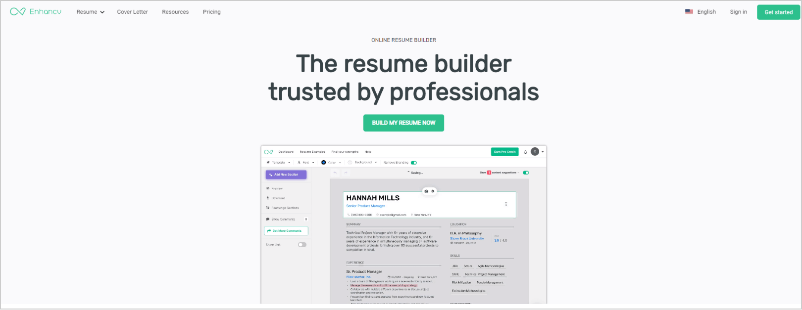
Source: Enhancv
The homepage is often the most visited one and your lead generation elements should be present there. Let’s look at the website of the online resume builder Enhancv. Their homepage is a good example of this and deserves the attention. The page is pretty straight forward and it has several lead generation features that should be included in any homepage that aims to convert. These elements include:
Clear value proposition – Your unique selling point and reason why your customers should choose you – a resume builder trusted by professionals.
Visible call to action button – It guides your customers towards the goal – to build their resume now.
Social proof – Shows how their resumes get people hired at top companies such as Tesla, Spotify, Google and more.

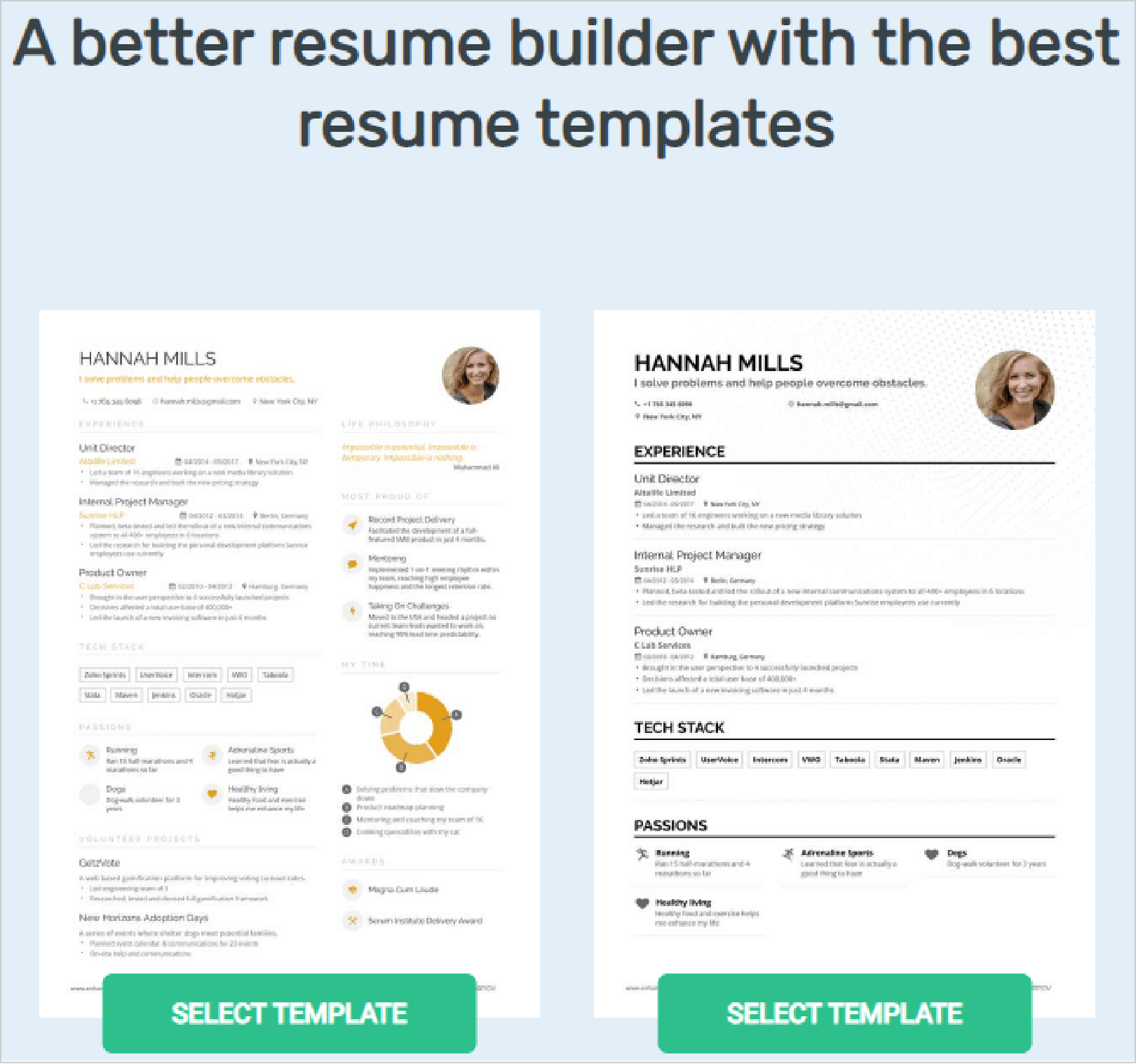
Source: Enhancv
If you scroll down the website you can see different resume templates with a CTA button, “Select Template”, which always should reflect the customer’s intent, in this case to create a beautiful resume.
Source: Enhancv
Social Proof and Other Trust-Builders
Since we are speaking about generating leads, your goal is to ask your website visitors to leave their information – most often an email address and name. Your guests will be more likely to trust you and your website if they see customers’ reviews and recommendations.
One of the oldest and mоst meaningful forms of advertising are recommendations which can have a big impact on conversion rates. With the above example of Enhancv, we’ve alluded to the idea of social proof and its importance. This is a way to show that other customers have purchased your product or service, they are happy using it and they would recommend it to others.
According to Spiegel:
- If products have displayed reviews the conversion rate increases rapidly. In fact, the purchase of a product with five reviews is 270% greater than the purchase of a product without any reviews.
- Reviews have a higher impact on high-priced products. According to Spiegel when customer feedback is displayed for higher-priced products the conversion rate increases by 390% compared to the cheaper ones where the conversion rate increases by 190%.
As you can see reviews from happy customers are powerful marketing tools. You can also use testimonials, logos of brands or case studies in various ways. You can not only display them on your websites but use them for social media posts.
In the screenshot below, DevriX has embedded different reviews from happy customers to show how other people have benefited from working with the company.

Source: DevriX
In case you don’t have reviews or you are not able to display them on your website you can simply add the logos of the companies that have chosen your products just like Slack have done here:
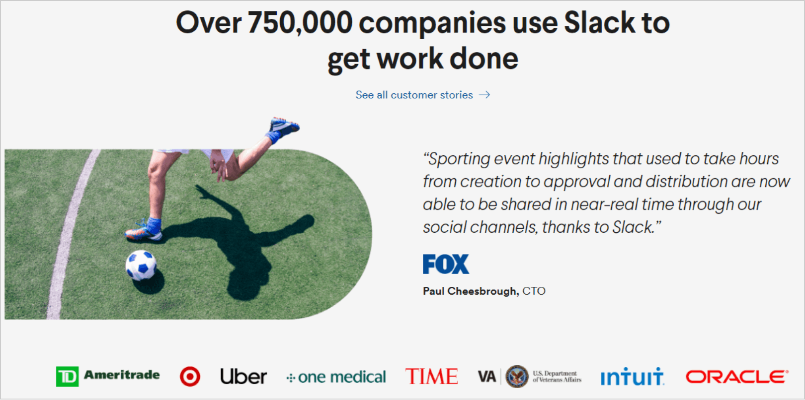
Source: Slack
Simple and Catchy Sign up Forms
Sign up forms are a must when trying to increase the number of leads through your website. Without them, you won’t be able to get contact details from your visitors. Information which you could use later on to send them special offers, information about your products, and services or newsletters.
Keep in mind you need to follow one simple rule when creating your forms. The less information you ask for, the more likely people will be to fill them out. In the example below, you can see Evernote asks their website visitors for email addresses only – Google or else.
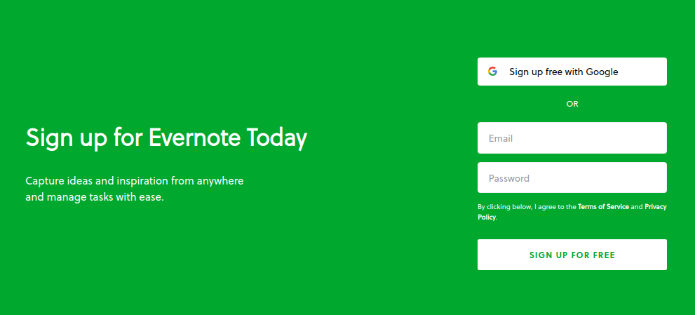
Source: Evernote
Friendly Pop-up Forms
Even though the pop-up forms could sound a bit controversial for some marketers it’s worth giving them a shot. Seeknote did research and investigated 1,754,957,675 pop-up forms. According to their data:
- The top 10% highest-performing pop-ups averaged a 9.28% conversion rate.
- The average conversion rate for all investigated pop-up forms is 3.09%.
When you create your pop-up forms make sure they are relevant and useful. They should consider your target audience’s needs. You can create pop-up forms for freebies such as guides, ebooks, research, tutorials, or everything else that would be valuable to your customers. If you are an online shop you can use pop-up forms to communicate your special offers, promotions or new products.
In the below screenshot Hubspot has embedded a pop-up urging its people to download it now and to get a whole free eCommerce kit. In addition, it has a visible call to action button that it’s impossible to miss.
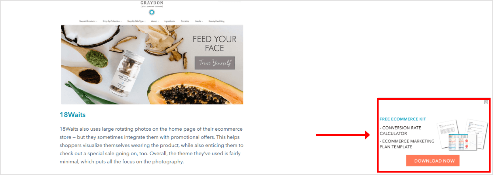
Source: HubSpot
According to the same research, Seeknote shared the following insights regarding pop-up forms:
- Popups with images convert better than popups without.
- Popups with a countdown timer convert better than campaigns without it.
In terms of where you should place the pop-up form on your website, there are various options. Hubpost chooses the right bottom corner. Some websites have it right after you visit them or while scrolling through their pages as Optinmonster does.
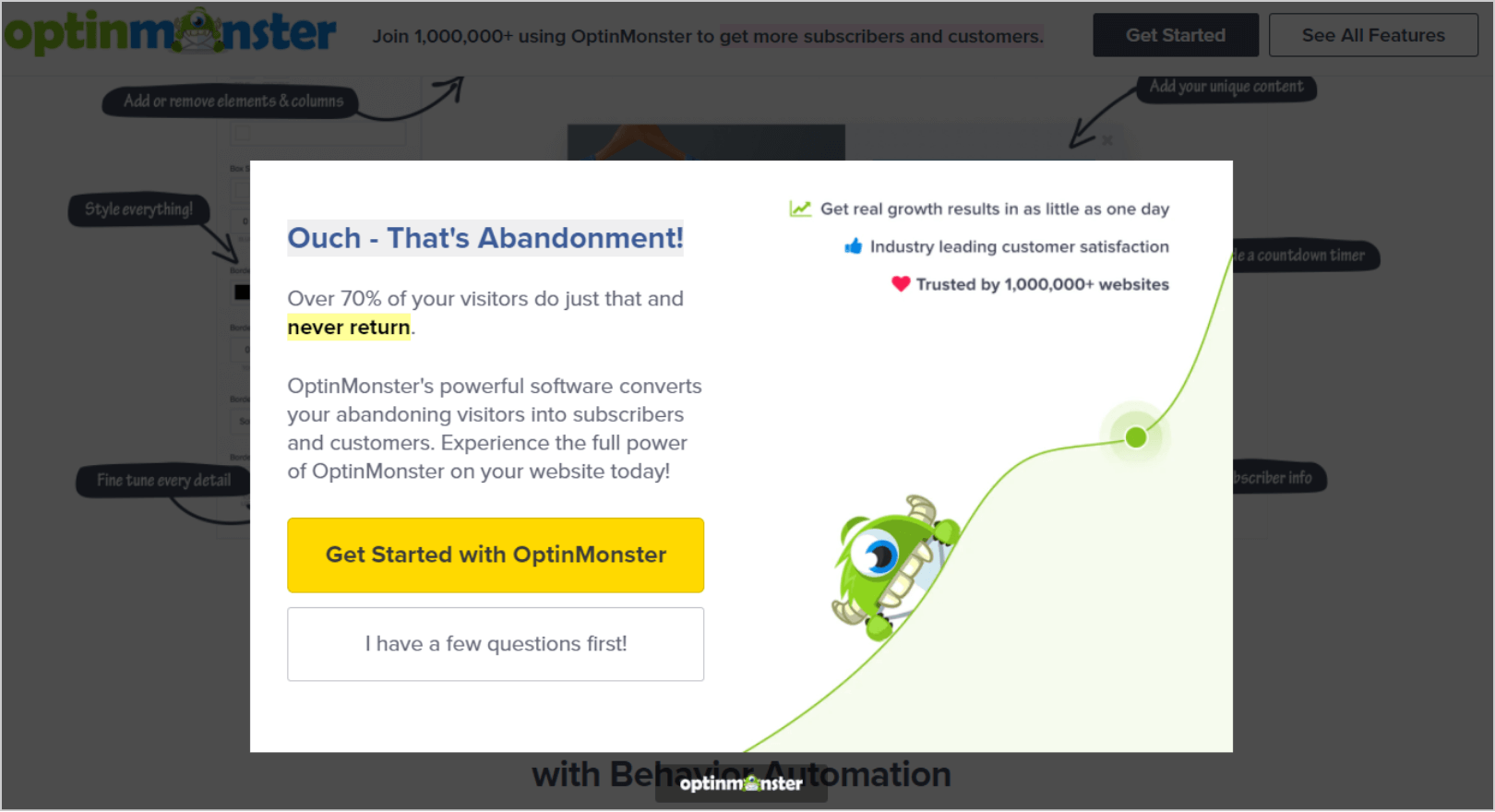
Source: Optinmonster
You can test different options and see which one works best for you in terms of placement, call to action, copy, and images.
Powerful Call to Action Buttons
It might sound too obvious, but the call to action buttons (CTA) should be included in this list. They are one of the most important features in a high-converting website. When visitors go to a specific web page you need to guide them to take action or they will leave and you won’t get any conversions.
You need to have call to action buttons carefully positioned on your website, but don’t be too annoying. For example, on its homepage Mailchimp has a different call to action buttons that reflect the different stages of the customer’s journey such as “Sign up free”, “Pick a plan”, “See how we stack up”, “Register”.
It’s important to have your primary CTA button above the fold because this way you will drive your customer’s attention to the most important content or action they need to follow. In the screenshot below, Mailchimp has its “Sign up free” CTA button above the fold in order to attract their customers without the need of scrolling down the page.
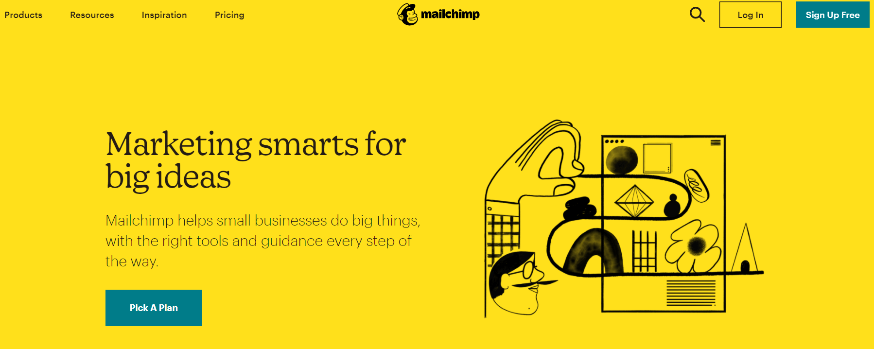
Source: Mailchimp
Provide an Outstanding User Experience
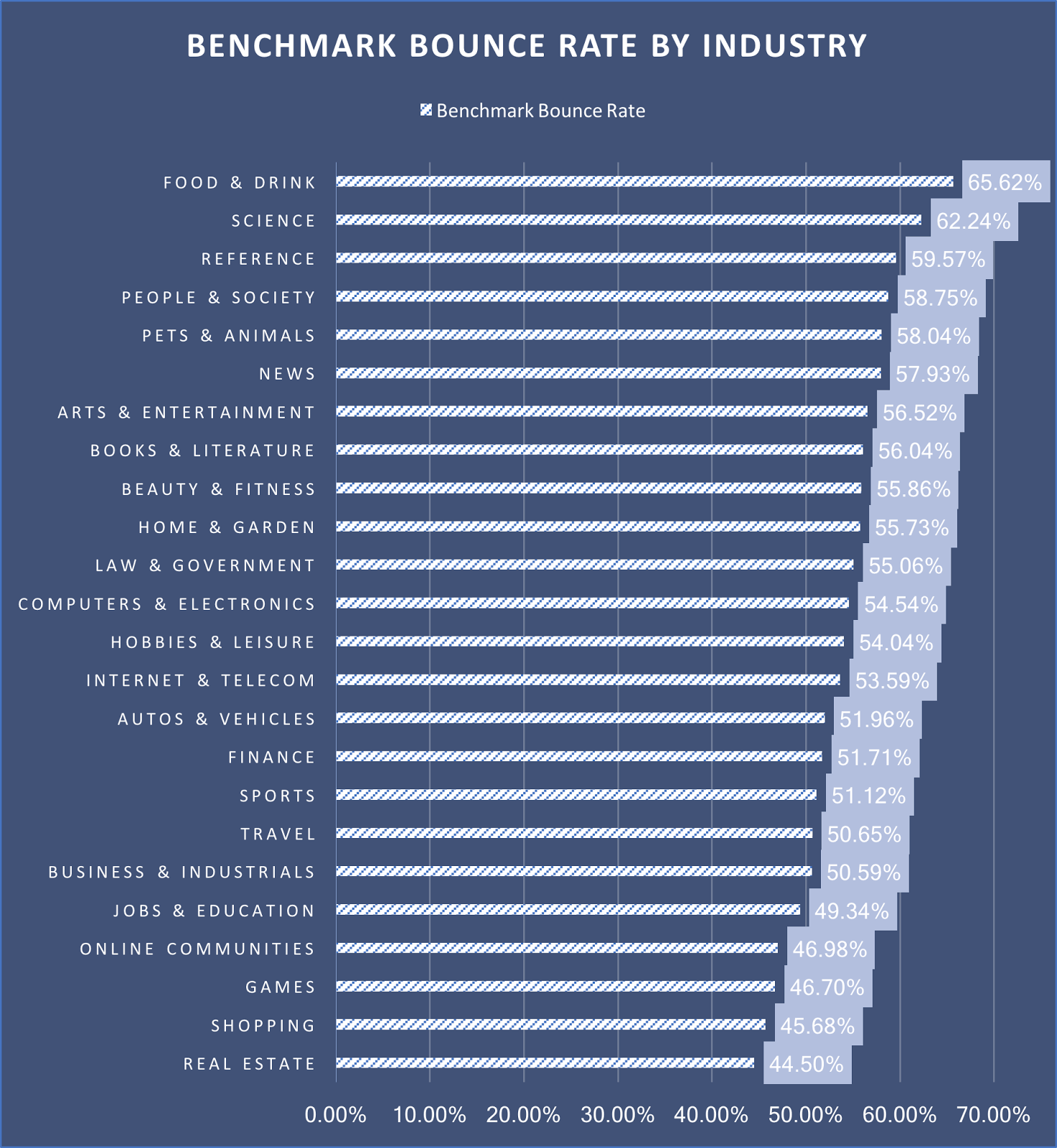
Your visitors are more likely to leave your page if they don’t have a smooth experience. The bounce rate is high in various industries as per the graphic below: BigCommerce.
You need to test and improve the user experience of your website. Your website should be user-friendly, easy to navigate, with clear messages and value proposition. There is no better way to achieve that than to test and ask directly your target audience. They will provide you with invaluable feedback and insights on what needs to be fixed in order to create an outstanding customer experience.
Inorder to test and improve your overall user experience, you can try tools like Hotjar which tracks and records screen videos. In this way, you can follow your customers’ journey on your website, evaluate the performance of specific pages, identify bugs or blockers.
With tools like Hotjar you can also create heat maps that show where your users click the most or the sections of your website where they don’t even reach. This data allows you to improve the user journey and provide a better customer experience.
Testing is the only way to know how exactly your page works and if your time and money invested has paid off.
Wrapping up
And although we’ve gone over some overarching best practices, remember that you’ll need tо continuously test and tweak your site to optimize it for leads based on your own, unique audience. We hope this article will help you to optimize your website for lead generation so you can capture more leads and convert them into customers.
Team DevriX
This article is crafted by DevriX's seasoned marketing team, boasting over four decades of collective expertise in crafting sophisticated marketing funnels, devising comprehensive content frameworks and pillars, implementing engaging email campaigns, and creating impactful social media content designed for scalability.
Our marketing experts specialize in the complete spectrum of inbound marketing strategies. As an accredited HubSpot Agency Partner and a Semrush Partner, we engage in meticulous research, blending our extensive experience with the unique insights of our highly skilled team.
We set benchmarks in content creation by incorporating cutting-edge marketing trends, leveraging in-depth industry research, and utilizing state-of-the-art AI tools for data segmentation and captivating content hooks. Our proficiency extends across a diverse range of sectors, including working with SMEs, Fortune 1000 companies, global B2B brands, major publishing entities, WooCommerce platforms, business directories, and affiliate networks.