Conversion rates, there’s never enough of them, right? No matter what type of niche you’re in, your website exists to bring you more leads, increase sales, and grow your business in the process.
However, if you’re not getting enough clicks and conversions, something must be terribly wrong with your website layout and the marketing tactics that you deploy.
When it comes to your website, there are various factors that can influence the conversion rate, such as usability, layout, CTAs, content, and overall UX as well. If you’re getting a significant number of web visitors, but no conversions, don’t worry, you’ve probably made some mistakes that luckily are fixable.
In this article, we’ll summarize the most common mistakes that lead to a reduced conversion rate, and what can you do to resolve them.
1. Your Website Is Still Slower Than a Snail
Come on, it’s 2019 and people still have to spend 5 seconds of their time on your slider to load? Please, that’s too long.
Even 1 second of delay can result in a 7% reduction in conversions. Up to 79% of online shoppers won’t return to a slow website either and complain to a friend about the experience too. Do you really want to you lose your visitors immediately, as well as sales opportunities!?
It’s time to test the speed of your website and optimize it for maximum performance. Luckily, Google have you covered with their Google PageSpeed Insights tool.
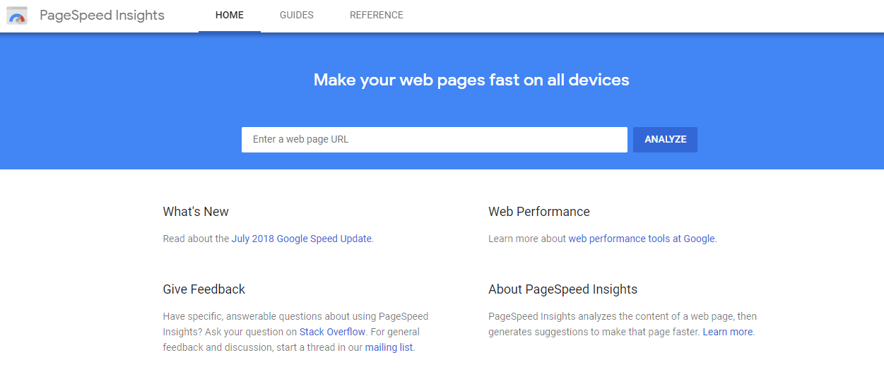
Enter your URL and click “Analyze”. This will provide you with a detailed report on the issues that slow down your website based on two major parameters:
- Above-the-Fold Load – The time that the page spends to display content above the fold when requested by users.
- Full Page Load – The time that the browser takes to fully load the page when requested by users.
Google PageSpeed Insights quantifies your webpage performance for mobile and desktop devices. The tool loads your URL twice, with a mobile user agent and with a desktop user agent.
Your PageSpeed score can be from 0 to 100. A score of 85 and above means that your page performs well. But, if you want to properly increase your conversion rates, you’ll have to turn that “well” into “excellent”.
PageSpeed Insights will point out the exact problems that diminish the performance of your website, and all the possible solutions that need to be implemented for the issues to be resolved. To learn how to use the tool properly, read our guide on using PageSpeed Insights for Website Performance Analysis.
In general, to speed up your WordPress website for maximum conversions, you need to implement the following:
Implement a Good Hosting Provider
For a robust website performance, you need a hosting provider that is capable of improving your website’s performance in every aspect, including speed.
Most of the hosting providers out there look like a real bargain, especially shared hosting packages that you can use to start your website for literally a dollar per month!
However, this comes with a price – a shared hosting package means that you share the server with hundreds, if not thousands of other clients. This means that if most of those clients get more traffic than you, they’ll take up more of the server’s capacity and slow down your website in the process.
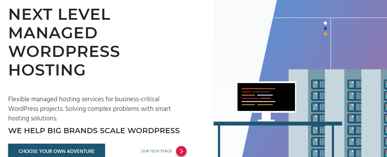
This is why the only WordPress hosting provider that we recommend to our clients is Pagely’s Managed Hosting service.
Their enterprise hosting platform offers you a scalable solution with multi-region redundancy and enterprise grade-security. The amount of websites that turned to managed hosting has grown rapidly over the last 8-9 years, and along with WordPress websites, it has become a dominant way for businesses to manage their content online. The four key benefits of using a managed hosting provider are:
- Better Security: Managed hosting services offer unparalleled security compared to other types of web hosting. A managed provider applies the highest level of security, daily backups, malware scanning, and updates that prevent hackers from attacking your site.
- Monitoring Uptime: Speed and performance have a direct impact on search rankings. Most of the managed hosting providers offer 24/7 website monitoring, which means that you don’t have to dwell on your website’s performance
- 24/7 Support: Managed hosting providers have trained experts that understand the technical details of the platform, and know how to solve common and complex problems.
Customizable Solutions: Most managed hosts can support almost every niche, from educational blogs to eCommerce websites, and everything in between. The solution is adapted to your business needs, instead of the other way around.
Install a Caching Plugin
When visitors open your WordPress site, the browser that they use stores different components of your pages, including JavaScript and content. A big chunk of this content remains static across the site and doesn’t need to be requested repeatedly in order to display. This process is called caching.
The content caching effectively reduces the number of HTTP requests between servers and browsers.
Installing and activating a caching plugin makes a copy of the page after the first load, and then serves that cached version to every next user that opens the page. There is a lot of excellent WordPress caching plugins available, but we recommend using either WP Rocket (the premium version) or the WP Super Cache plugin.
Reduce the Number of Plugins
Speaking of plugins, the more you have on your WordPress site, the slower the site will be. Each new plugin means more code is added to your site, and additional code for the browser to load. The less code the website has, the better its loading time will be.
A good rule of thumb is to only use the plugins that you need and uninstall or delete the ones that are not updated by the creators or that you don’t use anymore. However, cherry-picking the plugins that matter and of real quality is kinda tricky, which is why you need to see our guide for choosing your plugins smarter.
Use a Content Delivery Network (CDN)
All of the biggest publishers use CDNs to scale the high-traffic spike and deliver the content fast to the readers. In essence, a CDN takes all the static files (CSS, JavaScript) of your WordPress site and delivers them to users as fast as possible via the nearest server. You should choose the one that fits the best for your WordPress website and your business model.
Here’s a list of the most well-known CDN providers today:
Optimize Images
Image optimization matters when it comes to speed. Before you use the images, compress them with ImageResize or TinyPNG and then upload them on your site. These tools can compress the image file size up to 90% without sacrificing too much of the image quality and details.
When you optimize your images, use as many resolutions as you need. For example, if you only need a thumbnail of the image that is 300 x 300px, why would you want to insert a 1200x1200px for it only to appear smaller on the page? Thankfully, WordPress is very good at handling image resizing.
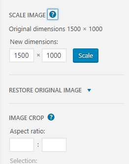
If you can, upload 2x image (retina) to make it look crisp on mobile devices with higher pixel density.
Optimize Your Homepage
If you want a high PageSpeed score, your homepage must be blisteringly fast! There are several things that you can do immediately to speed up your homepage:
- Excerpts Only: WordPress shows entire posts on your homepage by default. This slows down your site, and by using excerpts, the page will load faster because you only use a portion of the article.
- Minimum Posts: Use maximum 3-5 posts on your homepage.
- Minimum Widgets: Remove unnecessary widgets and inactive plugins that you don’t need on your homepage.
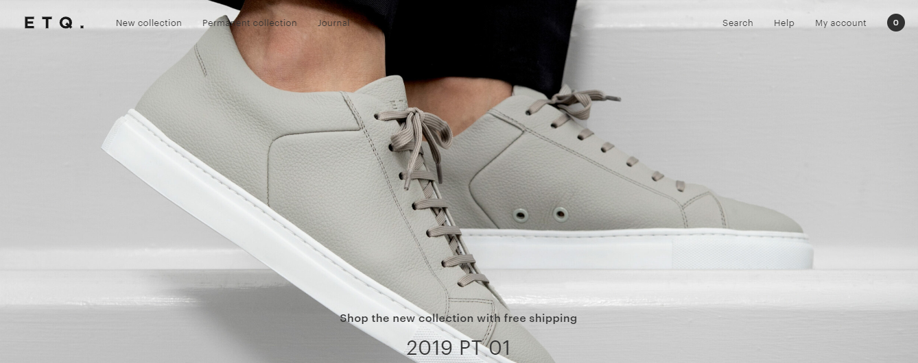
- Light Slider: If you use a slider instead of a hero shot, make sure that each slider image is optimized according to the rules that we’ve already outlined in this article.
2. The Design Is Obsolete
Web design trends come and go with great speed! The users become more tech-savvy, and let’s face it, no one wants to lose time looking at a slider. Added to that is the restless creativity of professional web designers and developers that constantly want to disrupt the status quo, and all of the sudden, the design of your WordPress site looks outdated and obsolete without any chance of making a conversion.
So, how can you revamp your design and turn your website into a conversion rating machine?
First, Analyze Everything
What is the current state of your website? Start with the analytics, validate if your layout really brings leads down the funnel, and benchmark the KPIs that you want to achieve. To collect and benchmark your data, we recommend Google Analytics. It’s free, and it is really easy to integrate on your WordPress site.
Examine the Content Hierarchy
The way you organize your content directly impact the conversion rate. Having a clear hierarchy for your content matters because people skim the content on each page and they don’t tend to stay more than 10 seconds in the process. So, arranging your content properly can definitely increase the chances of increasing your conversion rates. An example of a content hierarchy that always works like a charm from Tyche Softwares.
- Connect: Instantly connect your services with the users’ problems.
- Explain: Describe your solutions.
- Social Proof: How you’ve helped your customers.
Is the Navigation Straightforward?
If people can’t find what they’re looking for on your website, how do you expect them to become your clients? Users expect a pretty uncomplicated navigation process, and this is something that needs to be addressed ASAP.

Create a sitemap too, because it’s the fastest way to show how your pages are connected between each other.
Improve the Style
Website design is not only about improved content hierarchy and navigation, but it’s also a matter of style. Focus on the following elements:
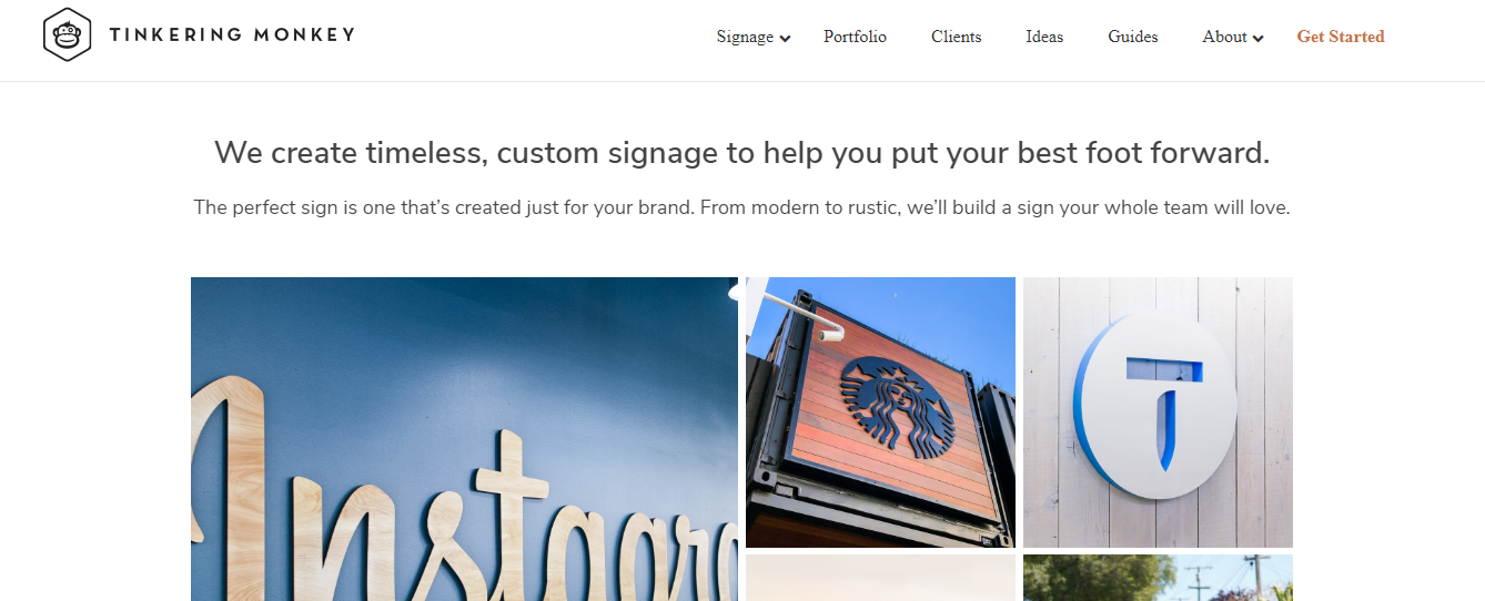
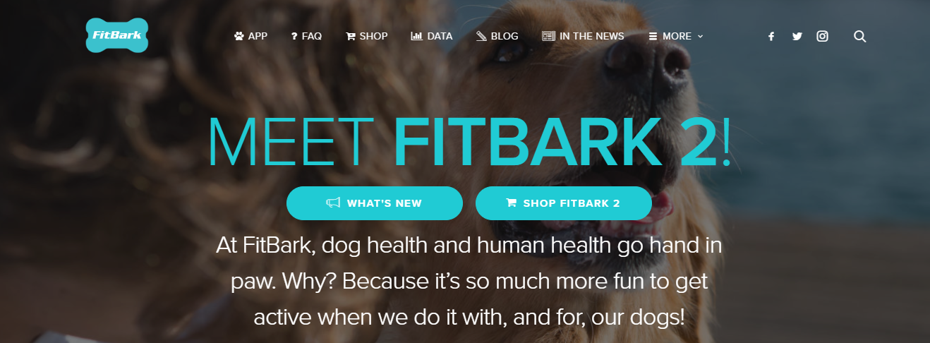
- Imagery: A bad image creates a bad image for your business. Make sure that you use quality and unique imagery.

- Typography: Typography is crucial to the success of your website because, with the right typography combined with your website layout, you can directly improve the time that people spend on your website, and consequently, the conversion rate.

- Whitespace: Make your website more elegant by allowing more whitespace. The right amount of whitespace also helps the users to focus on the core message and on your CTAs.

- Spacing: A line spacing of 1.3 to 1.7 is the desired one, but this should vary depending on the type of your page, the font size, and the number of characters.
3. Unapparent or Weak CTAs
There’s an old saying “He who doesn’t ask, shall not receive.”
The same rule can be applied when it comes to your web presence and your conversion rates. Here are the 3 most common reasons why the CTAs on your website don’t work:
- You’re too short: Less is more, but not always. The sole “Buy” or “Register” doesn’t exactly explain what will happen if someone clicks the button. “Download” and “Download Your Free Book” is not the same”.
- No context: Having a CTA that is not relevant to your content is confusing for the users. When people scan the content, they need to summarize and capture the entire context of the page, and this can’t be achieved if your CTA and headlines don’t match what’s in the content.
- No Focus: A proper CTA screams “HEYY I AM HERE!”. You need to enclose it within your page aesthetics and its clear message and content. Pay attention to how you use colors, contrast, and typography as well.
The following aspects will help you to effectively optimize your call-to-action for conversions:
Make It Visible
If you want a bigger conversion rate, your call-to-action must be visible to the users! Place a CTA that is large enough with the perfect alignment against the rest of your page components. You must place it somewhere where the users can easily spot it and get more clicks as a result.
Good Copywriting
CTA is not a place for copywriting errors. It must be convincing, and it must present the benefits of what you offer. If people are not convinced of your copy, you can’t convert them. Consider your headline, main copy, and the microcopy as the hint that will convince people further. Present the benefits, and use powerful words that can increase the click-rate, but don’t overdo it and ensure that you “walk the talk”.
To learn more tactics on how to create the perfect call-to-action for your website, read our guide for creating CTA buttons that work.
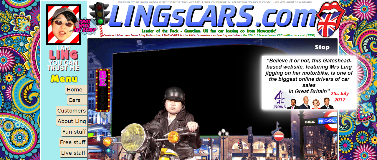
4. Overuse of Colors
It’s true, colors psychologically affect the users and they can mean sink or swim for the conversion rate of your website. They create emotions, and when it comes to increasing your sales, there’s nothing more convincing than an emotion.
However, if you use too many color palettes on your website, you’ll make it look cheap and tacky. Something like this:
You don’t need more than 3-4 colors for your website:
- A dominant color aka your brand color.
- 1 to 2 additional colors that highlight the brand color.
- A background color.
Before you pick the right colors of your website, you need to understand the psychology behind color first. Let’s take a quick look at each color and meaning behind it:
- Blue: trustworthy and calming.
- White: pure and honest.
- Green: organic and positive.
- Pink: youthful and feminine.
- Gray: integrity and matureness.
- Purple: youthful and contemporary.
- Yellow: emotional and positive.
- Red: excitement.
- Orange: organic and positive.
- Black: serious.
- Brown: unpretentious.
- Gold: stable and elegant.
Pick Your Dominant Color
Which color matches your business the most? Take some time and reflect on your brand and if there’s a certain color that attracts or would attract the customers. Also, think about your target clients. Do you want to attract younger audiences, or you have a much mature age group as your target market? Are your services sophisticated and exclusive, or affordable and for everyone?
Once you choose your dominant color, you need to use where customers pay the most attention, such as the CTA, contact info, logo, and titles, and headlines.
Choosing Additional Colors
A website with only one dominant color can be dull. Which is why if you want to make your design more captivating, you need to use additional colors to highlight the segments of the page that deserve more attention.
If you’re not sure about which additional colors to use, you can use Adobe’s Color CC Tool to define your additional complementary palette.

When you have your additional colors ready, you can use them to highlight the secondary information and messages on your site.
These are the elements that are not the main focus, but you need them to stand out from the rest, for example, secondary CTAs, information boxes, buttons, and subheadings.
Picking a Background Color
You need a background color that will make the users feel comfortable when they browse your website. And that means staying on the site longer, which can effectively reduce the bounce rate and increase the number of people that opt for your services or respond to your CTA.
The background color should depend on the elements that you want your target audience to focus on. For example, the more content-rich your website is, the better is to use a white or neutral background color:
If your website is business, or with a notable corporative look, you need to pick your background color depending on the purpose of your services.
For example, if your website is for promotion purposes, you may need a background color that is a combination of your dominant shade and your accent colors.

If you want to highlight the value of your services, a white or neutral background is the wiser choice.
For eCommerce businesses that are all about style, fashion, and design, the rules of background color are not carved in stone. If you’re creative enough with your design, every shade can become your background color.

Bottom line, if you want bigger conversion rates, your choices of colors should not be random and over-excessive. Let the colors power your message and bring people closer to your call-to-action.
5. Non-Responsive Design
Ever since the iPhone was presented back in 2007, our lives have changed dramatically. People use smartphones and tablets to browse on the go, in their beds, and no matter how disgusting it is, even in the bathrooms!
As a matter of fact, the percentage of people that prefer to use mobile devices to browse the Internet over laptops and desktop computers is now more than 60!
So if your website is still not responsive enough for smartphones, you can’t expect bigger conversion rates.
It is vital to use a platform that provides the users with a responsive experience from the start, which is another key benefit of using WordPress as your enterprise CMS. It is the ideal platform if you want to manage a desktop and a mobile version of your website properly.

6. Not Following the Design Standards
You may want your website to look like a Picasso painting (literally), but is that what the users want? In a world where they have millions of websites to land on, do you think that they will spend the time figuring out your eccentric web layout?
The most important thing about a website is its usability, and there’s not a better way to ensure usability than following the design and usability standards of today:
Simplicity Matters
In most of the cases, your target users are not members of a prestigious design club, and they’re interested only to find what they were looking for when they clicked on your link.
Stop adding unnecessary elements that don’t add to your main design goals, and help users achieve what they need by not using too many colors, a maximum of three types of typeface, and using graphics sparingly.
Have a Consistent Design
The overall look of each of your pages should follow a certain design scheme. This means that the background, typeface, colors, and your content should be the areas where you must stay consistent across all pages.
Be Conventional
There are some layouts and elements that the users became familiar with over the years, and if you attempt something extremely different than those, you can’t expect an increased conversion rate. These include:
- Having the main navigation on the top of the page.
- Logo on the top left of the page.
- A clickable logo.
- Links that change the color of appearance when you hover or click them.
You need to take advantage of the conventional norms in web design and ensure that the users’ path to the CTA and your messages is clear.

Wrapping It Up
If your website is guilty of at least one of the mistakes that we outlined above, it means that you have some hurdles to overcome if you want to increase your conversion rate successfully. It’s time to get serious and leave nothing to chance and expectations!
Recognize where your faults are, and follow each advice that we talked about in this article, and implement it ASAP for a surge in customer satisfaction and conversion rates. Also, don’t forget to write to us if you have additional questions or conversion rate optimization questions that we can help with!
Team DevriX
This article is crafted by DevriX's seasoned marketing team, boasting over four decades of collective expertise in crafting sophisticated marketing funnels, devising comprehensive content frameworks and pillars, implementing engaging email campaigns, and creating impactful social media content designed for scalability.
Our marketing experts specialize in the complete spectrum of inbound marketing strategies. As an accredited HubSpot Agency Partner and a Semrush Partner, we engage in meticulous research, blending our extensive experience with the unique insights of our highly skilled team.
We set benchmarks in content creation by incorporating cutting-edge marketing trends, leveraging in-depth industry research, and utilizing state-of-the-art AI tools for data segmentation and captivating content hooks. Our proficiency extends across a diverse range of sectors, including working with SMEs, Fortune 1000 companies, global B2B brands, major publishing entities, WooCommerce platforms, business directories, and affiliate networks.

![Website Metrics That Matter [And You Should Track]](https://devrix.com/wp-content/uploads/2019/12/Website-Metrics-That-Matter-And-You-Should-Track-380x160.png)