The success of a website that converts visitors into clients is in the details. Lots of designers can get carried away and focus on creating a stunning and unique design, better imagery and nice typography. However, there’s much more to that if you really want to push people to take the desired action when they land on your page.
If you want your website to bring you more leads and clients, you must focus its design on interactive elements that induce people to take action like call-to-action buttons (CTAs). Designing an effective call to action is one thing, getting people to click it is another.
In this article, we’ll outline how you can create brilliantly designed CTA buttons that work and help you to encourage your web visitors to take the desired action that you had in mind when you created your webpage. Let’s look at some of the best tips along with excellent call to action examples.
What Is a CTA Button and Why It Matters?
First, let’s define what the call to action meaning is. A call-to-action button (CTA) is an interactional element of your web and mobile interface that has the goal of persuading users to take an action that leads to a conversion, for example, subscription, purchasing, contacting, etc.
In most cases (if designed properly), call-to-action buttons are easy to spot on the page and designed in a way that users are drawn to them.
What is the purpose of CTA?
The main goals of CTA buttons are lead generation and sales/purchases. If the button is captivating enough to attract the users’ attention, it is good enough to make them click and enter the next stage of the purchasing/subscription process such as filling out a form, ordering a product or signing up for a product/service.
Related: Top 10 Lead Conversion Strategies to Boost Your Business Success
Even if the content on your website is brilliant, you can’t convert more people to clients if you don’t include CTA buttons. Without them, people will read the content and bounce off your page, possibly never coming back.
From the outside, you may think that a call-to-action button is all about big bold letters and colors. But, it’s not that easy. There are lots of characteristics that make a CTA button a successful one. Let’s see which are the most important aspects of call-to-action buttons that work.
How Are CTAs Important for SEO?
In SEO web design, a call to action (CTA) is required in order to produce conversions. Whether you’re promoting affiliate offers, selling items, or gathering leads, you need to get people to take some kind of action. A call to action is a brief statement — usually in picture format — that instructs people on how to proceed.
The key to an effective CTA is twofold: first, it must be visible and highly noticeable on your website; second, it must be concise and clear in its language. Visitors should be able to understand what you want them to do and why it’s in their best interest to do it.
There are a few different types of CTAs that you can use on your website, each with its own benefits:
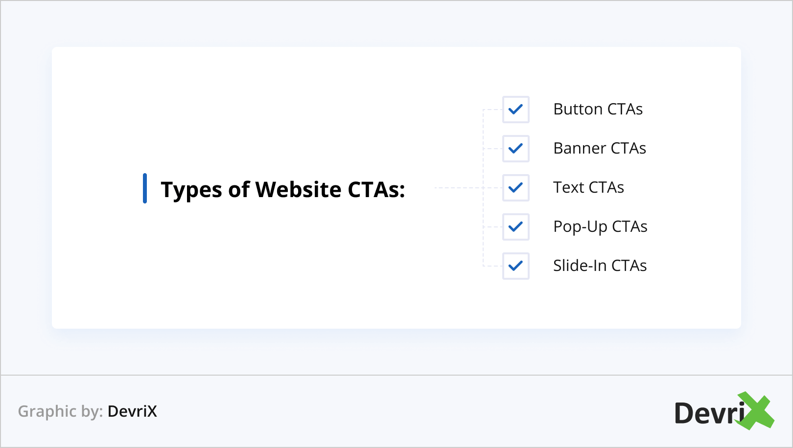
- Button CTAs: These are perhaps the most popular type of CTA, as they’re highly visible and easy to understand. Buttons can be placed anywhere on your website, but they’re typically found in the sidebar or near the bottom of the page.
- Banner CTAs: Banners are another effective type of CTA, as they can be placed prominently on your website and they’re often hard to miss. However, banners can be intrusive and overwhelming if they’re not used sparingly.
- Text CTAs: Text-based CTAs are simple and straightforward, and they can be easily integrated into your website’s existing content. However, they’re not as effective as other types of CTAs because they’re not as noticeable.
- Pop-Up CTAs: Pop-ups are a controversial type of CTA, as they can be considered intrusive and annoying. However, pop-ups can be effective if they’re used sparingly and if they offer something of value to the visitor.
- Slide-In CTAs: Slide-ins are similar to pop-ups, but they’re less intrusive and they typically offer something of value, such as a discount or an exclusive piece of content.
When choosing a CTA for your website, it’s important to consider what type of CTA will work best for your business and your goals. If you’re not sure which type of CTA to use, you can always experiment with different types and see which ones produce the best results.
An effective CTA will result in more conversions on your website — so if you’re not using one, you’re missing out on a crucial opportunity to grow your business.
Visibility
If you want your web visitors to become your customers, your CTA button must be visible and easy to spot from the moment users land on your page. If you design your button to be large but perfectly aligned with the proportions of the other elements on your website, you will ensure that users will be able to see it.
If you’re not sure about your call-to-action button visibility, you can try the old-fashioned but well-proven “squinting” test. Stand back a few feet from your computer screen and try to squint with your eyes until the details on your website are nothing more than blurred shapes. If the CTA button is still visible and recognizable, then you’re good to go.
Clickability
Every element and copy on your website needs to lead your users to the CTA button. That’s why it is inexcusable to dim your buttons along with the rest of your content.
When it comes to visibility, the crucial component of call-to-action buttons is their color.
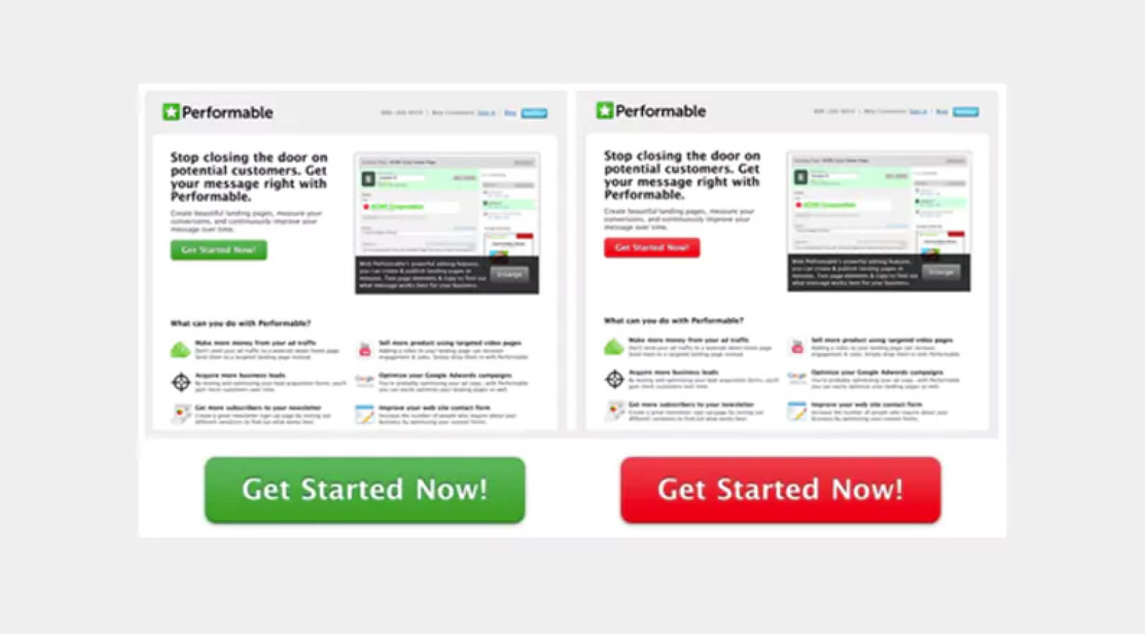
The CTA button color can have a substantial effect. In the HubSpot A/B test above, the colors they chose were red and green. The rest of the content and graphics are exactly the same in both versions of the page.
The green color is related to nature and clean environment. It gives a positive “Go” movement. The red color communicates excitement, passion and also, warning, which is why it is used for stop signs and traffic lights.
They ran both test pages for a few days. Their result was that the red button outshines the green button by 21%.
That is a big difference in conversion rate. A 21% increased click-through rate of the action button can mean that other important metrics are also increased too. Even if both versions of the page received the same amount of traffic, the page with the red CTA button is definitely the more efficient one.
This is why a quick A/B test of the button color is important. It is good to know what works better in terms of colors and apply that knowledge when you create your next CTA or landing page.
Just like in every other element of your website, you can take advantage of an A/B testing process to see what works the best. There are numerous A/B testing tools that you can use for this purpose and many of them are outlined in this mammoth A/B testing guide from CrazyEgg.
Most of the buttons that users click online have the following elements:
- Clear Color Contrast
- Distinctive Button
- Surrounding White Space
- Rectangular Shape
- Supportive Border Line
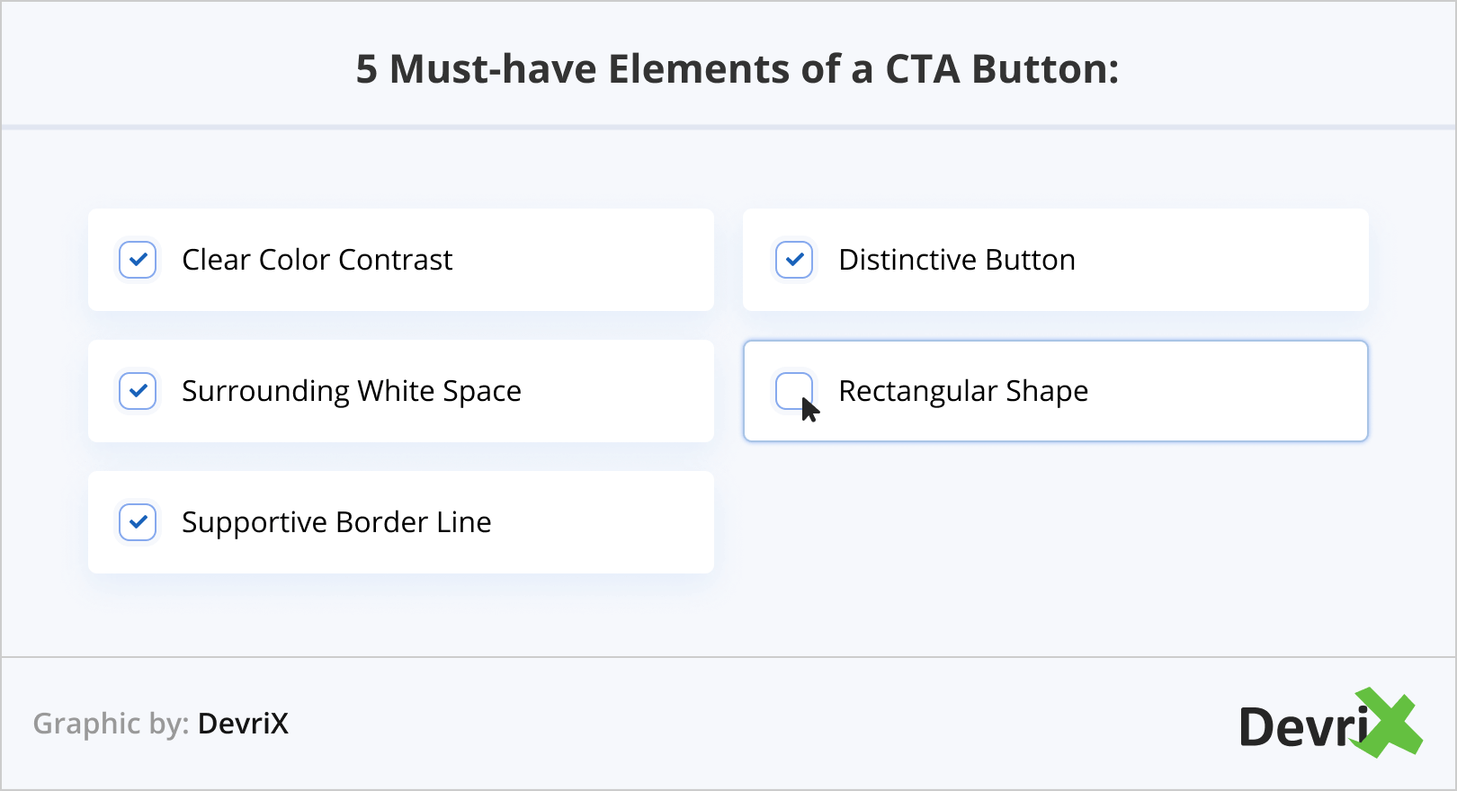
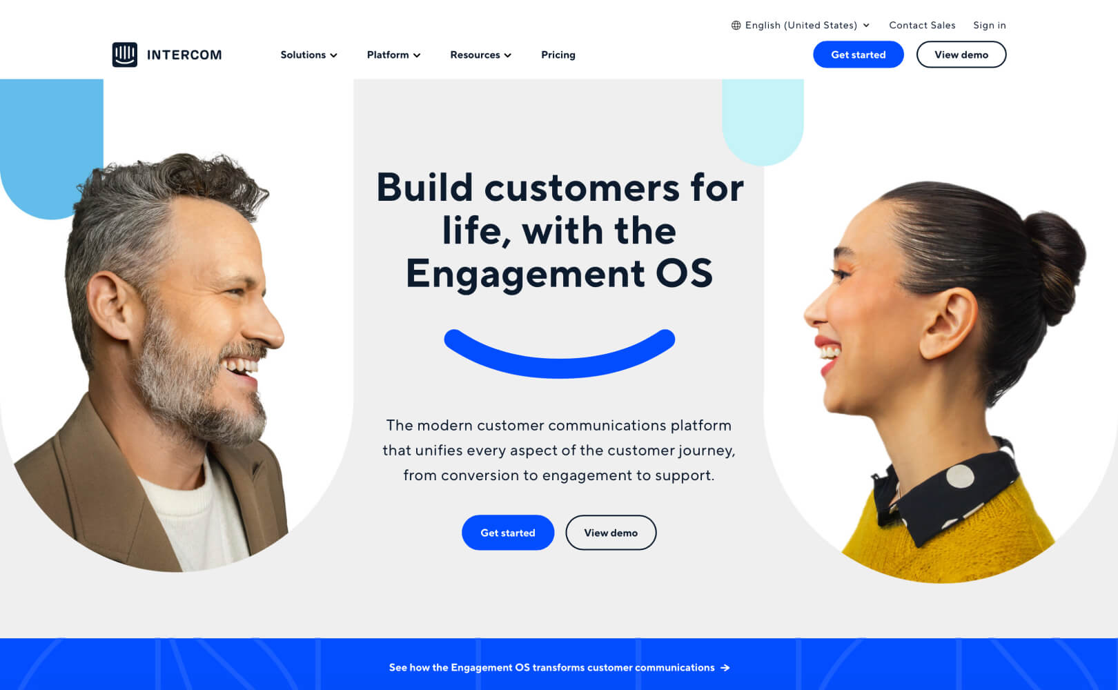
A perfect example that incorporates most of these elements is the CTA button of Treehouse’s homepage.
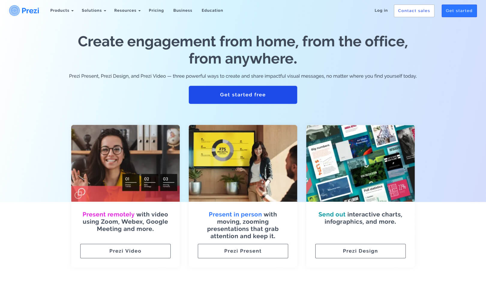
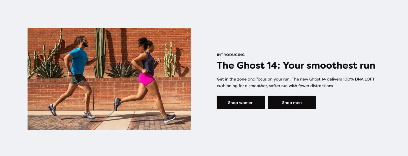
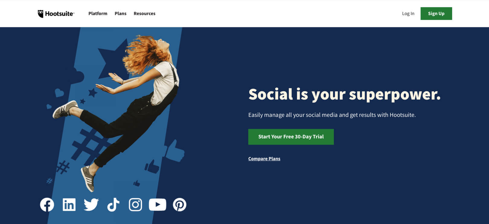
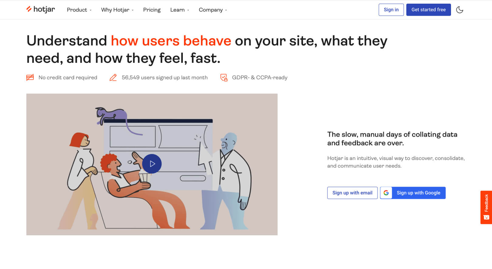
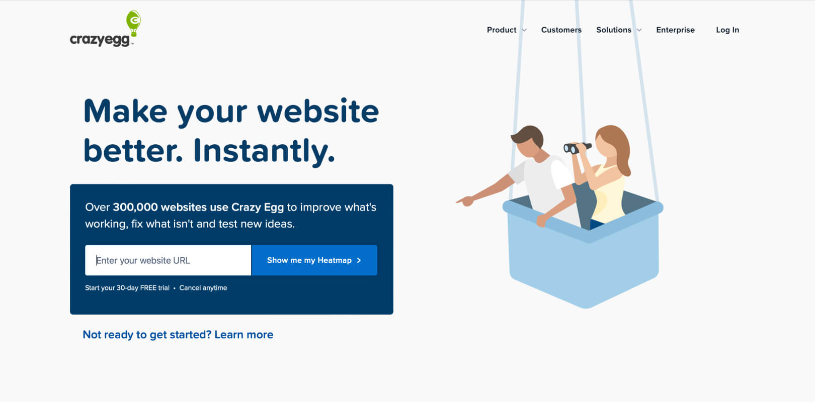
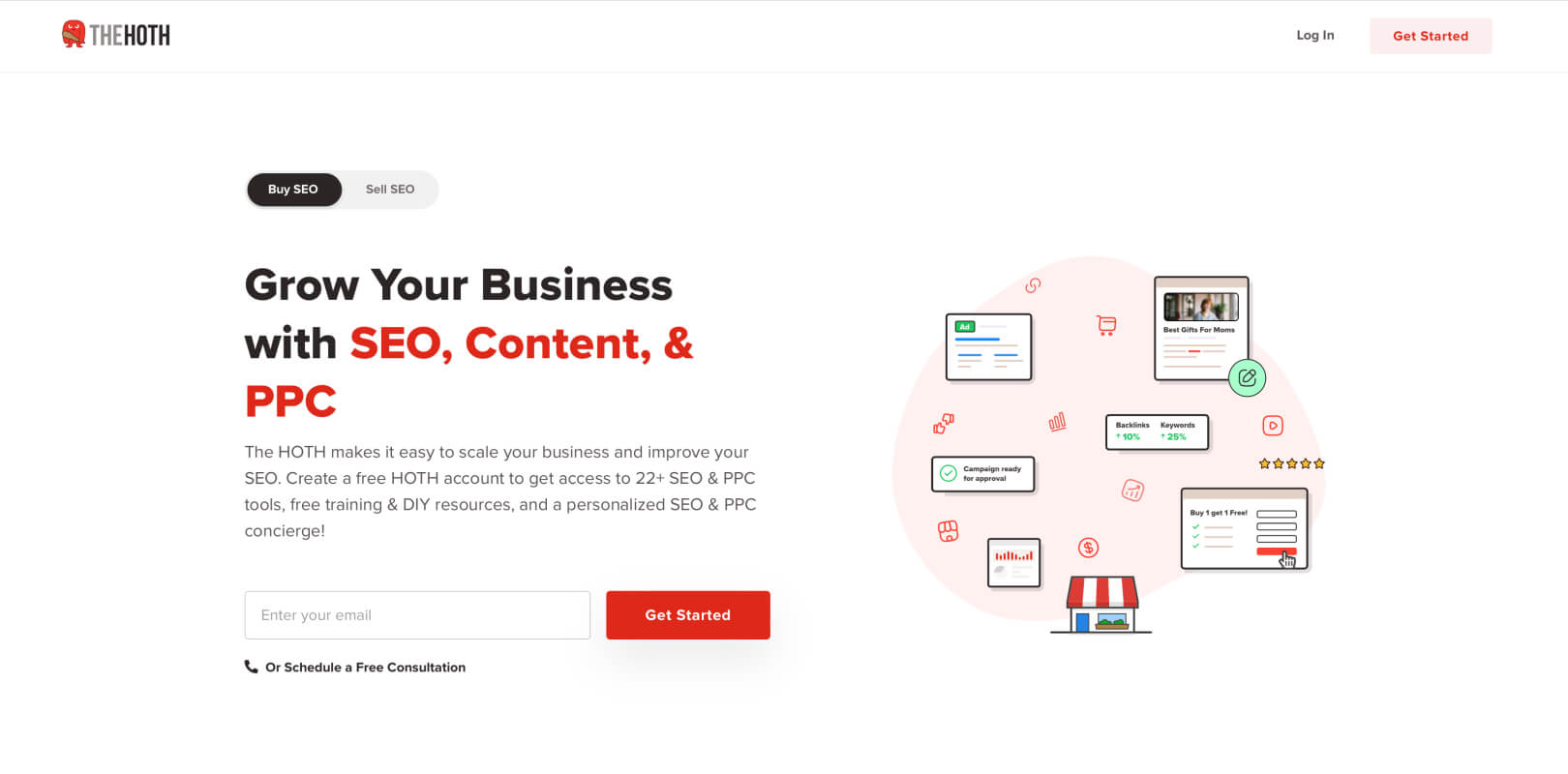
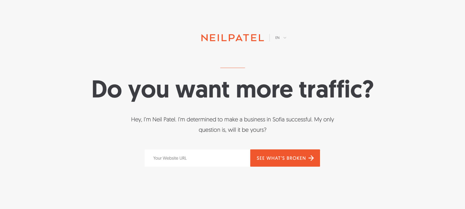
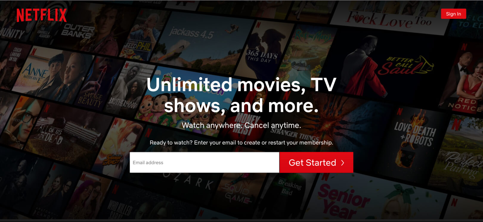
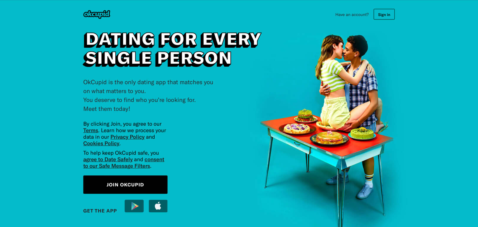
When you design your call-to-action buttons, make sure that you get rid of all the distraction around them and focus on making them clickable. Here are more examples of clickable CTA buttons online:
Positioning
CTA positioning is vital for the success of your conversion process. If you place call-to-action buttons in sections where the visitors can’t spot them then you will get fewer clicks and there’s a chance that the rest of your content will not be properly positioned at all.
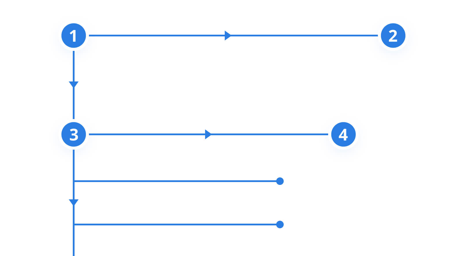
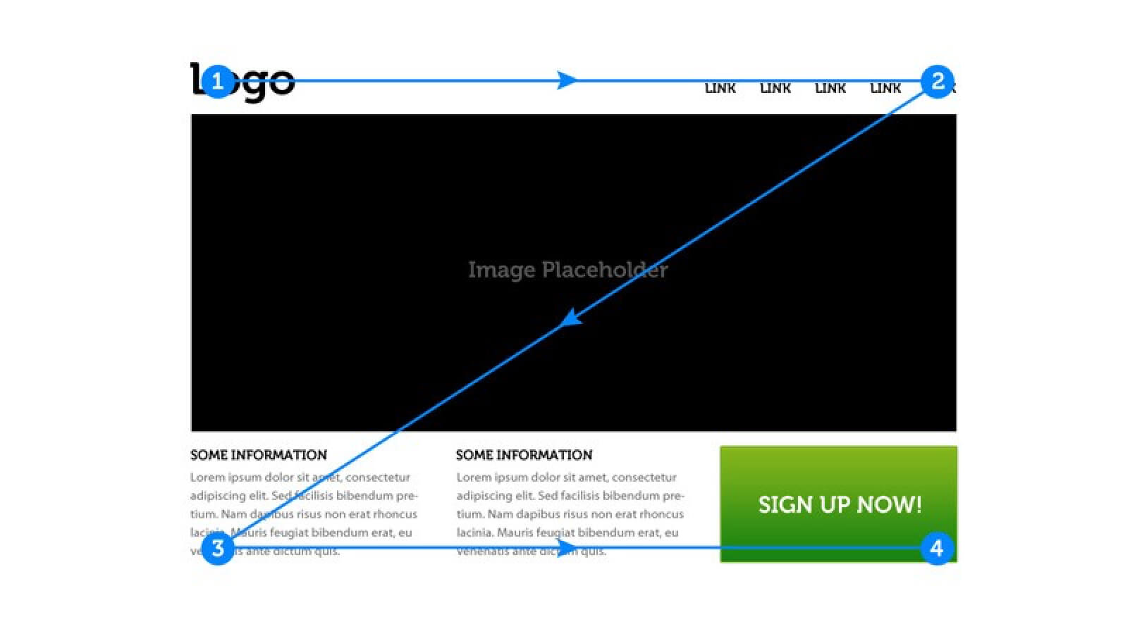
As we mentioned above, people tend to scan content when they’re online. A study, done by the Nielsen Norman Group, provides us with a better understanding of how users scan content when they land on certain online pages. When they land the first time, they don’t inspect everything. Instead, they look for the element that most catches their attention. The most common user scanning patterns are the “F” and “Z” pattern.
The “F” scanning pattern is most common for users that scan through blogs and news site content. The visitor first scans the screen in a horizontal line and then moves down the page to scan another horizontal line. At the end of the scanning process, the user does a straight line downwards by scanning paragraphs and opening sentences/keywords.
The “Z” scanning pattern occurs when the users land on pages that are not that filled with content, such as landing pages. Again, the user first scans the top of the page horizontally starting from the left corner, then goes to the right corner diagonally finishing on the bottom left corner and at the bottom right corner in the end.
What these patterns allow you, as a designer, is to place the CTA buttons in places that get the most attention from your target users. In fact, a personalized call to action tailored to a specific target audience performs 202% better!
Another useful tactic for call-to-action button positioning is placing the button “Above the fold” or at the center of your web layout if the area is not too packed with other elements.
If you try to sell a complex product/solution and the users must digest and understand some information first before making decisions, perhaps placing the button below the fold will bring better results.
Copywriting
Copywriting is another important call-to-action strategy. When you offer a clickable CTA button, you have to offer a convincing copy about why users should click in the first place. You have to outline the benefits that you offer to your online visitors. If people are not convinced, they will not click at all, it is as simple as that.
Microcopy is another concept that you want to consider if you want to build call-to-action buttons that work. This is the tiny text that is a hint for what the users get if they click on the button.
Some of the most clickable buttons online use power words to increase the click rate. Power words are used to ignite the audience’s feelings.
These words are often used by politicians when they give a public speech to inspire courage, safety, and greatness among people. SmartBlogger’s Jon Morrow has an excellent list of power words that can make people convert when they land on your page.
As a rule of thumb when using power words, don’t overdo it. If you’re certain that your target audience will find your solution useful, but doesn’t know it yet, you can use more power words to lure them to click. However, do let the copy stay relevant and avoid looking spammy at all times.
Just like blog post titles shouldn’t be lengthy, your main CTA copy shouldn’t be too long either. If it’s long and heavy to read, you may lose your customers before they even decide whether to click on the button or not. Here’s what a CTA button copy should look like:
It is short and the words are really easy to read. And it is relevant, which is extremely important. It doesn’t matter how short the copy is, if it’s not relevant to the user’s needs, the button will remain unclicked.
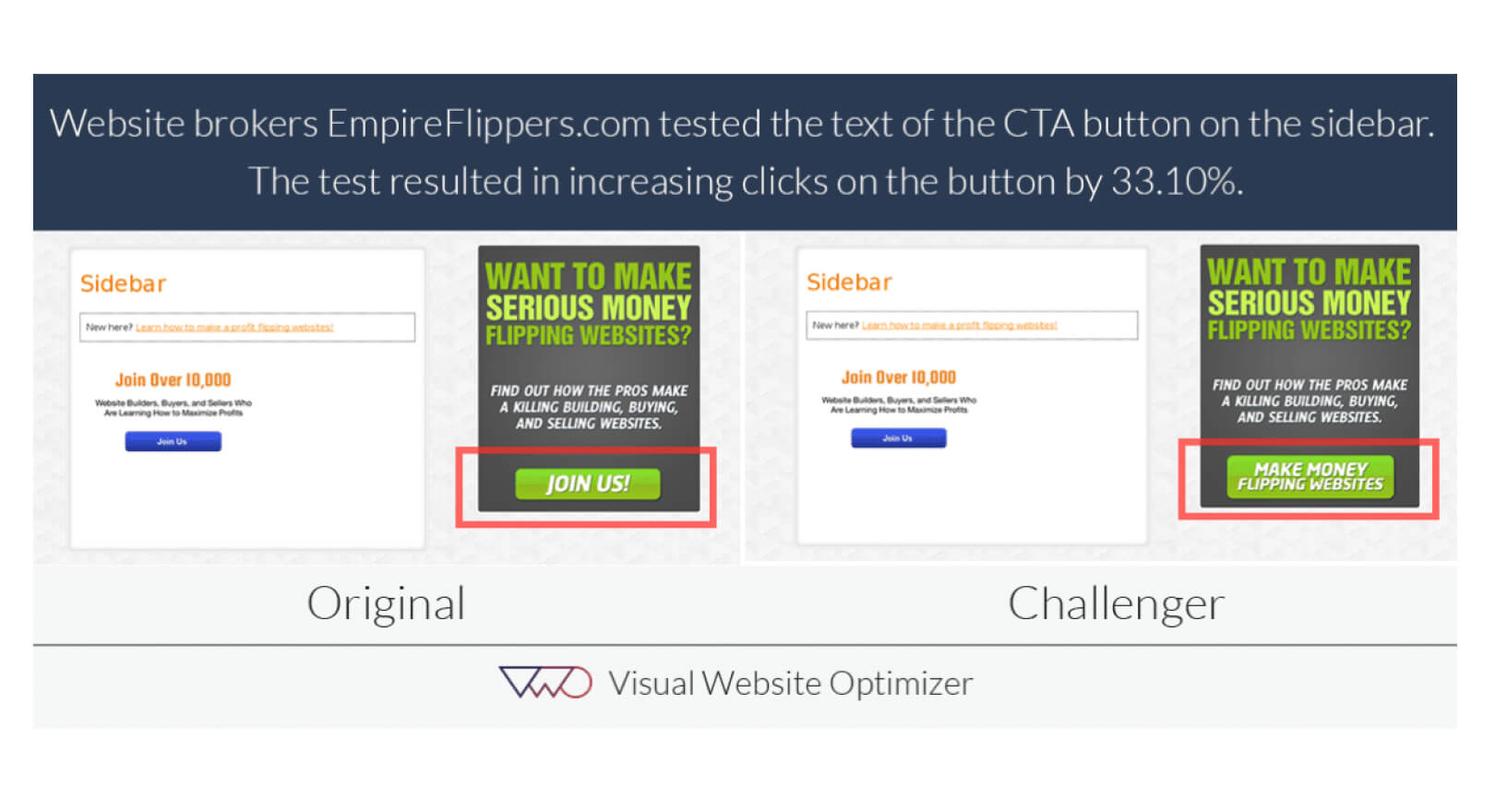
In your action button copy, you need to be very clear about the benefits that the user will get by clicking it. In the A/B test above from Visual Website Optimizer, they tested two versions of the CTA copy for the company Empire Flippers. One of them was general “Join us!” and the other was more action-oriented “Make Money Flipping Websites”.
The action-oriented copy had 33.8% more conversion rate than the original one. It worked because lame CTA copy like “Join us” doesn’t really explain what the users get when they join. This is why you need to perform tests and find the copy style that will bring in more conversions and click-through rates.
Problem/Solution Presentation
If you want to write an enthralling call-to-action for your button, you must have a deep understanding of your target users, their pain points, problems, and solutions. How can you leverage your customers’ problems/solutions to make your CTA buttons more effective? Let’s inspect the components of the problem/solution presentation process and help you figure it out.
Problem Identification
An understanding of people’s problems will make all the difference in your CTA copy because when you understand a problem deeply, you’ll know how to offer the solution.
If you want to know what’s on your target audience’s mind, when it comes to pain points and problems, you can use Quora, a Q&A page where people ask and answer all sorts of questions in various niches.

In the screenshot above, the person wants to know if he enters into a highly competitive industry. Contrary to the answer above, If you give the person advice on becoming a fast-food worker, you failed to discover the person’s main problem.
This can be perfectly applied to your CTA button design and copy. Here’s an example that understands the problem and the solution.
Offering the Solution
How you offer your product/solution can be the decisive point that will determine whether the user will click on the button or not. You need to clarify that they’re just a click away from the solution. Here’s a great example of how to offer the solution within your CTA button:
Wrapping up
To conclude, the power of call-to-action buttons should not be taken lightly. It is the crucial element that can help you bring more leads into your sales funnel.
Creating them doesn’t have to be a complex process. Keep in mind your users’ problems and the solutions that can make the buttons stand out by applying the rules above. Put the basics into practice and increase your conversion rate now! And if you need help designing effective CTA buttons, our web development and design team at DevriX has tons of experience in this area and can create buttons that will maximize results.
