
Did you know 40% of online transactions are done using a mobile device? Even though the conversion rates are still behind those on desktop, mobile purchases are constantly growing.
If you are an online shop owner you must optimize your mobile checkout process otherwise you will lose clients.
What does the data say about mobile shopping?
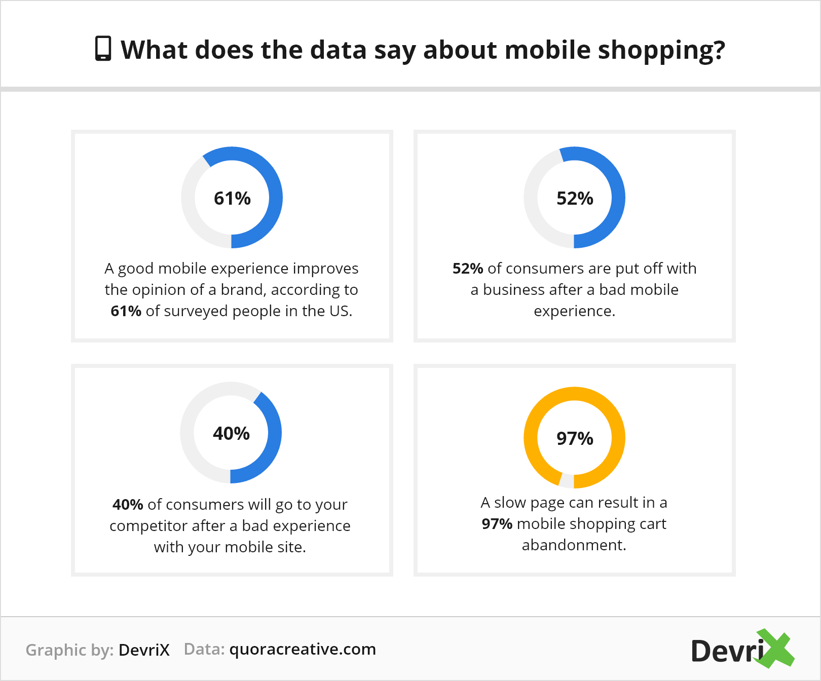
- A good mobile experience improves the opinion of a brand, according to 61% of surveyed people in the US.
- 52% of consumers are put off with a business after a bad mobile experience.
- 40% of consumers will go to your competitor after a bad experience with your mobile site.
- A slow page can result in a 97% mobile shopping cart abandonment.
An excellent mobile shopping experience is crucial. The data above proves it. It’s easy to lose customers on a website that is slow and not optimized for mobile.
How to Optimize Your WooCommerce Checkout Process for Conversions
There is more. Even though mobile traffic has increased by 222% in the past seven years, desktop conversion rates are still higher than mobile.
We can conclude that people are increasingly using their mobile devices but they still prefer to purchase on desktop.
Consumers don’t feel comfortable checking out from their mobile devices. They might browse or add products to wish lists so they can purchase them later from their desktops.
That is why, in this article, we are offering eleven steps on how you can improve your checkout page on mobile and increase your mobile conversion rate.
1. Design Easy Mobile Navigation
Mobile navigation is different from desktop navigation. When you design your mobile interface, consider that people will be using their thumbs.
Did you know there are actually six ways users hold their phones:

Source: Uxplanet
Research says that 75% of people use their thumbs to touch the screen. And fewer than 50% hold their phone one-handed.
The most important items like the call to action buttons should be in the customers’ comfort zone and easy to tap.

Source: Sephora
Let’s quickly examine the visible elements in the above screenshot:
- Sign-in into your account
- Basket icon
- Displayed product
- Add to wishlist icon
- Visible call to action button
The checkout seems pretty accessible, you don’t need to search for your basket or for the products you’ve saved.
Adding products to the wishlist is an important functionality of the mobile shopping experience, let’s see why in the next step.
2. Add “Save for Later” Feature to the Shopping Cart
A “Save for later” or “Add to the wishlist” feature can reduce the number of cart abandonments and will enable shoppers to save items to purchase later. It also allows customers to leave the website if needed and when they return, they will have the desired products saved.
This way the shopper won’t lose time in searching the wanted products again and can proceed to checkout if they so desire.
A pro tip would be to send reminder emails to customers and let them know they have products saved. You can even create a small sense of urgency by saying for how long you are going to keep their products.
3. Make Sure You Have a Clear and Visible “Add to Cart” CTA Button
One of the most important elements is the call to action button. You need to design it in a way that it will be visible, attractive and it will make your guests convert.
Imagine a customer that likes a certain product and wants to buy it but can’t find the call to action button. You can’t afford that, especially considering the fact the mobile conversion rates are pretty low already.
A fundamental mobile design principle is to make your call to action buttons big. Users have to be able to tap easily on them using their fingers or thumbs. This is contrary to the desktop’s small call to action buttons where you can click them with a mouse.

Source: Oysho
4. Speed up the Checkout Process by Offering Guest Checkout
Making customers create an account can be a real stopper. Actually, this is the second reason for cart abandonment. Research shows 28% of the customers leave their carts because the website didn’t provide the guest check out option for those who don’t want to register.
In order to decrease cart abandonment rates, opt for an easy, fast checkout process that doesn’t ask shoppers to register first. Guest checkout is quick and convenient.

Source: Levi’s
Logging in requires more commitment and sharing of personal information. Not everyone is comfortable with it, especially if a customer wants to make a one-time purchase.
5. Break Down the Checkout Process and Add Progress Bar
After the shoppers have tapped on the “Buy now” button you can show them how long the process will take.
Let’s pretend the customers are on the go and need to quickly purchase a birthday present. They’ve added the item to the basket and moved to the checkout. But they have no idea how long the process is. And if they are in a hurry, they might leave the purchase for later, but never come back.
This should not happen to your customers because you are going to lose them. 21% of cart abandonment happens because of too long and complicated processes.
To avoid this you can implement a progress indicator that will let the customers know at what stage of the check out process they are at.

You can split it into four steps:
- Bag
- Delivery
- Payment
- Confirmation
6. Save Your Customer’s Time by Introducing Auto-Fill
In the world of mobile sales, everything needs to happen fast. Users won’t spend time waiting for a page to load nor fill out your endless checkout form with unnecessary fields. You can make your customer’s life easier by adding an auto-fill option for the name, address, or email.
How to speed up the checkout process:
- Introduce auto-fill
- Reduce the input fields to a minimum
- Ask for the most essential information without unnecessary details
- Auto-generate passwords for new registrations
- Provide address finders or maps so the customers can quickly add their address
- Indicate each required field clearly with an asterisk
- Use the shipping address as a billing address

Source: Sephora
7. Use Auto-Suggestion and Errors Display
The main purpose behind auto-suggestion is to make it easier and faster for users to fill out forms. Address assistance and autofill not only save time but also reduce errors.
You will make the checkout easier and faster by making the error message stand out by adding red borders around the fields. This way the user will see it immediately and correct the error. If a shopper misses a required field you can display the message right away and show the user exactly where the problem is.

Source: Adidas
8. Add a Phone Number or a Customer Service Icon on the Check out Page
Put up a clickable phone number so customers can call in case they have urgent questions. Online shopping is growing but there are customers who are still wary about making a purchase online.
A phone number will not only ease a customer’s anxiety it allows them to ask questions if a last-minute problem occurs.

Source: Crazy Egg
For the customers who prefer to chat, you can display a chat icon at the bottom right part of the screen.
Adidas displays the icon during the whole checkout process and you can tap on it anytime.

9. Display the Order Summary
The main reason for the high cart abandonment is the extra costs like shipping, taxes, or fees. To avoid that you should display clearly what the final cost of the order will be. This will eliminate any unnecessary surprises for your customers.
What else does the customer need to see during the checkout process?
- Product photo
- Product name
- Price including additional taxes and shipping charges
- Option to check the estimated date of delivery
- A clear call to action button
- Delivery address
You also need to give the user control of the cart activity. This means your clients should be able to make changes to their orders easily like updating quantity, switching and removing products, or editing the address.
10. Provide Different Payment Options and Make the Process Fast
Mobile payments can be a nightmare. Imagine yourself trying to add your credit card details, then an error occurs, then you need to do it again. This is pretty frustrating and it can make people leave their carts.

Source: Adidas
To make the process go smoothly:
- Offer different payment options such as PayPal, Stripe, Apple Pay, Stripe, Visa Checkout, etc.
- Show previously used cards under the “Saved cards” section so users can select the card and add only the CVV code.
Don’t forget to boost customer confidence and build trust by displaying security validation badges. Your website should have a valid SSL certificate so the customers will trust that their data is protected.
11. Display Purchase Confirmation
After the purchase, you need to immediately display purchase confirmation. You can create a page that confirms the order has been completed successfully. Also, you need to send a confirmation email with the purchase information.
What information you should include:
- A customer service number or a link in case customers need it
- Provide a payment confirmation that it was successful
- Display purchase details: product, quantity, the total price
- Delivery information
- CTA button, if necessary, with the next steps the customers need to follow
Wrapping up
A simple mobile checkout process is crucial. People can still be wary about purchasing online through their mobile devices. This is why you should make the process as easy as possible.
Prove your customers they can trust you by showing your website is secure and you protect your client’s data. Create an outstanding mobile experience for them so they can return and purchase again from your shop.
Team DevriX
This article is crafted by DevriX's seasoned marketing team, boasting over four decades of collective expertise in crafting sophisticated marketing funnels, devising comprehensive content frameworks and pillars, implementing engaging email campaigns, and creating impactful social media content designed for scalability.
Our marketing experts specialize in the complete spectrum of inbound marketing strategies. As an accredited HubSpot Agency Partner and a Semrush Partner, we engage in meticulous research, blending our extensive experience with the unique insights of our highly skilled team.
We set benchmarks in content creation by incorporating cutting-edge marketing trends, leveraging in-depth industry research, and utilizing state-of-the-art AI tools for data segmentation and captivating content hooks. Our proficiency extends across a diverse range of sectors, including working with SMEs, Fortune 1000 companies, global B2B brands, major publishing entities, WooCommerce platforms, business directories, and affiliate networks.


