Mobile optimization matters for your WordPress website. Today more than half of all internet searchers are made on mobile, meaning that Google currently processes more mobile searches than desktop.
Because of the rise of mobile, Google has made some major algorithm changes. In 2015, they released the Pigeon update to provide mobile-optimized websites with better mobile ranking in SERPs. A year later,in 2016, talks about mobile-first indexing began. Then, in late 2017 it slowly started to roll out, and today it’s an important ranking and indexing factor for all websites – old and new.
This matters because most users click on websites that they’ve found after a mobile search, and Google perfectly adapted their algorithms according to that. In essence, Google prefers to index websites that are better at meeting the needs of users.
What this means is that your WordPress website must be as mobile-friendly as possible! So, how can you tell that your WordPress mobile SEO is on point? Let’s find out!
1. First, Examine the Mobile Design
The crucial thing that you need to focus on when it comes to WordPress mobile SEO is the mobile responsive design of your site and its performance. If your website is maximally optimized for mobile, your users will be more satisfied as a result.
Your WordPress website is mobile responsive if its layout is fully adjustable to the screen size of the device.
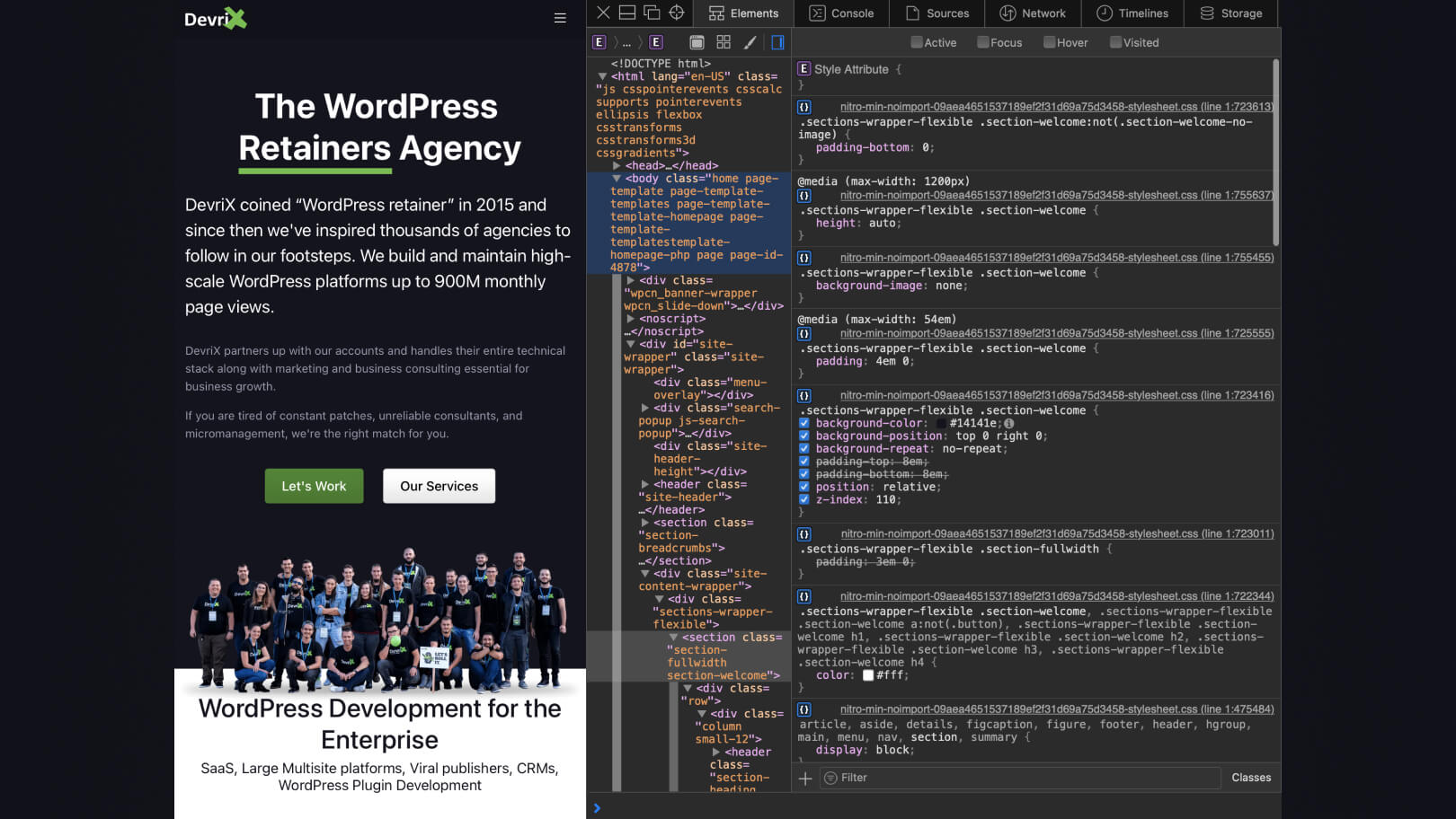
With WordPress, developing a mobile responsive website is effortless because of the automatic way that WordPress aligns the elements of your site for mobile devices. However, for the elements to align properly you need to ensure that everything is perfect, and this means testing the design when you make a mobile version of your website.
The first thing that you can do is simply resize the window of your browser. It is a simple test that can help you figure out whether your WordPress site is properly responsive or not. All you need to do is open the website in your browser and gradually shrink it to resemble the size of a mobile screen.

If your website is responsive the content will adjust and each part of the page will appear one below the other without overlapping.
Additionally, you can test things further with Chrome Developer Tools. Open your website and click on F12. To activate the device mode, click on the device icon on the top left corner of the Developer tools menu.
Clearly, there’s much more to mobile responsive design than just width size. It’s possible that not all media queries are looking for viewport width. By using the Chrome Inspector, you can get much closer to using a real mobile browser. Of course, you can also check the mobile-friendly design of your WordPress website by using Google’s Mobile-Friendly Checker Tool.
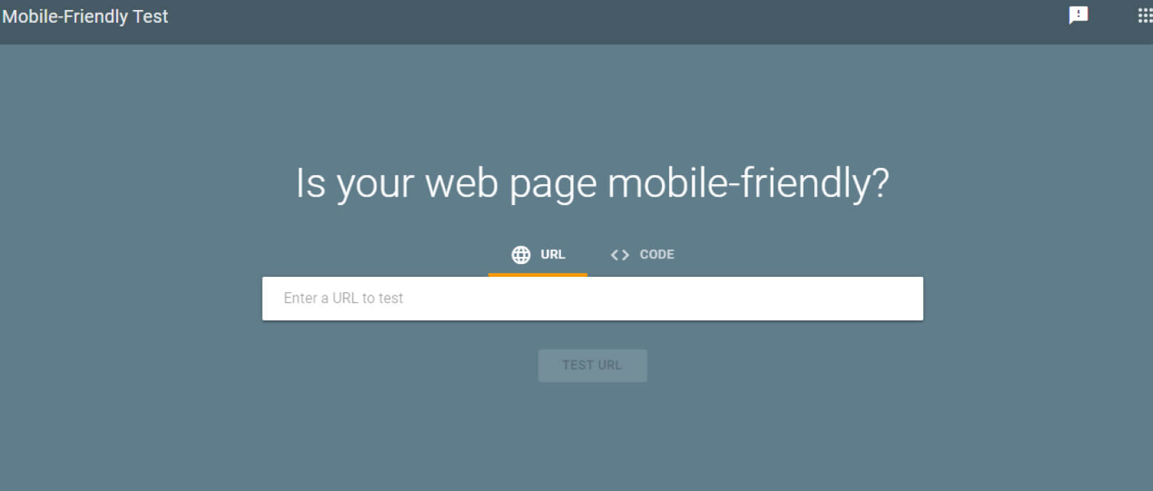
Just enter the URL of your website and click on “Test URL” and Google will analyze exactly how mobile-friendly your WordPress site is.
There are three principal ways to make a mobile version of your website:
- Responsive Design. Mobile responsive design utilizes CSS3 media queries and a fluid grid with proportional units that automatically fit the pages that users open in their devices.
- Dynamic Design. This method works by serving the users with various HTMLs based on their devices, this way you can place different content for those that access your website via mobile or desktop. With this method, you can remove high-quality assets that can slow down your website for mobile users.
- Parallel Design. This lets you create a mobile URL structure that hosts pages that are specific to your mobile users. In essence, if your desktop domain name is www.example.com, its mobile version will be m.example.com. This will automatically redirect any user on a mobile device to the mobile URL.
You can use any of the options above to make a mobile version of your website. However, focusing on responsive design is crucial if you don’t want to have two entirely different versions of your website. That would only add overhead in terms of maintenance, increase the potential for bugs in the code, and will ultimately lead to unhappy customers.
When you enhance the mobile version of your website, the main thing that you need to focus on for better mobile SEO is its performance! It all comes down to speed really. The faster your site opens, the more satisfied the users will be. A good way to learn what needs to improve on your WordPress website for better performance is by using Google’s PageSpeed Insights tool.
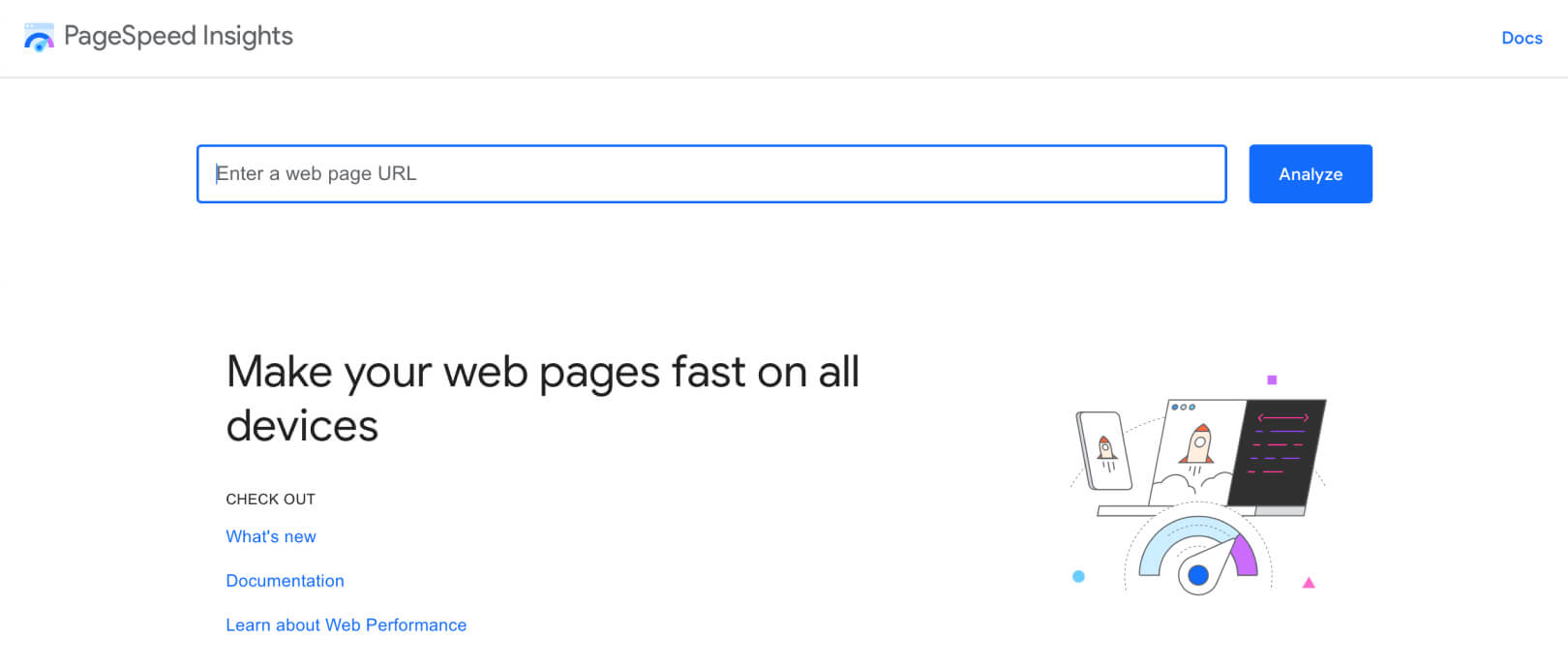
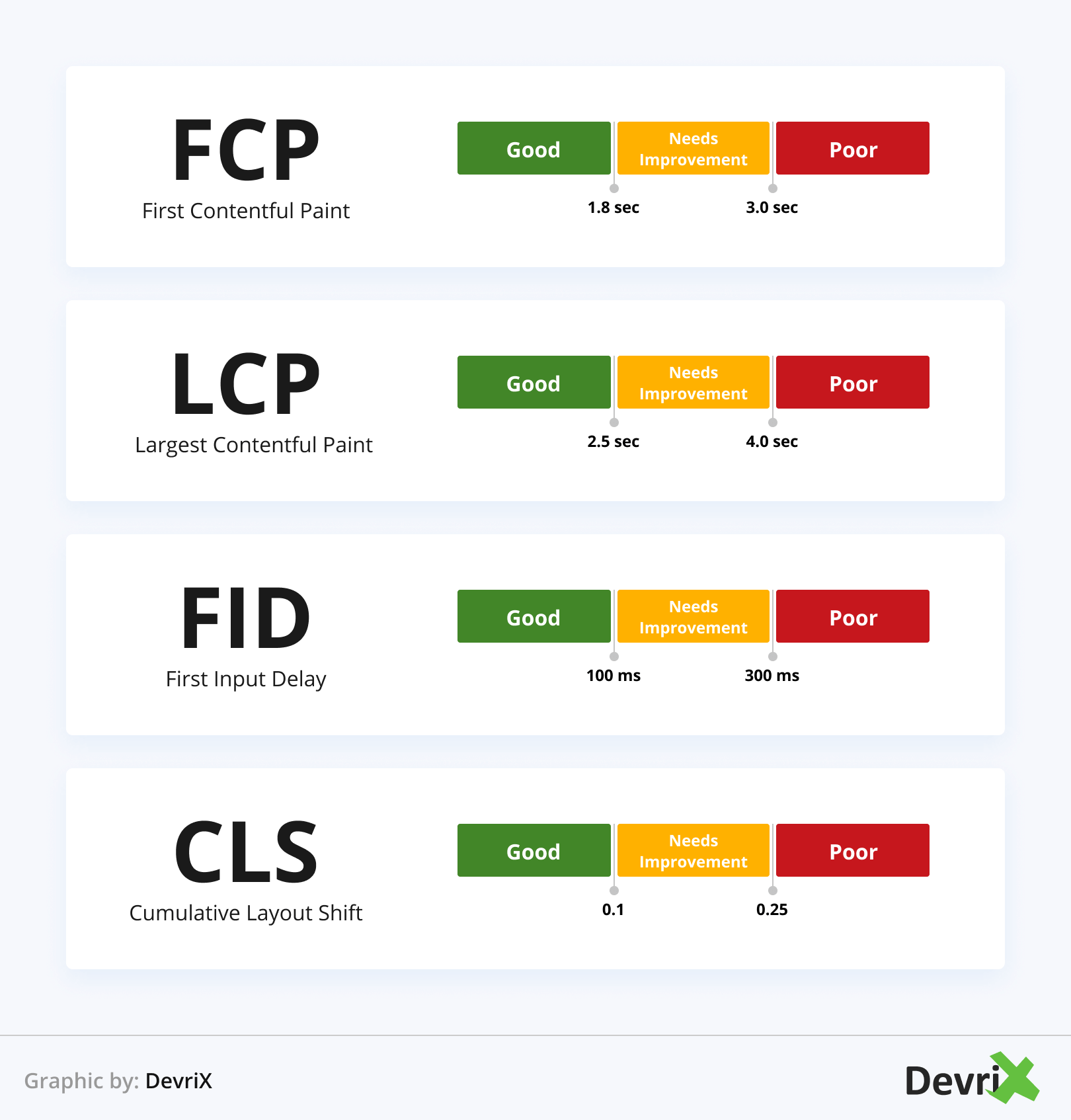
Just enter your URL and click on “Analyze”. This will present you with a comprehensive report about the issues that slow down your website based on four major parameters:
- First Contentful Paint (FCP). The time from when the page starts loading until when any part of the page’s content appears on the screen.
- Largest Contentful Paint (LCP). The time it takes for the largest content on a page (image, video, block of text) to render. It’s calculated from when the page started loading until the element is visible.
- First Input Delay (FID). The time from when a user interacts with the page for the first time (clicks on a button, opens a link, makes an on-site search, ect.) until when the browser processes and responds to the request.
- Cumulative Layout Shift (CLS). Measures the instability of a piece of content – i.e. the time for which an element that is visible on a page changes its initial position between two frames. For example, a banner that appears half a second later than the instant a page is loaded.
Google PageSpeed Insights quantifies your webpage performance for mobile and desktop devices. The tool loads your URL twice, with a mobile user agent and with a desktop user agent.
Your PageSpeed score can be from 0 to 100. A score of 85 and above shows that your page performs well. But, if you want to become the number one search result in your industry, you’ll have to turn “well” into “excellent.”
2. Analyze Your Mobile Users
The second step of your mobile SEO audit is to analyze what users do on your website once they access it on their smartphones. More specifically, you need to examine the data for:
- Mobile traffic
- Mobile search activity
- User behavior
The best tool for measuring mobile traffic is Google Analytics. Open GA, go to the Audience tab and click on Mobile > Devices.

Next, select the timeframe that you want to analyze, check off the boxes for each device, and select “Plot Rows” in the upper left corner of the table.
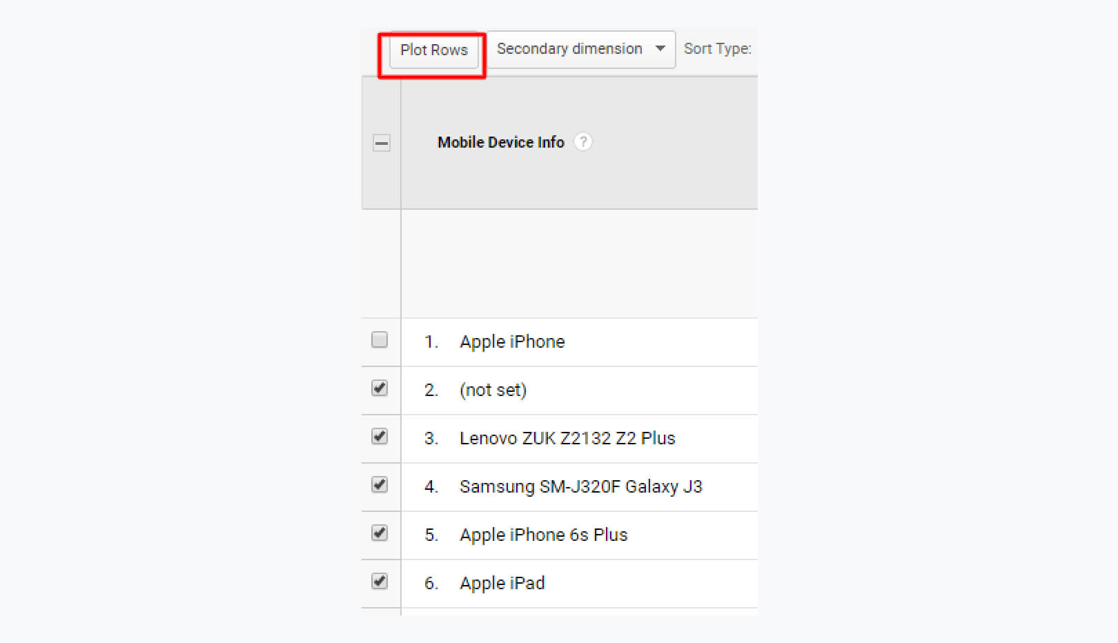
Here, you can see how the traffic progresses for each of the devices in the selected timeframe, and furthermore, the percentage of traffic that comes from each of the devices.
Now, why does this matter? Well, we have already mentioned that, thanks to mobile first-indexing, Google gives an advantage to mobile-friendly websites in SERPs. So, if you have a big percentage of web traffic that comes to your site after a mobile search, then you’re in the right direction towards improving your mobile SEO!
Of course, it is also beneficial to look at what phrases and keywords your mobile web visitors use before they click on your link in the search query. This will give you powerful insights about your target audience’s interests and search intent, so you can update your SEO and overall marketing strategy.
To get this information, open your GA account again, go to Acquisition > Search Console > Queries.

3. Optimize Your Keywords for Mobile
One of the ways to reexamine your mobile SEO strategy is to conduct mobile keyword research and optimize your pages accordingly.
As we move into the mobile era, more search queries are being made on smartphones and tablets than on desktop PCs, and this is why you must understand that keywords today are specific for desktop and mobile browsers. For example, mobile keywords can be shorter and easier to type than long-tail desktop keywords.
In essence, people search for things differently when they’re on their smartphones. One of the biggest differences from desktop search queries is voice queries. There are not a lot of users that perform voice searches on their laptops.
However, the number of voice searches on smartphones is on the rise. According to a study by Google, 27% of the world’s population uses voice search on mobile. And why not when it’s convenient! You can search for anything as you workout, drive, or walk. This is what the technology has done for the users, and they’re taking full advantage of it.
So, what can you do exactly to keep your keywords optimized for mobile devices? We have a few suggestions:
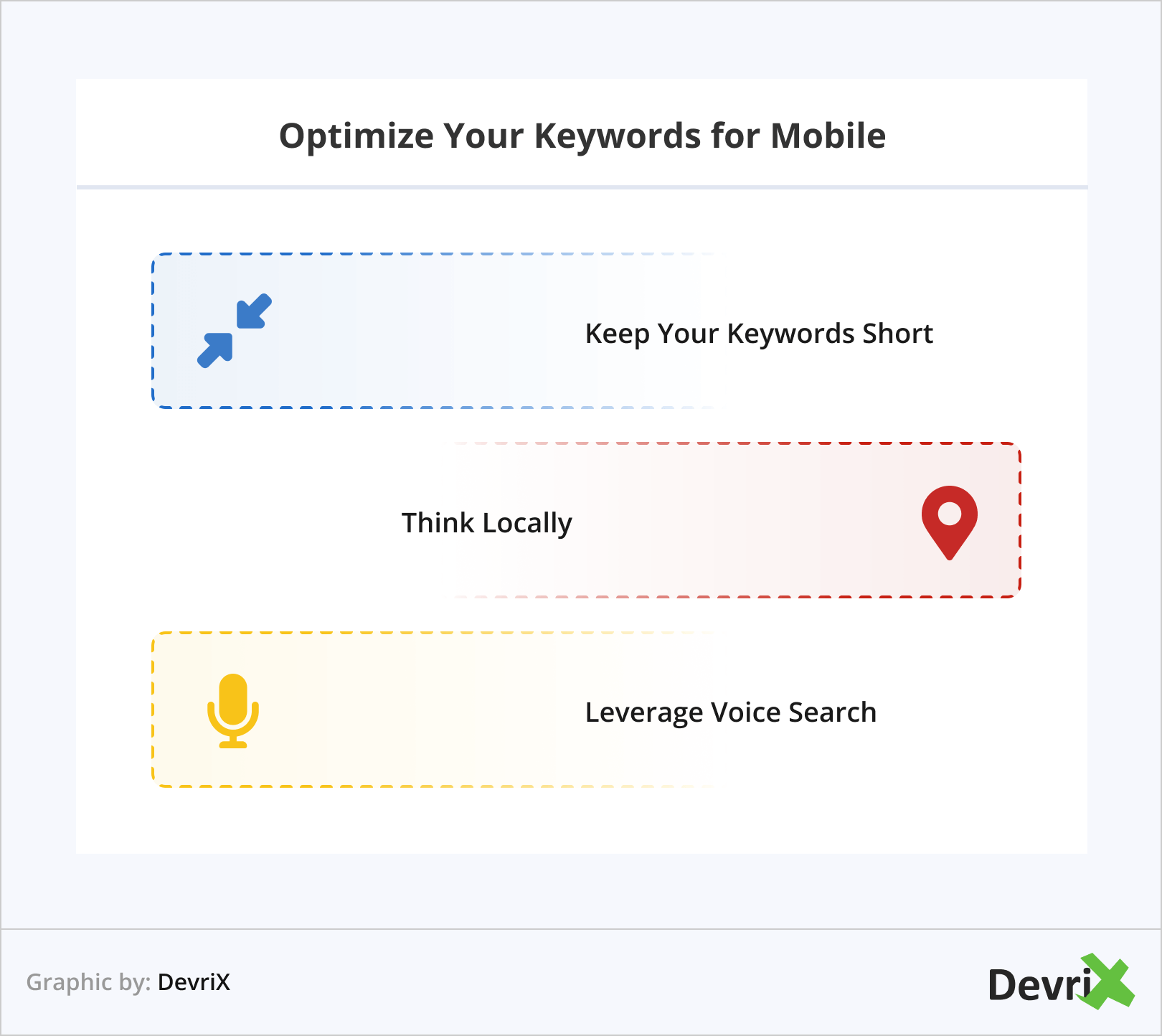
Keep Your Keywords Short
The shorter the better. Not everybody wants to type long sentences and make typos in a mobile query. It is a lot better to use fewer words and get what you were looking for.
If you want your WordPress website to be ranked higher for mobile searches, you need to optimize your pages for not more than 2-3 words search queries. In other words, you need to use shorter keywords for your industry.
Related: How to Find Low Competition Keywords with Commercial Intent
Think Locally
Search queries with a local component are made with smartphones because of the convenience of using Google Maps to get to the store or business/service that people look for. This is because mobile queries are done quickly and on the go! In fact, Google found that 76% of people who perform a local research on their phone visit a physical location within the next 24 hours, and 28% of these searches result in a purchase.
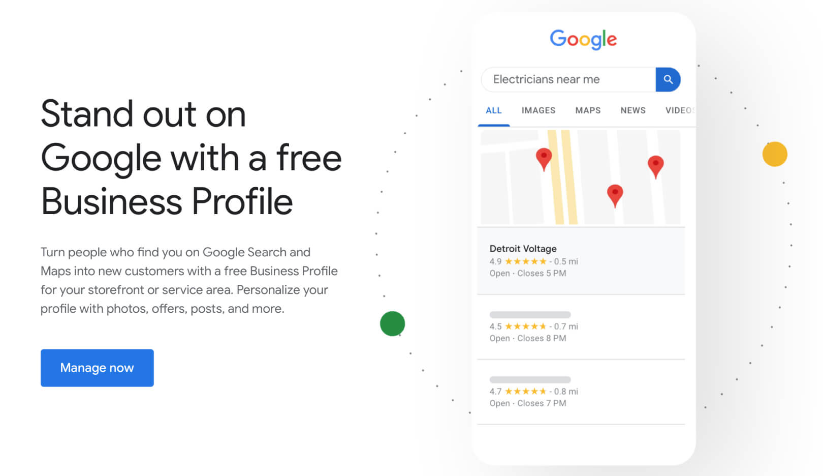
To leverage locally-focused keywords, you need to optimize your WordPress website for local SEO. You can start by claiming your Google My Business page. Open google.com/business and click on “Start Now”
Fill in the necessary information, and verify your business on Google. With that, people can learn a lot more about your business when they enter a related search query.
Keep an eye on keywords that include “Near me” or “Nearby”. They’re common because they’re frequently used in local searches.
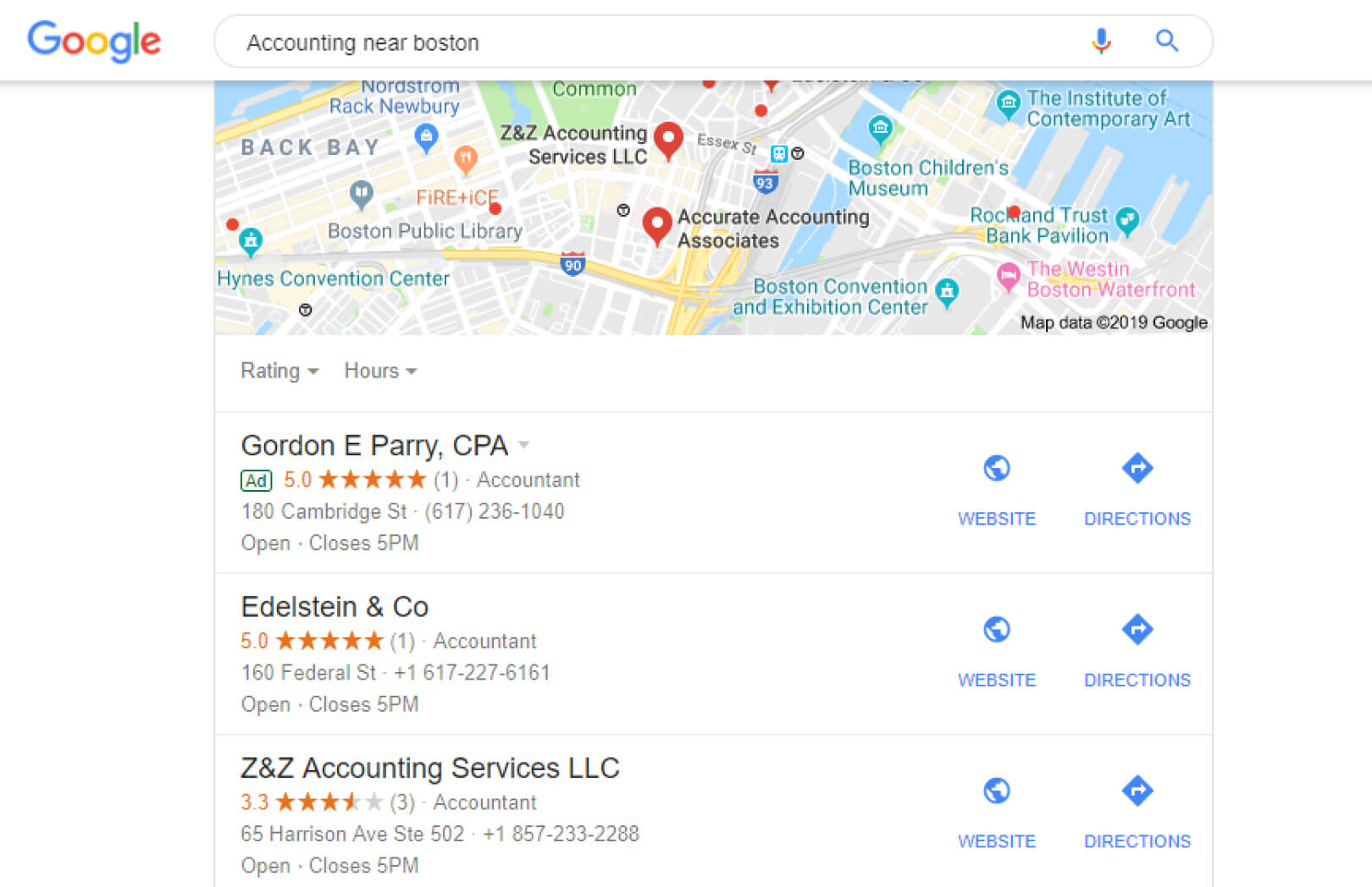
In order to rank for these keywords, you need to have a complete Google Business verified profile. Your address and additional business info should be displayed when someone does a search on your brand name, and your business should also be featured in Google Maps.
Related: Top 7 Benefits of SEO for Small Businesses
Don’t Forget About Voice Search
When people use smartphones, they might not even type at all when they perform a search query. Voice search is one of the biggest non-text search methods. As stated by Google, these are the top reasons why people use voice search:
- They can multitask.
- They can do a search faster than typing words.
- They can get instant information.
- The routine of voice search is more convenient.
People can literally get what they are looking for while they’re driving their cars!
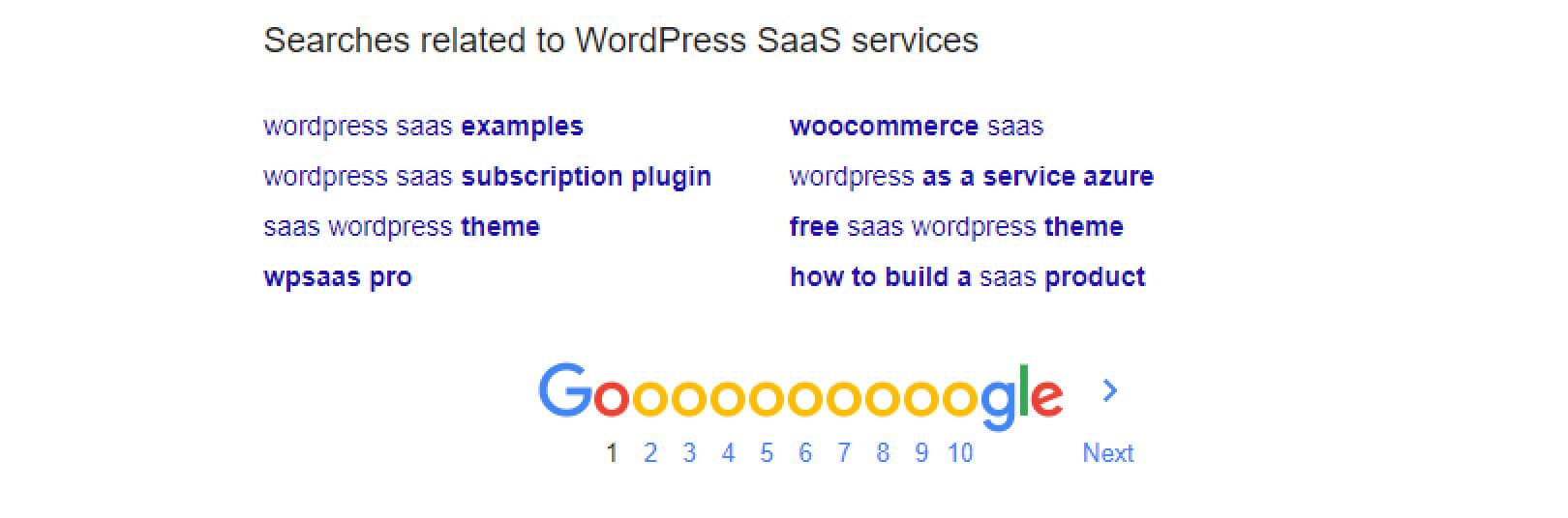
One of the most intelligent ways to get a grasp on how people perform shorter voice searches is the “Searches Related” section of Google Search. Just type in the question that is related to your product or industry and Google will show you the related searches:
When you structure your content for voice search, you need to map out every question of your customer journey, which in turn, will guarantee that you’ll cover each point of the customer journey:
- Awareness. “What’s the best CRM tool for B2B?”
- Interest. “Can you make a phone call with HubSpot?”
- Evaluation. “Who is better HubSpot or Zoho?”
- Purchase. “How much does HubSpot cost?”
- Customer Support. “Does HubSpot include 24/7 support?”
- Loyalty. “Which companies work with HubSpot?”
The most important thing when it comes to optimizing your WordPress website for voice search is to ensure that your content is relevant to the search query. Additionally, you need to make sure that your pages are easy to crawl as well. Also, if you haven’t submitted a sitemap to Google Search Console yet, do that immediately!
4. Analyze the Speed of Your Website
One of the most important things that you can do for your SEO strategy, not just for mobile but in general as well, is to improve the speed of your WordPress website. Mobile users are impatient with slow-loading sites, and even if you have the most-gorgeous responsive layout, it would not mean a thing if you don’t make a mobile version of your website that loads fast.
Related: How to Optimize Your WordPress Layouts for Mobile Traffic
According to Google, 61% of users won’t open a mobile site again if they have problems with it, and 40% would open a competitor’s site instead. As you can see, the speed of your website can have a direct effect on your sales, and it can either decrease or increase your bounce rate.
Google has considered speed as one of the most important ranking factors for years. No matter your niche, your WordPress website must be impeccable on mobile, both in terms of UX and performance.
Before the performance can be improved, it must be tested first. Some handy tools that might help you out with the testing process are:
When you bring your data together, you will need to start the performance optimization process. We suggest you start with the following three methods:
Reduce the Size of Your Images
First of all, get rid of the imagery that is not particularly necessary on your site. If some of the images really have to be there for a better effect, make sure that they’re compressed without losing too much of their quality. You can achieve that with the help of tools such as TinyPNG.

Responsive imagery is crucial for better loading times. Luckily, that function is included in the WordPress core since version 4.4. So, with an updated WordPress version, you don’t have anything to worry about regarding image responsiveness.
Related: How to Improve the Technical SEO of a WordPress Website
Optimize Plugins and Themes
Badly-coded plugins or themes can cause a serious bottleneck to the performance of your website.
If that’s the case, you need to update your themes, plugins, and the WordPress core. If that doesn’t fix the problem, you need to deactivate each of your plugins on a staging site until you find the corrupt plugin. This is why your best bet is to have your system build on top of some WordPress default themes, for example, Twenty Twenty-Two.
Another useful method is to minify and connect the CSS and JS files of your plugins. For this purpose, you can use a plugin such as WP Rocket. If you’re using a managed hosting environment like Pagely’s that is already heavily optimized, the caching may have already been performed for you.
Use a Good Hosting Provider
Speaking of Pagely, there’s not a single better hosting solution for your WordPress website out there.
Managed WordPress hosting providers such as Pagely have server infrastructure and caching in place that will skyrocket your website speed. They make use of modern technologies such as PHP 7.3, which is several times faster than PHP 5.4, and a CDN (Content Delivery Network) which can speed up your media files load time, and it’s very easy to use.
Wrapping Up
Bottom line, just like with your desktop SEO, mobile SEO should be a continual work in progress. There are always fresh developments and technologies that alter the way people use and browse websites on their smartphones, and this is why there’s no time to wait for improvements.
Open your WordPress site on your smartphone, and use the steps and tips above to conduct a thorough mobile SEO audit and prepare the pages for mobile users that find you on Google. Take action and observe how that bounce rate goes down!
Team DevriX
This article is crafted by DevriX's seasoned marketing team, boasting over four decades of collective expertise in crafting sophisticated marketing funnels, devising comprehensive content frameworks and pillars, implementing engaging email campaigns, and creating impactful social media content designed for scalability.
Our marketing experts specialize in the complete spectrum of inbound marketing strategies. As an accredited HubSpot Agency Partner and a Semrush Partner, we engage in meticulous research, blending our extensive experience with the unique insights of our highly skilled team.
We set benchmarks in content creation by incorporating cutting-edge marketing trends, leveraging in-depth industry research, and utilizing state-of-the-art AI tools for data segmentation and captivating content hooks. Our proficiency extends across a diverse range of sectors, including working with SMEs, Fortune 1000 companies, global B2B brands, major publishing entities, WooCommerce platforms, business directories, and affiliate networks.