Creating a great website became much more than perfectly-designed looks. Other elements such as text, videos, and images became the principal factor that influences the entire feel that users have when they visit your site. Content became UX, and it’s what unites and holds your design together.
Having low-quality content and terrible design will not only deliver zero value for your readers but also, it can never provide a good user experience. This is why when designing and assessing your website, you must use the Content-First approach.
According to Prototypr, a Content-First Design is:
“An approach that involves the use of content to define the layout and elements in a design, rather than the other way around.”
This is an approach that acknowledges content as the leading component of websites. While design and elements matter, content is the principal reason why people visit websites in the first place. If you’ve designed your website before you’ve developed your content, it’s like you’ve built a car without an engine.
So, if that’s the case with your website, there are two solutions. One of them is to develop a brand new design, and the other is to work your way around your design and actually redesign your website with a content-first approach. The following is a guide to help you understand why content merges every element on your website, and how to you can use it to redesign for an engaging experience.
Why Content Matters for Web Design?

You can invest a great amount of time and resources in your design, and you should. But if you want to keep and engage users on your site, you can’t do it without content. While visitors want to see aesthetically pleasing and interactive elements, they also want to get some value from your website experience.
When it comes to delivering a great user experience through your content, the following aspects matter:
- Ensure Readability: Your content needs to be easy to scan and readable. You must ensure a clear content structure and proper headers, subheaders, and visuals.
- Information Architecture: The content on your site should be organized to be accessible by the user in a hierarchical way. You need to properly lay out the content on your website and make sure that you’ll capture users’ attention through the way your content is architectured.
- Conversion Rate Optimization: An excellent conversion rate is achievable only if you ensure a pleasing website experience through your content. To improve your conversion rate, when you design content-first, you need to make sure that each piece of text, video, or image is placed exactly where users need it.
Why Do You need to Redesign with Content-First Approach?

From what has been said above, it’s clear to see why content matters for your web design. It’s just, a good interface is not enough anymore. Bad content also pulls along the following reasons to redesign your site:
- Goals Don’t Match Results: You attract people to your site, but you can’t hold them there. To generate quality leads, you need quality content and good content architecture.
- Goals Changed: Changing your goals means different marketing strategies, and consequently, different layouts and content.
- Put Content in the Spotlight: Perhaps your content is really good, but you haven’t presented it in the right manner that will make people convert on your website.
What do your visitors see when they open your site? Is the problem you solve clear enough and is the information easily accessible to users? If you don’t have a clear response to those questions, you’ve probably haven’t aligned your content with your target users, and consequently, you can’t convert them into clients.
Here’s the thing, your content needs to be directed towards your users. You need to structure your content according to the target users’ preferences. When you realize your target users and the type of content that you need to use for the design, then you can kick-start the redesign process successfully.
Benchmark Your Current Data

Before you redesign your website, you must define the goals that you want to achieve, in order to measure your success afterward. The data that will collect can either validate your goals or oppose them. You need to benchmark the following data:
- Unique Web Visits Per Month:
- Average Monthly Bounce Rate
- Average Monthly Time Spent on Site
- Best Performing Keywords
- Number of Inbound Links
- Number of New Leads Per Month
- Monthly Sales Numbers
- Number of Pages That Are Indexed
- The Number of Pages That Receive Traffic
To gather and benchmark this data, we recommend Google Analytics. It’s free, and the tracking code is really easy to integrate on your WordPress site.
Do You Have a Clear Content Hierarchy?

The way your content is organized determines the conversion rate of your WordPress website. It’s called content hierarchy, and it is the process of tactical content placement on each of your pages. he most important content is placed at the top of the page, and the less important at the bottom.
Having a good content hierarchy on your website is important because, people read and skim content faster than ever, and with average bounce rates of 40%, people do not stay on your page more than 10 seconds. But, if you arrange the content strategically during the redesign process, the chances of attracting users’ attention and make them stay on your page longer are significantly bigger.
Besides hierarchy, people need to trust in the content that they’re reading. This is you must decide what type of content will stay on your site, and what new information will be inserted after you revamp your site. You need to ask yourself: What do the users really want to know when they open my website?
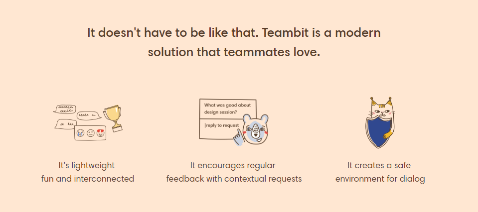
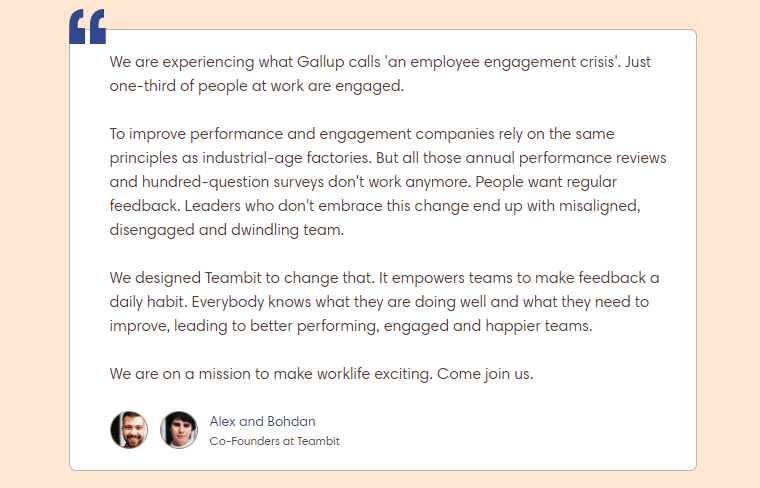
The answer to that question defines your content and where it is on your page. After that, you need to think about any related information that you can insert and how to develop a good page flow accordingly. For example, you can implement the following content hierarchy on your page as Teambit did :
- Connect: Form a connection with the reader by connecting your service to their problem.
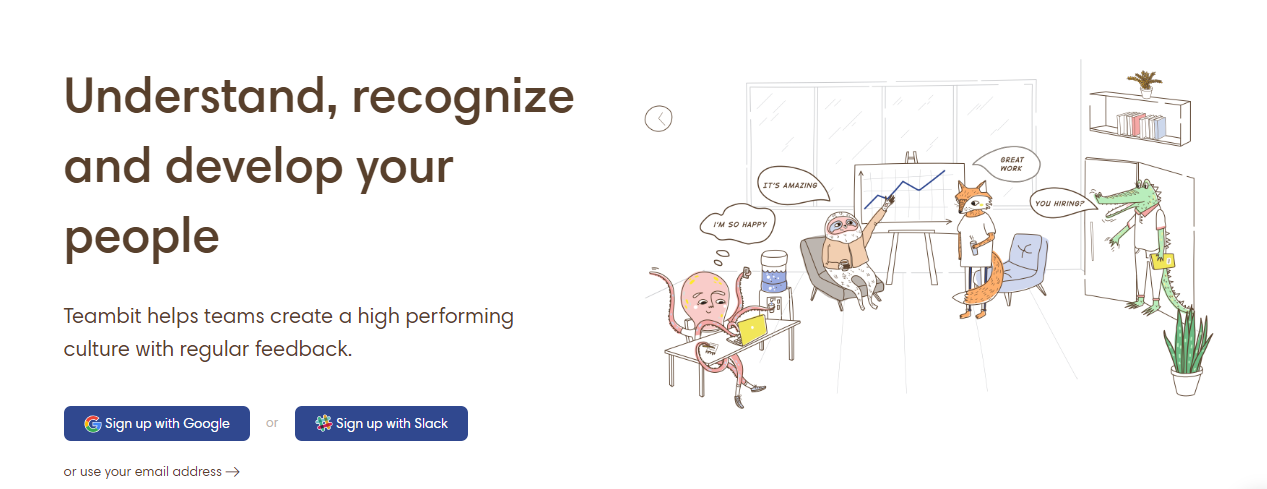
- Explanation: Explain the solution that you offer and its features.
- Social Proof: Tell readers how you’ve helped some of your clients.
Don’t forget to check your visual content hierarchy. Today, it takes more than just text to grab someone’s attention. Visual elements matter, and images, videos, and designs all work together with text to increase your conversion rate. Visual content is an excellent way to highlight the most important points on a page like your call-to-action and main benefits.
Is the Navigation Easy to Use?
Website navigation is one of the most important website aspects. It helps people find the content that they’re looking for and on your website, it should be straightforward and unthinking. Users expect to navigate in websites with ease, and if your navigation is not on point, it’s definitely a segment that needs to be covered with your redesign process.

One quick way to gauge your website navigation is to look at your best competitors’ websites. Open them one by one and mark down what you like and what you don’t like about their navigation. After that, you can go back to your website and use notes to improve your menus and breadcrumbs along with other segments in your redesign.
Are Your Visuals Optimized?

We’ve already said that visual content gives life to your copy. Before you begin with the website redesign process, check if your visual content is optimized and if you can reuse them or readdress them in the new version of your website.
Think SEO-first as well. When Google crawls through your pages, the search engine doesn’t look at what the image is, but instead, it inspects its filename and alt attribute. Make sure that they’re short and that you don’t keyword-stuff them to ensure a smooth path for search engine crawlers.
Make sure that the images on your website are within the right pixelation limit too. For example, if you use an image with dimensions of 1000×800 pixels and if the display size for that same image on your website is 600×400 pixels, then you need to resize and compress the image correspondingly.
Do You Use the Right Keywords?

You can’t think content-first if you can’t think keyword-first. These are the phrases that define the needs of your target customers and tell you exactly what type of content they are looking for in your website. Before you begin with the redesign and content refreshment task, check if your keywords are:
- Product/Service Focused: The keywords you use in your content must be somehow related to the services that you offer and the solutions that you provide.
- Relevant: Your keywords need to resonate with your target market. If you know what your customers want, you’ll classify their interests, and categorize your keywords accordingly.
- Long-Tail: Users mainly key in long phrases to get better results in their search queries. Highly specific multi-word phrases which are ranked, make the job of search engines easier than generic single keyword or double word phrases.
Revamping with Content-First Architecture

Your content needs to be organized in a user-friendly and natural manner.
From the start, you should know that each page of your WordPress site serves a different purpose. This means that every page needs to have a specific goal. Each page has a specific value to offer, and without knowing that value, you can’t create effective content architecture. Here are several approaches that will help you develop brand new and powerful content architecture:
Card Sorting
This is probably the most cost-effective way to learn what type of content architecture will work on your redesigned site. Write each content set on a different card and let a group of your target users rank and sort the cards by relevance and order. If you want to use this technique globally, there are also numerous card sorting tools available online. It is a very easy way to gather user input data and barely costs anything at all.
Wireframe It
A wireframe can provide you with a sense of how each content set will be arranged on the page in connection with other content sets and how that content architecture can help you define the user journey.
Create a Site Map
This is the quickest way to signify how different pages and their content are related to one another. Top navigation menu, second level pages, custom post types, landing pages. What do you need to show and where should that go? Good navigation is paramount to improving the CRO (conversion rate optimization) of your new website.
Examples of Good Content Architecture
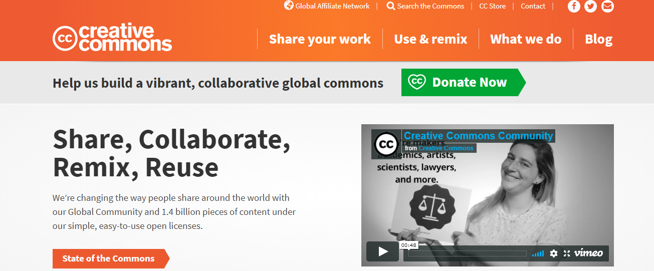
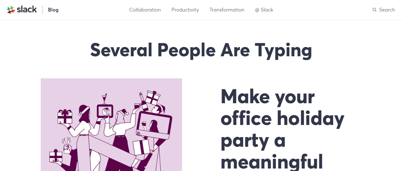
A different kind of website needs a different way of content organization. Practices often differ based on trends and new content, the amount of content, and as well as the way people use the website. Here are some examples of websites with spot-on content architecture:
Use the Content Architecture to Develop User Flows
The customer’s journey defines the content touchpoints that the target users have with your site. To build a user flow through your content architecture, first, you must have a defined user persona and a problem that you can solve for the persona (use case).

To get started, you need to know the direction from which your readers come to your site. Some of them will enter the domain name directly, other will come after Google search results, and there are also users that will land on the site thanks to an email and social media marketing campaigns.
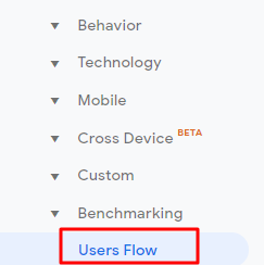
The entry is vital because this is where the customer journey begins. Before you redesign an entirely new customer journey, reexamine the existing one on your current website through Google Analytics:
Open Google Analytics, go to Audience > Users Flow
And also Behavior > Site Content > All Pages
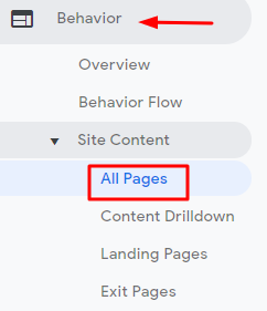
These reports are useful because they’ll give you insight about your current target user journey., It will help you develop ideas for a brand new user flow that you’ll set up through your content architecture.
You can start to map out the new customer journey with a piece of pen and paper, or, you can use some of the following tools:
Even after you redesign your website, you’ll still have to check and optimize the customer journey. Make sure that you remove any unnecessary navigation menu items and pages that people don’t use on your website, and make the most important content noticeable from the start. Include tracking scripts to measure how the site’s visitors navigate and develop better workflows.
Think About Style
Your content should be the focal point of each page and every other opportunity to insert whitespace or other elements should depend on the content’s positioning, design, and size.
You need to know how to style your content, not just to make a blog post look beautiful, but also to make sure that it doesn’t conflict with the other elements of your page. There are a few things that you need to focus on when you style the content of your WordPress site:
Images
When the image quality is bad, the entire website looks bad, including content. Your images need to with the perfect context and size. If the image is smaller than required, it will look blurry and stretched.
If it’s larger than required, it will take longer for the page to load. If you write about a specific service, you can use stock photos too to enhance your content. There are lots of beautiful stock images that you can use that will blend in perfectly with your articles:
Typography
Choosing the right typography for your content means that you’ll improve the UX of your website and make users feel unobstructed when consuming your content. This is vital to the success of your WordPress website, due to a couple of reasons:
Brand Identity: Different typography styles can communicate different messages to people. There are fonts that convey creativity, stability, trust, strength, elegance, sophistication etc.
Better Conversion Rate: With the right typography and layout you’ll make your target users feel at ease, which can directly result in increased website visit time and consequently, bigger conversion rate.
You need to choose typography that is easy to read, relevant to your brand image and contextual with your target audience.
Font Size
Use font sizes that are mathematically recommended. You can start with a size of 16px for paragraph letters and go up for other elements such as subheadings, titles and main titles. 18px is not a small size but not too big either, so it’s excellent to use for your paragraphs.
White Space
Whitespace is the gap between your paragraphs, rows, headings, subheadings, images, videos, body text etc. Using whitespace helps you style content in the following ways:
- Makes it Elegant – When you add more whitespace, you’re making your pages look more minimalistic and elegant.
- Makes People Focus – With proper use of whitespace, you can focus the user’s attention on what’s important.
- Less Reading Stress – With the proper use of whitespace in your paragraphs, you can make even long and potentially overwhelming content readable.
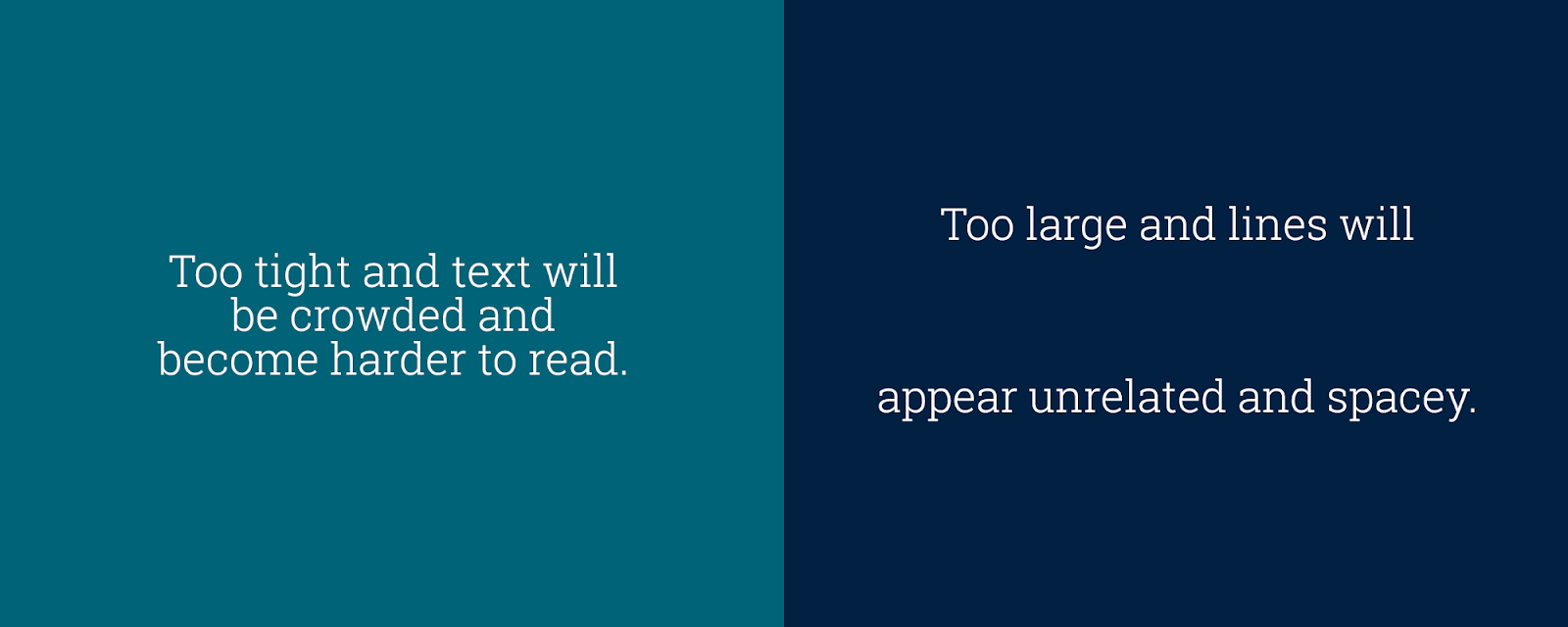
Line Spacing
Anything between 1.3 and 1.7 is fine, but most of the time this depends on the font size and characters per line.
Optimize for Mobile
Users ask for websites that don’t require them to zoom in on every word to see the content. Today, when most people are online, more of them are on their mobile phones than on their desktops, it’s really a no-brainer to offer them a flawless mobile experience in your new design.
WordPress offers a mobile-responsive experience from the moment you put your page online. It is the norm of the users and the norm for a WordPress page that converts. WordPress is ideal if you don’t want to manage two separate websites (one desktop, another mobile) for your users.
The responsive version of your WordPress website is like liquid. The page scales up and down to fit the best it can to the screen where it’s being opened.
That’s why, when you redesign the desktop version of your page, you need to have a mobile-first approach too. You need to think like your users and look through their eyes when they’re on their smartphones. For that reason, it is necessary to provide a flawless transition on every screen, whether that’s a laptop, smartphone or tablet.
Follow the Common UX Principles
There are some things that are standard and a must if you want to provide a good and interactive experience for web visitors. The following are the common principles that every business should respect when optimizing UX for success:
Meet the User’s Demands
By doing your market research, knowing your target customers well and observing them while you conduct your usability study, you’ll be better at identifying user needs and successfully satisfying them in your website design.
Be Consistent
Consistency is another rudimental principle that needs to be respected in UX design. When you redesign your website, you need to stay consistent in terms of functions, interactions, content, performance, and tasks operation. You need to always aim to reduce the learning process for users. Take a look at The New York Times page for example:
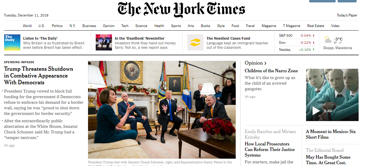
They’ve stayed consistent for years. Even if they do minor changes to the design, their users will know exactly where to look for the main headline and click. Other similar magazines such as The New Yorker and Forbes are following the Consistency principle too, with minor changes over the years.
Stay Functional
Function before design, but with the perfect aesthetics is the design rule if you want a WordPress page that converts visitors into customers. You can’t hide a standard operation like opening a menu based on how cool it would look if you somehow hide it in the design.
You need your website to solve people’s problems and the only way to achieve that is through its functionality.
Design Intuitively
When someone lands on a page, he/she intuitively looks for the menu, slider, latest posts feed and other elements that can be seen in most of the pages online today.
Everything should look obvious to the user. They need to know how to operate with your interface as soon as they land on the page. They need to recognize it as they’ve used it for years.
Test Your New Content Architecture

Your website is not about you, but for your users. This is why you must test out your new architecture for “look and feel” with a group of target users first. When you get in-depth feedback before your new design is live, you can get rid of content elements that don’t work, and further optimize the rest:
- Gather a Focus Group: 7 to 10 of your target readers.
- Display the New Design: Present them with the new content arrangement.
- Let Them Use It: Let them use the redesigned version of your site and tell them to take notes on what they feel when they use it.
- Collect Their Reactions: See which elements of your redesigned content performed the best with the target audience. There will be winners and losers among your content elements, and this feedback will help you gauge that and how your new site will work in the real world.
Transforming the UI of Your Website

The visual design along with your content architecture form the user interface of your website. The sitemap and wireframing are the first steps to defining the new UI of your website. However, don’t forget about the user experience, because it’s much more important to help readers accomplish something on your site than making the page look neat.
Make every action easier on your newly redesigned site. Step away from the old and ineffective content approach and get rid of everything that sidetracks the users. Before you finally launch your new site, make sure that everything is on point, run through the following checklist:
- User-Centricity: Have you built what your customers want to see? Is the experience engaging for them? You need to make people that read your content to engage and take action.
- Understandable: Even if you’re Elon Musk, you need to write your content like each of your readers are a tabula rasa, but at the same time, leave no stone unturned and explain everything thoroughly.
- Content-First: Always validate if your new design makes sense with the content-first approach. Write killer content, and spread it according to the structure that we described in this article.
Wrapping Up
Website development is a continuous and agile process, just as content development. The design and content frameworks can do wonders together if your redesign decisions are based on data benchmarking and follow the appropriate best practices.
Don’t forget to track data and compare it with your previous website version. Evaluate if your content-first approach in your new design works better and don’t forget to A/B test for constant tweaks and improvements. Never forget to measure and optimize your content, because that’s what led to the redesigning your website in the first place.
