Website information architecture is the foundation of a good UX. As users, we’ve all come across websites that are impossible to navigate or understand, and know how frustrating this can be.
We also know how quick we are to leave a site like that behind and look for a competitor who seems to know what they are doing.
Even if the first provider’s product was of higher quality, we’d have never stayed long enough to find out. And that’s because their website was a jungle of content, menus, and pages with no obvious logic behind them whatsoever. Their information architecture was a mess and didn’t have a sturdy structure to hold it together, thus making everything appear to be random and very confusing.
And this is why, as the people behind the websites, we should make sure that this never happens. Online properties should welcome users and be easy-to-understand, intuitive, and have user-friendly content and navigation.
So how does one do that? Let’s find out!
What Is Website Information Architecture and Why Is It Important?
Information architecture (IA) is the supporting structure of a website and focuses on organizing, prioritizing, and labeling the information available on a website in a logical and easy-to-follow way. It provides systematic guidelines about where every piece of content should go, how those pieces are connected to other elements of the website, and which has more priority than the others.
Without this detailed and logical structure, it may become difficult for users to find what they need and simply become frustrated and leave.
The ultimate goal of IA is to improve the user experience by serving as a bridge between the website content and functionality. This allows users to intuitively interact with the site in a seamlessly logical way that is both optimal and time-saving.
A website without any well-structured information architecture is like a bookstore with no organizational system and a shop assistant on their first day at work. You go in and find all the books randomly piled up on tables with no apparent logic to help you find the title you came looking for.
Information Architecture Vs. Website Navigation Vs. UX Design Vs. UI Design
Although information architecture, website navigation, UX, and UI design are tightly connected and often used interchangeably, they are different things.
In a way, IA is the foundation of good navigation and UX design. It provides the structure of the information that the interface designer uses to base the navigation upon.
You can imagine the IA as a map – the information there is static and perpetual. However, when you move across the map, you can take different routes to get from one place to the other. That’s what navigation does for you, it makes it possible to reach one piece of content from various locations on the website, following a number of logical steps.
To continue the map allegory, without the proper structure, landing on your website may feel like unlocking a new area in a video game. You know there is stuff there, and you know the names of the places where you have to go, but your map is still all covered in black, and you have no idea which way to go.
As for UX and UI design, without the proper structure to rely on, no designer can miraculously make the mess user-friendly. But, at the same time, a well-made structure alone, i.e. IA, is not enough to make an interface a satisfying user experience.
So in a way, IA is also the outline that the UI can be based upon, and a prerequisite for UX.
The Information Ecosystem
There are three major factors that influence website information architecture and they form the so-called information ecosystem.
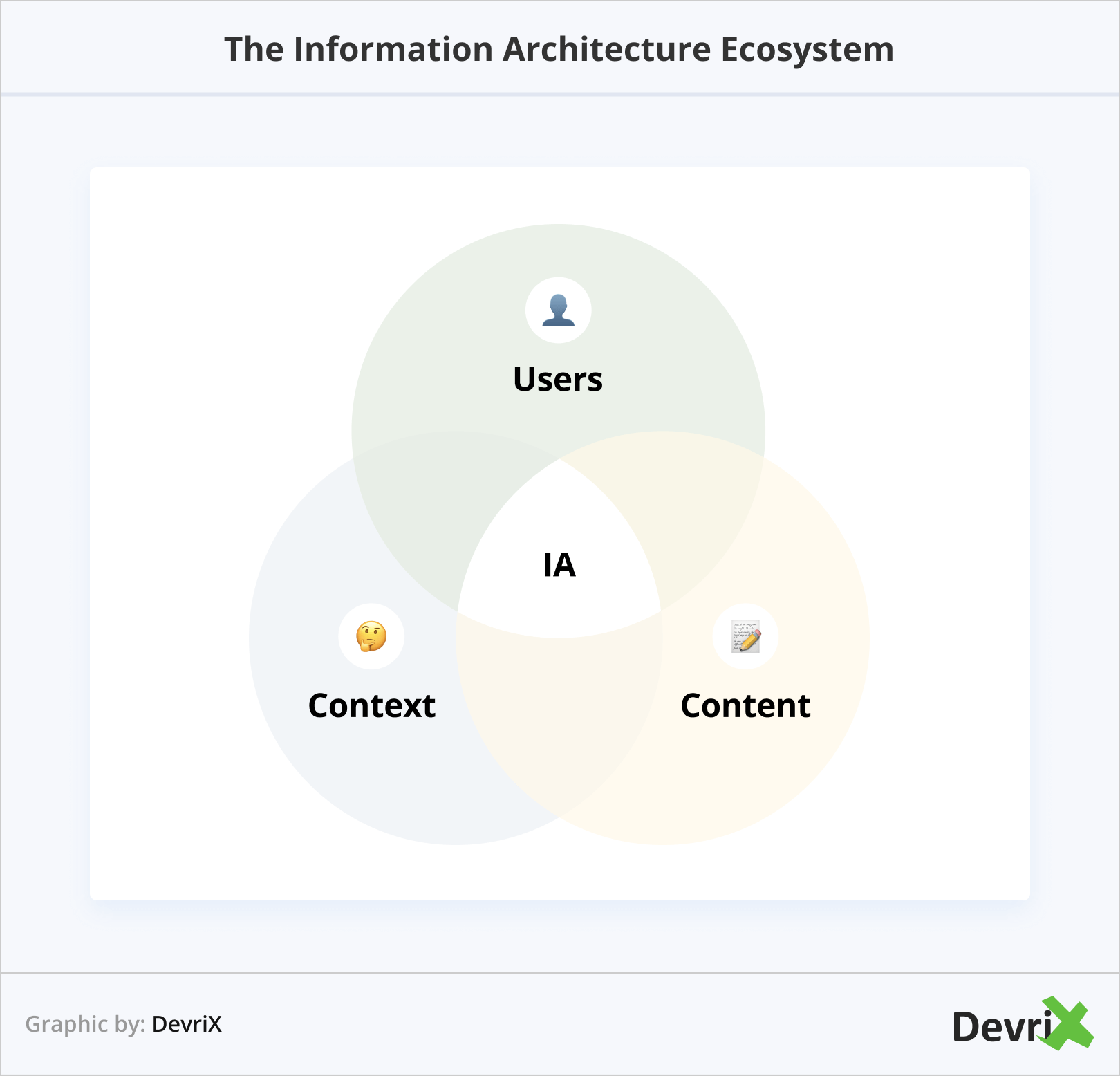
Users
As you are probably already aware the user’s needs should be at the center of information architecture. To be able to achieve this, you should perform market research and UX research and work to understand your customer’s way of thinking, their logic, technical literacy, browsing habits, goals, and priorities.
If you are migrating an existing website, you can build a customer journey map to identify where visitors encounter issues, and what causes them.
Content
The amount, quality, and current distribution of content are also of significant importance if what you are doing is a website restructure. A content audit will allow you to refresh older content, regroup sections, improve quality, and identify missing information.
However, if you are starting from scratch, content is not of less importance. You should be very clear about what your long-term website scaling plans are, and structure the information in a way that it can grow without losing logic and consistency.
Context
Although the UX and the user’s ability to comprehend the content and follow its logic are a top priority, business goals are also at play here and should be taken into account. After all, it’s for the company’s benefit that you are building the website in the first place.
The purpose of the website should dictate the structure and the way you are guiding the customer on their journey. You should also consider other factors, such as the budget, the long-term goals of the company, and the technical skills of the design team.
Information Architecture Principles
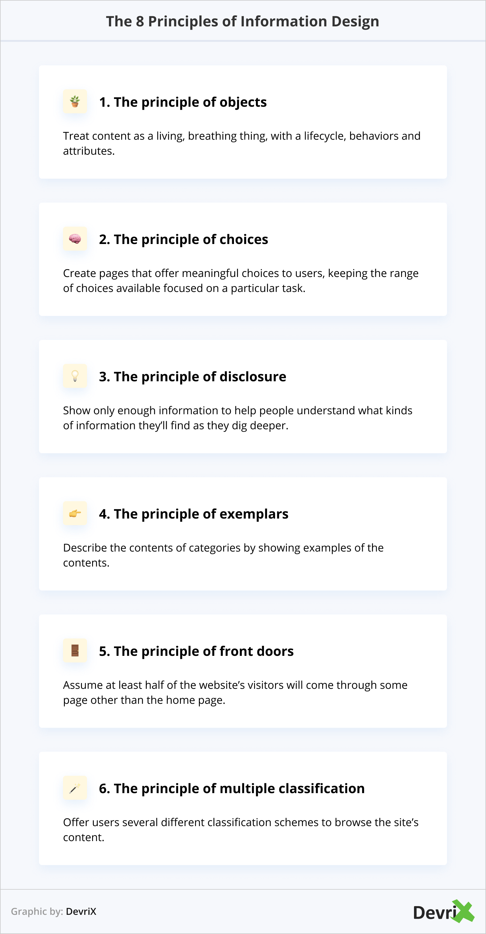
Getting website information architecture right is a tough cookie to crack, and there are many factors to take into account. However, back in 2010, Dan Brown, a veteran in the field, proposed the 8 principles of information design that have been approved and accepted by the IA community over the years, and are now considered a standard:
1. The principle of objects – Treat content as a living, breathing thing,
with a lifecycle, behaviors and attributes.2. The principle of choices – Create pages that offer meaningful choices to
users, keeping the range of choices available focused on a particular task.3. The principle of disclosure – Show only enough information to help
people understand what kinds of information they’ll find as they dig deeper.4. The principle of exemplars – Describe the contents of categories by
showing examples of the contents.5. The principle of front doors – Assume at least half of the website’s
visitors will come through some page other than the home page.6. The principle of multiple classification – Offer users several different
classification schemes to browse the site’s content.”
The guidelines are simple and general enough to be applicable in different situations, but at the same time useful and suggestive in giving you a framework to refer to.
How to Create an Information Architecture Structure
Now that you are familiar with the basics, let’s focus on how to successfully build a website information structure in 5 steps.
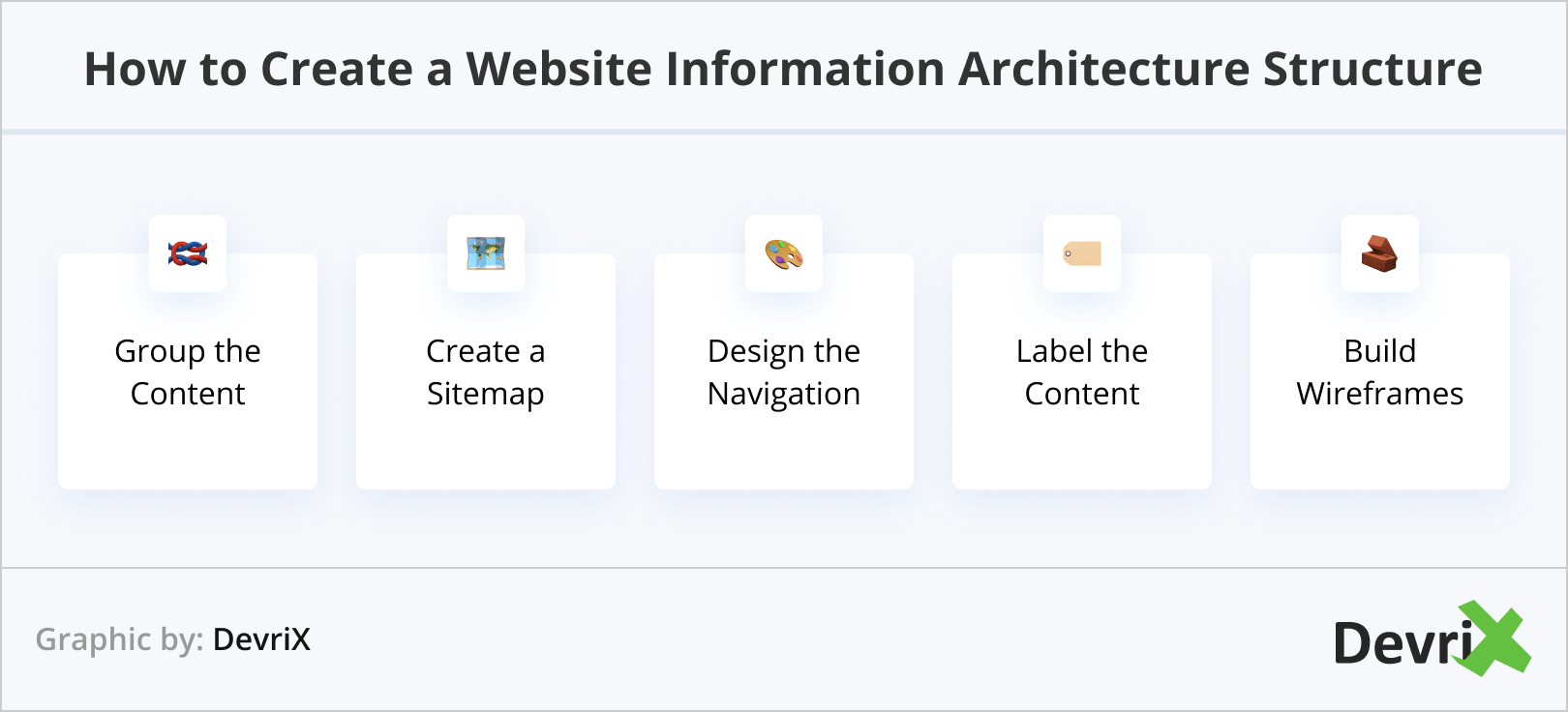
1. Group the Content
Regardless of whether you are building a completely new website or reconfiguring an existing one, you should start by organizing the content that will be on it.
If it’s a migration that you are doing, that’s the moment to do a content audit and remove or update any irrelevant old information.
Once you are left with only the pages that you will use, you can make content cards and distribute them among context groups.
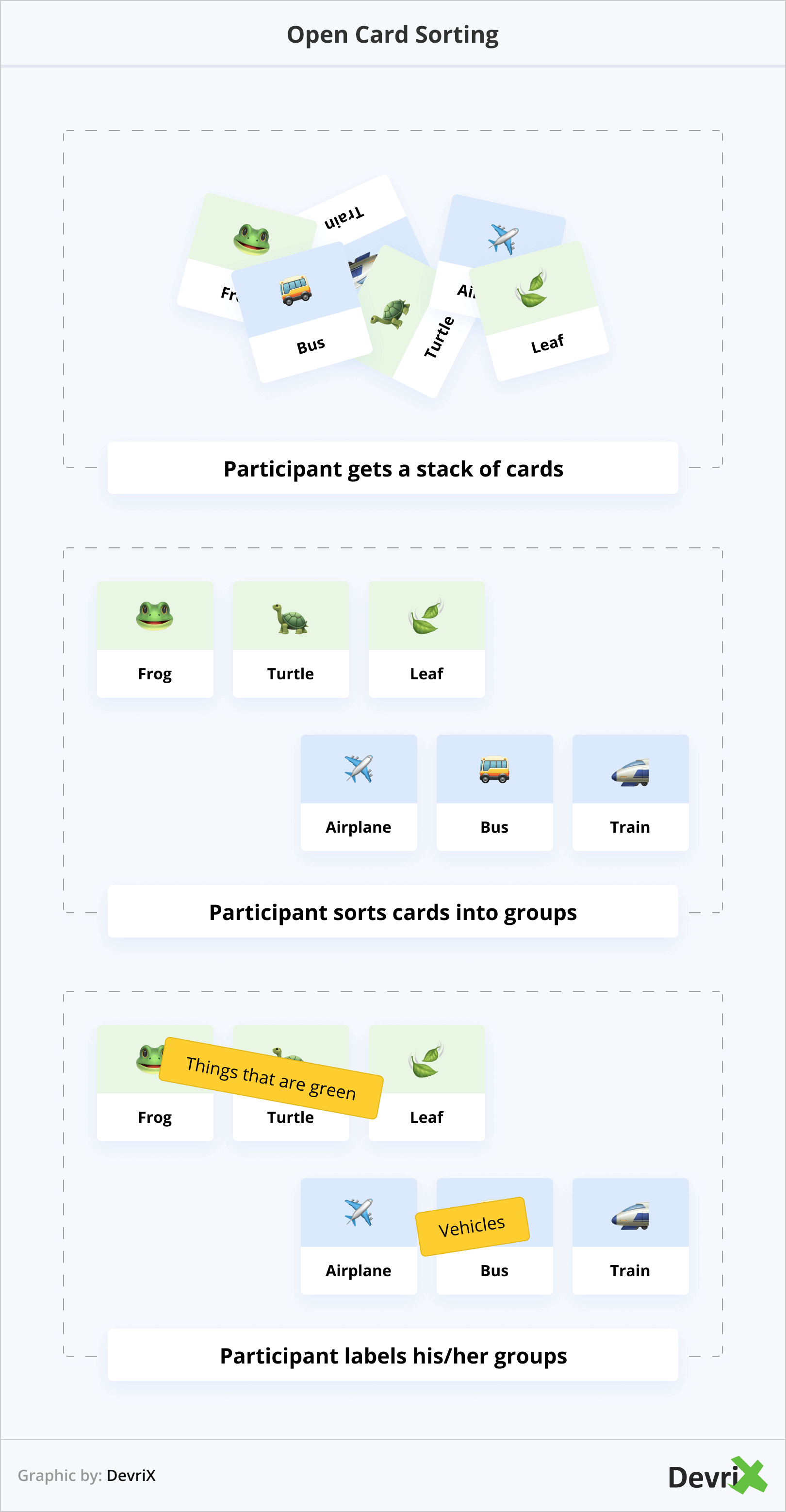
The sorting can be done by your team but you should also consider using the help of a focus group. This will provide a better understanding of the end-user’s point of view and way of their thinking. By following their logic in your IA structure, you can make navigating your website more intuitive and user-friendly.
One way to approach content cards is by allowing users to group them on their own and without providing any detailed guidelines. The other is to give them a list of categories that they should distribute the content amongst.
2. Create a Sitemap
The sitemap is the hierarchical structure of the content on your website. Based on the groups you’ve set up in the previous step, you can build a tree-like organization visualizing how the pieces of content are related to each other. To make it easier to read and understand by users with different levels of familiarization with IA, you can color code the content depending on its importance and its priority layers.
3. Define the Navigational Pathways
As mentioned previously, navigation and IA are not the same things, though they are connected.
Based on your sitemap, you can set the different pathways that the user can take to navigate to any piece of content.
However, keep in mind the principles we talked about earlier. A user rarely starts their journey on the website from the same point as someone else, and there shouldn’t be only one way to get to the place they want to go.
Otherways, you may make some content pages unreachable or tough to find, and the users that are looking for them will keep ending up at the wrong place and will quickly give up.
4. Label the Content
Labeling the content makes it easier for the users to understand when they click a certain tab or menu. The headings and subheadings of the labels should be short and clear, all the while providing enough relevant information for the person to know what to expect.
Copywriters and the content creation team can be of great help here, so make sure to include them in the process.
5. Build Wireframes
Wireframes are prototypes of the website, stripped down to the basics. Their goal is to visualize the information architecture and navigation, and test their usability. To do so, you should, once again, use the help of a focus group or a sample of individual users to simulate a real-life experience while browsing the wireframe. The group can give you feedback where they encounter issues, what sections they find confusing or illogical, and what can be improved.
Bottom Line
Websites should make sense and be easy to navigate. If your content is disorganized and doesn’t follow a logical order that’s easy to understand, people will not stick around.
Bringing order to chaos will make the customer’s journey of your website hassle-free, and will improve both UX and navigation.
Team DevriX
This article is crafted by DevriX's seasoned marketing team, boasting over four decades of collective expertise in crafting sophisticated marketing funnels, devising comprehensive content frameworks and pillars, implementing engaging email campaigns, and creating impactful social media content designed for scalability.
Our marketing experts specialize in the complete spectrum of inbound marketing strategies. As an accredited HubSpot Agency Partner and a Semrush Partner, we engage in meticulous research, blending our extensive experience with the unique insights of our highly skilled team.
We set benchmarks in content creation by incorporating cutting-edge marketing trends, leveraging in-depth industry research, and utilizing state-of-the-art AI tools for data segmentation and captivating content hooks. Our proficiency extends across a diverse range of sectors, including working with SMEs, Fortune 1000 companies, global B2B brands, major publishing entities, WooCommerce platforms, business directories, and affiliate networks.