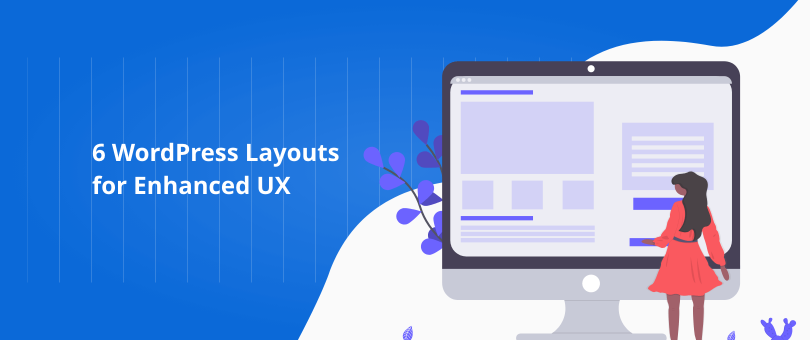
The layout and design of your WordPress website have the power to improve the interaction of your target prospects with your business online. A website that exists only for the sake of it is a non-converting website, and those types of sites are no different than a business card or a resume.
Among visual design, content and site architecture, conversion rate optimization, and how the users perceive websites lies the formula of the successful layout. There are always layouts that are easy to comprehend and with an effective UX, and they always result in a positive conversion rate. Let’s explore these layouts and how they can take your website design to a whole other level.
First, Why UX Matters?
The main purpose of your website should be to convert visitors while generating positive emotions through the interactions of the users. Think about it, does a website that can’t satisfy users’ needs make sense?
A well-thought-out website fulfills the functional needs of the users, for example finding the information that they’re looking for, or ordering/purchasing a product. Next, the design should also satisfy the psychological needs of the prospects by saving time and making the entire experience efficient for them.
According to research conducted by Stanford University, users assess the overall visual design of a website fairly quickly! If the website looks professional enough, it means that it appears more credible, which consequently leads to bigger conversion rates. Each element is key to your UX, from typography to layout, to font size and colors.
How Your Website Layout Affects the UX?
When you’re focused on UX and conversion optimization, you must provide prospects with what they’re looking for. If they have some sort of problem, they must be able to solve it when they land on one of your pages.
That can be only achieved through a visually-engaging and optimized web layout. The layout should be simple to use and intuitive. It should contain nothing but the basics and the most important elements for persuading visitors that your business is worth their attention.
Without further ado, let’s proceed with some WordPress layouts that can enhance the UX of your business website.
1. Zig-Zag Layout
The Zig-Zag layout takes advantage of a well-known pattern users use to scan content. More specifically, the Z-pattern. This layout mimics the shape of the letter Z, and the pattern traces the zig-zag route that the human eye makes when we read and scan content.
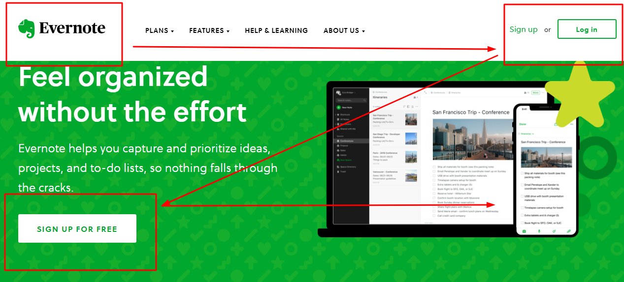
Image Source: Evernote
This layout is an excellent solution if you want a minimalistic WordPress site with a small amount of copy and elements, especially for landing pages. Before you begin with the zig-zag layout, make sure that you have an answer to the following questions:
- What information do you want the visitors to notice?
- In what order do they want to see the information?
- What do the users need to do on my website?
At best, people need to see the most important content first, and the next most important information second. This is why you need to place the most important content on the Z scanning path so that users see the content at the right time.
2. Full-Screen Photography
They don’t say that an image is worth thousands of words for nothing! A full-screen photo always captivates the people’s attention, and it’s one of the finest ways to get your brand message across your WordPress site.
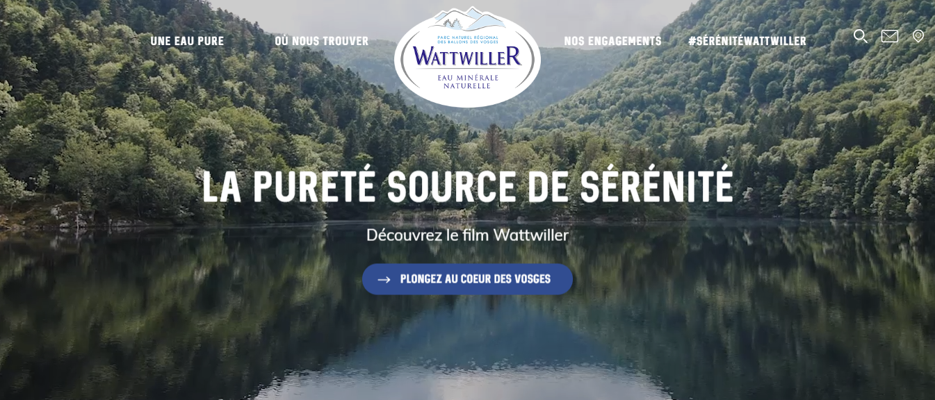
Image Source: Wattwiller
With a full-screen photo, you practically say more with less! When executed properly, full-screen photography is beautiful. However, the greatest power of the full-screen image layout is that it tells your story in a clear, quick, and engaging way.
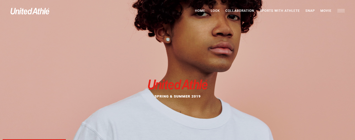
Image Source: United Athle
The Rule of Thirds
The full-screen photograph that you want to insert on your page should be equally divided with 2 horizontal and vertical lines, and the most important elements or the message that you’re trying to deliver should be placed in the places where these lines intersect.
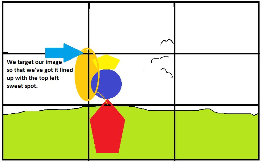
Image Source: Interaction Design
So, if you want to place an image of a product, make sure that the product is positioned more to the side than in the center. This will create the sensation of movement and will make users look towards the object.
Make sure that you have the right background for the image! The background needs to be completely compatible with your brand and its visual identity. Also, don’t forget to combine the full-screen photo with the right CTA (Call to Action).
3. Split Screen Layout
A split screen layout literally means that your web layout is divided into two or more vertical parts. This layout provides you with the opportunity to present diverse objects from equal importance on the same page. You can showcase your products, services, or product packages in a distinctive and structured manner.
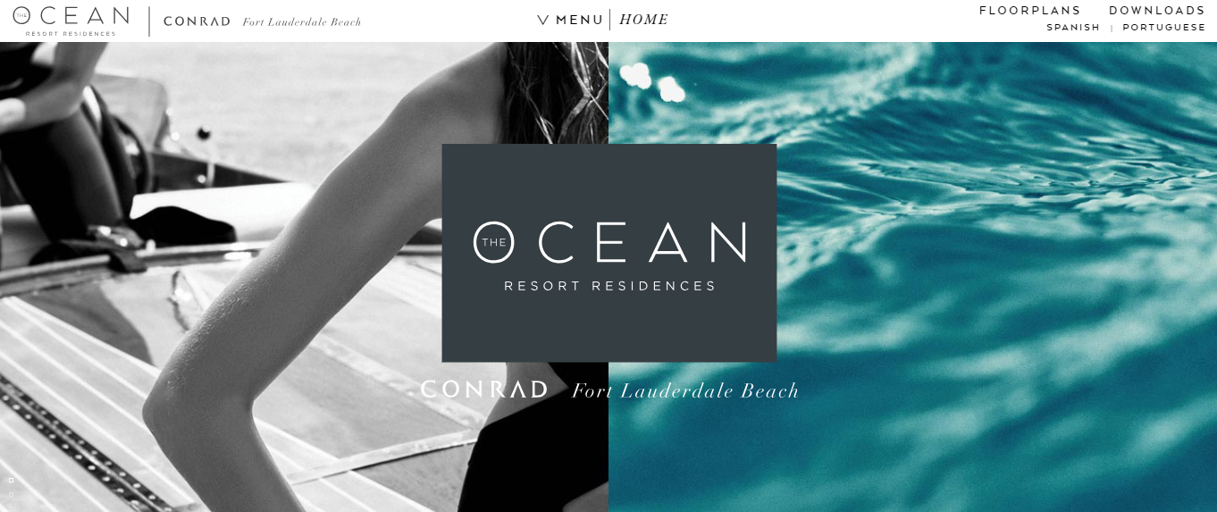
Image Source: Ocean Resort Residences
Splitting the screen presents a distinctive way to guide the users on your WordPress website. It draws their attention to exact parts of the website, plays on contrasts, and showcases trendy unconventionality.
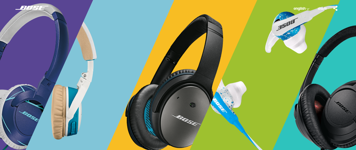
Image Source: Bose
Moreover, this layout is excellent when it comes to responsivity, and it works brilliantly on smartphone and tablet screens as well as on desktop screens.
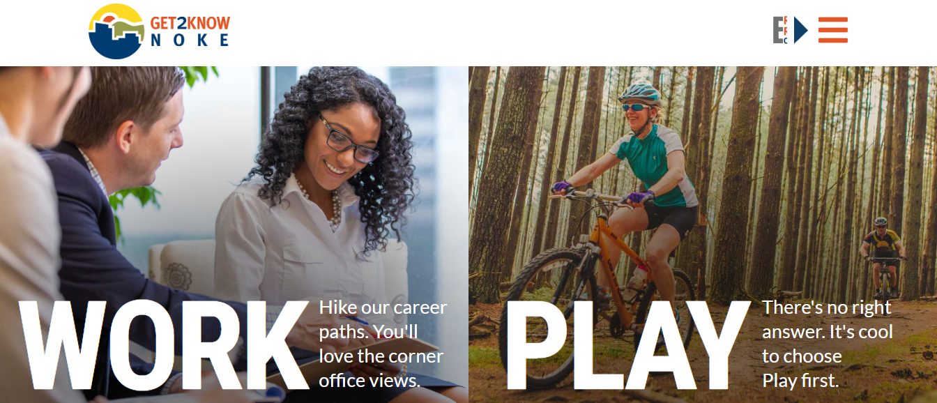
Image Source: Get2KnowNoke
However, before you decide on a split-screen layout for your website, ask yourself the following questions:
- Is this layout appropriate for my content?
- Will I use sufficient negative space for this layout to be successful?
- Will this layout confuse the users?
- Will their attention be split in half as well?
When you design your WordPress site with a split screen layout, remember to not overdo the number of vertical parts. Keep things simple, and make the job of choosing between alternatives easy.
4. Unequal Layout
An unequal layout is an asymmetrical layout that is divided into uneven parts.
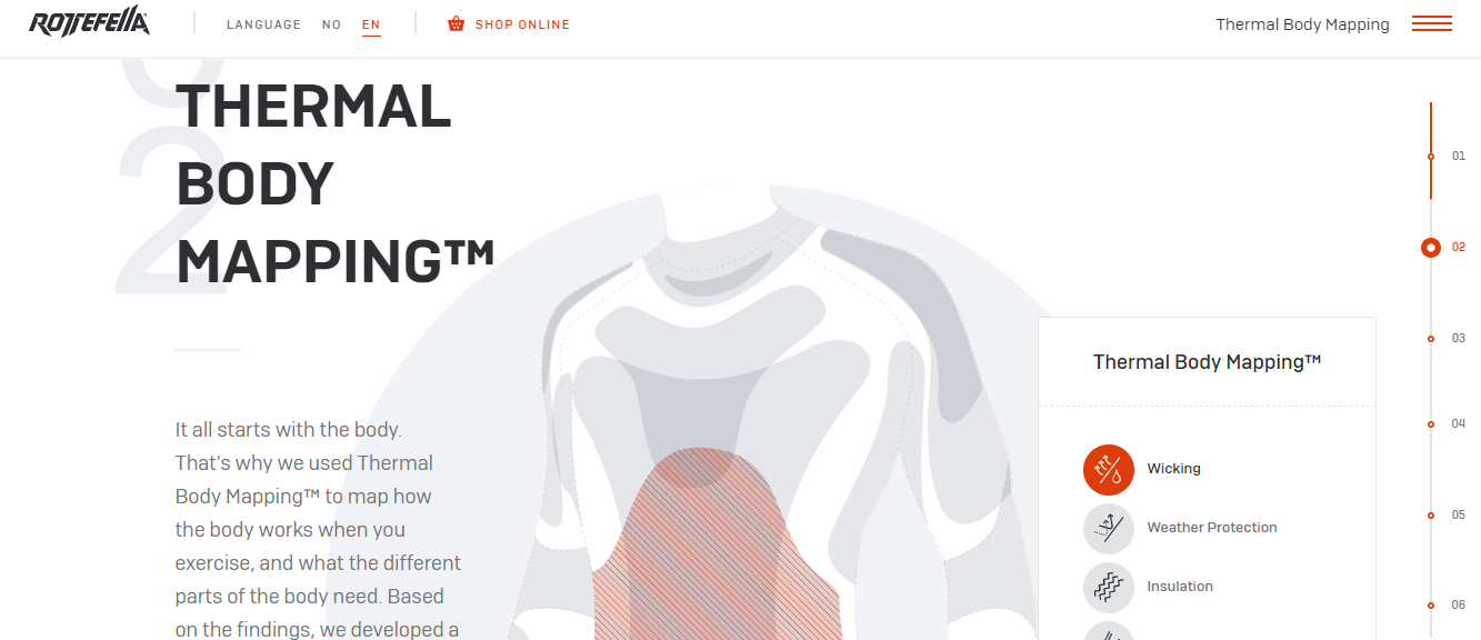
Image Source: Rottefella
This is the perfect layout if you want to combine text paragraphs and imagery in your WordPress design. Photos and graphic elements have the power to perfectly complement the text and depict the message that you want to transmit to your target users.
The unevenness also adds the effect of dynamism, particularly with a diagonal layout.
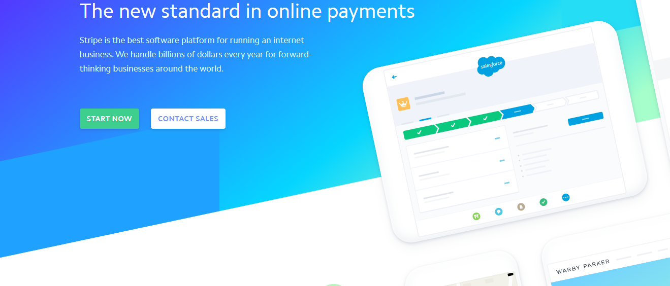
Image Source: Stripe
An additional benefit of using an unequal layout is that it’s engaging because each of the major elements of your design is placed in a non-linear way, and that’s what redirects the scanning behavior of the users from one element to another.
5. Grids
One of the best ways to organize content on your site is to use grids. The grid-based layout helps you align your content according to sequenced columns and rows. With grids, you’ll provide users with a consistent experience across all devices and different screens.
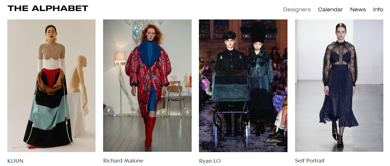
Image Source: The Alphabet
The main benefits of a grid-based WordPress layout are:
- Organized Content: A grid-based design will keep all of your elements aligned, which in turn will make the page look cleaner and better organized. It sets up a good structure for your website.
- Improved Efficiency: Users want to find what they’re looking for as fast as possible. With grids, you can speed that up because you’re guiding the readers directly to the content.
- Title Readability: When done right, the readability of the grid titles looks stunning! It’s neat and it’s well-structured, and it enhances the readability of the titles.
- Responsivity-Compatible: The small boxes of grid content can be well-suited to every smartphone/tablet screen size.
A good rule of thumb for a grid-based design is to make sure that the entire box is clickable, not just the text or the box background image. Additionally, pay attention to white space between the grid cards. It looks brilliant without whitespace, but if you plan on using some, make sure that it’s a small amount that won’t interrupt the content scanning process.
6. Parallax Scrolling
The parallax effect produces a 3D scrolling as the users scroll down the page. With it, every website design can come to life. As the readers scroll down, with a parallax effect, the background of your WordPress site flows at a different speed than forefront imagery and elements, creating an appearance of depth in the process.
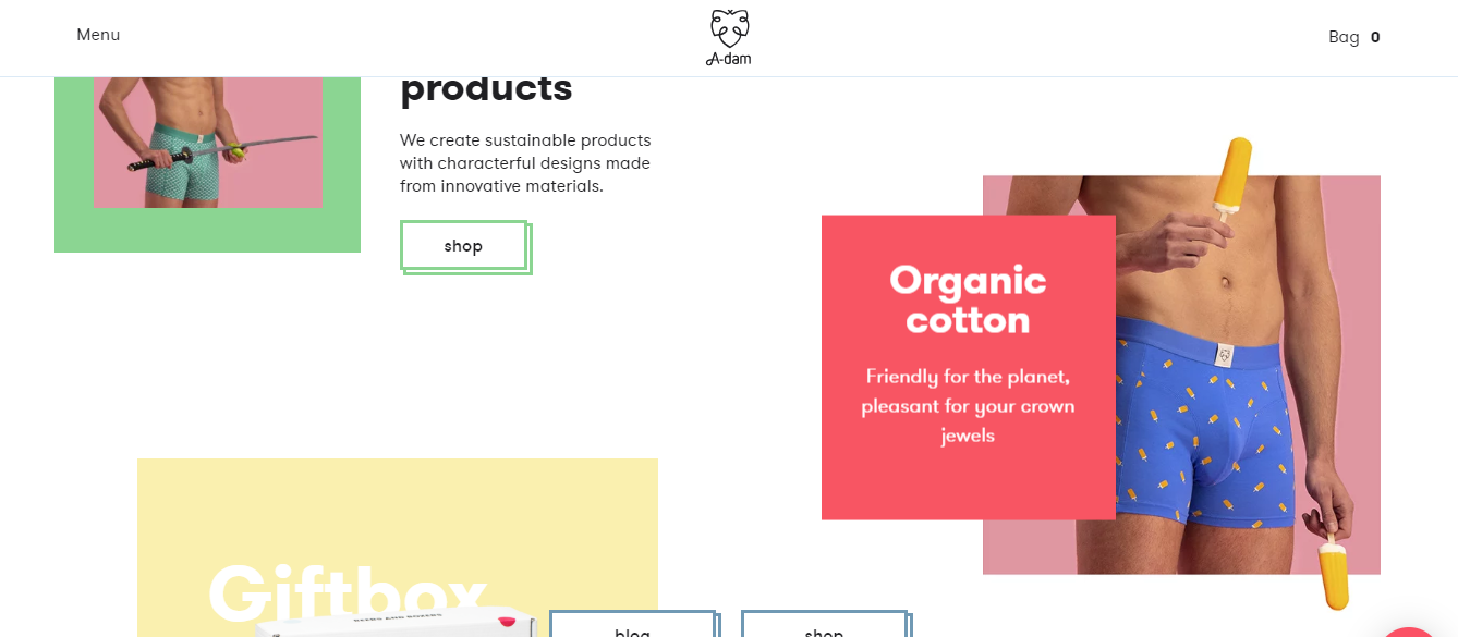
Image Source: A-dam
A parallax web layout can improve your UX and conversion rates by:
- Impressing the readers with page depth and animation.
- Supporting your brand story through the design.
- Guiding the readers through a natural web flow.
When you design your WordPress website with the parallax effect, remember to keep the navigation smooth, and also, don’t distract the users with needless animations.
Additional tips you can implement in your parallax layout:
- Keep It Simple: Too much complexity and you’ll confuse the users because they won’t be able to separate content from the design.
- Tell a Story: Storytelling is automatically more interactive with parallax.
- Emphasize the CTA: This will improve the user experience and bring better results to your business as well.
- Test on Mobile: Parallax designs can be sensitive on a smartphone browser, so make sure you test them out before you deploy them.
Wrapping Up
There are countless ways to design a WordPress build, and you must choose the right layout for your target audience. Your website can’t be effective if you don’t give attention to UX and conversion optimization.
With a clear, simple, and intuitive layout, you’ll have a WordPress website that makes users want to stay, come back, share the site, and buy from you. It’s what UX is all about really!
Team DevriX
This article is crafted by DevriX's seasoned marketing team, boasting over four decades of collective expertise in crafting sophisticated marketing funnels, devising comprehensive content frameworks and pillars, implementing engaging email campaigns, and creating impactful social media content designed for scalability.
Our marketing experts specialize in the complete spectrum of inbound marketing strategies. As an accredited HubSpot Agency Partner and a Semrush Partner, we engage in meticulous research, blending our extensive experience with the unique insights of our highly skilled team.
We set benchmarks in content creation by incorporating cutting-edge marketing trends, leveraging in-depth industry research, and utilizing state-of-the-art AI tools for data segmentation and captivating content hooks. Our proficiency extends across a diverse range of sectors, including working with SMEs, Fortune 1000 companies, global B2B brands, major publishing entities, WooCommerce platforms, business directories, and affiliate networks.