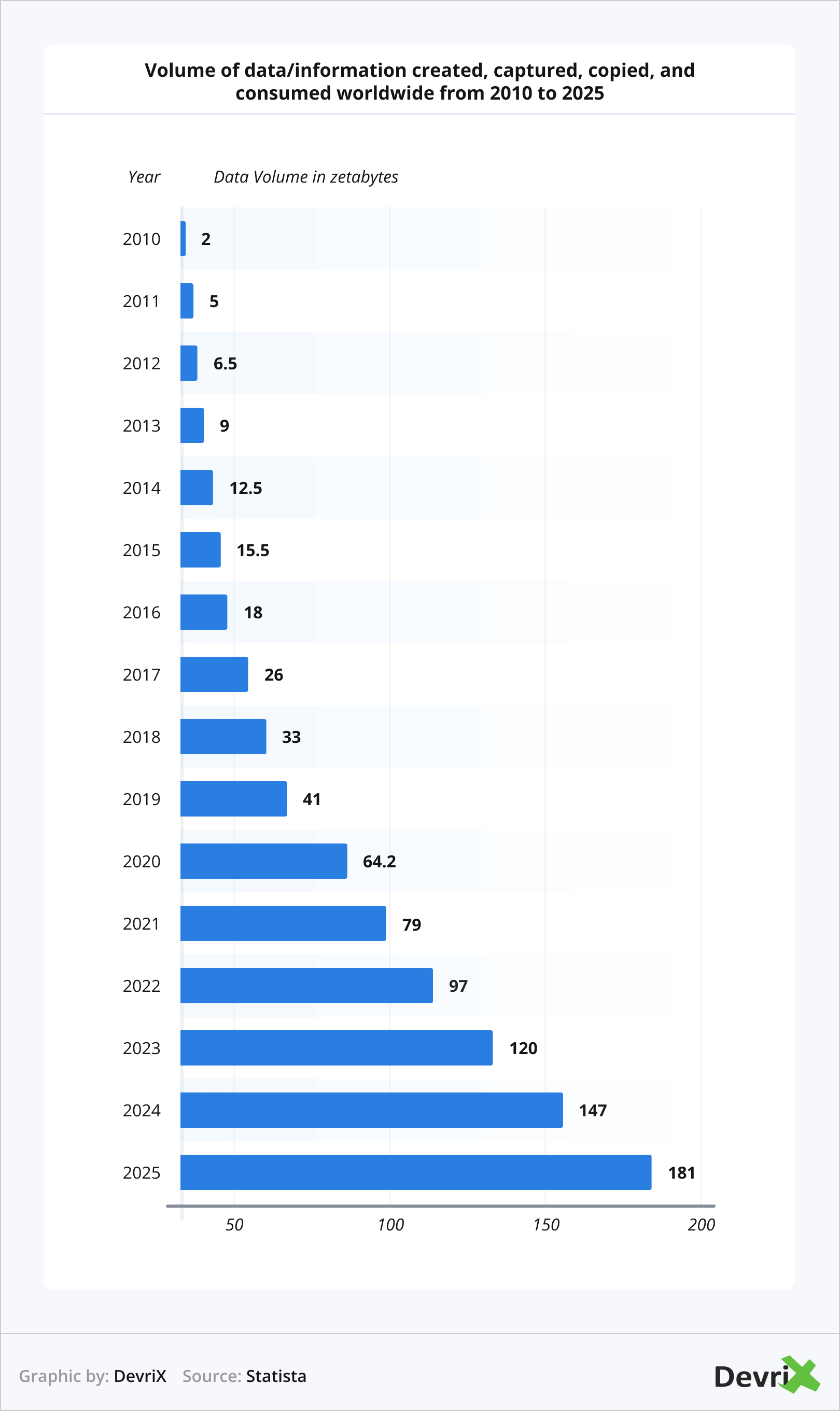
Today, we’re flooded with data from virtually everywhere and information overload is a reality. According to Statista, people consume about 50% more information than just 10 years ago.
Our brains are configured to handle a certain amount of information regardless of what we’re looking at. However, technology has helped us adapt and pick things up much faster than we did only a couple of decades ago.
If you look at things closely, 90% of the information that is being transmitted to our brain is visual. We maintain up to 80% of what we see and do compared to 30% of what we read.
The fact that we as humans are wired to receive visual information better than text is more than enough to justify the need for social media data visualization. Data visualization provides you with the ability to exploit your data as an invaluable asset for your social media campaigns.
Metrics have always played a key role in marketing and how brands plan their subsequent campaigns in the marketplace. Through data visualization for social media, you will increase the speed and quality of your social media marketing decisions.
In this article, we will first explore the data visualization definition and its importance. After that, we will look into how social media data visualization works and go through the built-in analytics of the most widely used platforms.
In the end, we will give some data visualization examples outside social media and ways to use them to achieve your business goals.
Why Is Data Visualization in Marketing So Important?
Data visualization is important in all industries that can benefit from data collection and analysis, but it is especially important in digital marketing. In our data-driven world, understanding your audience is critical to success.
Also, data visualization is the key to understanding your users’ behavior. Otherwise, data can be meaningless and overwhelming. However, with proper graphical representations of your analytics, you can see patterns, correlations, and trends that you would never be able to see with raw data alone.
Not only that, but data visualization in marketing can help you tell a story with your data, and storytelling is extremely important for your brand. In addition, social media data visualization can help you understand what content is resonating with your audience and which posts are falling flat. In short, data visualization is an essential tool for digital marketers who want to ensure their marketing dollars are being spent effectively.
What Is Data Visualization for Social Media?
Social media data visualization is much more than just likes and shares. It provides you with a deeper understanding of your audiences and how they engage with your brand. Collecting social media data can help you understand the success of every post, campaign, and network that your business is active on.
With social media analytics, you can learn which platform generates the most leads, and which content converts audiences.
Beyond the measures of likes, shares, and impressions, you can leverage social media data visualization for:
- Audience Segmentation: Through analytics, you can segment your social media audience based on demographic parameters.
- Lead Generation: By analyzing social media data, you can develop an accurate lead generation model that revolves around the users’ activities on your social media profiles.
- Sales Outreach: Salespeople can use social media insights for personalized conversations and sales approaches.
- Content Engagement: You can use your data to assess where you need to engage with users more and where to post less.
The process of social media analytics includes the following 3 steps:
- Capturing: Defining a specific social media goal and capturing data to measure your KPIs. Each of your social media KPIs must be measurable.
- Understanding: Identifying which tactics are working on certain networks. If users don’t interact with your content, something in your strategy is off.
- Presenting: When you understand your social media data, it’s time to visualize and present it. This is where digital data visualization steps in.
The Integrated Data Visualization of Social Media
Each of the major social media networks has its built-in analytics that provides you with insights about users’ activity.
Facebook Insights
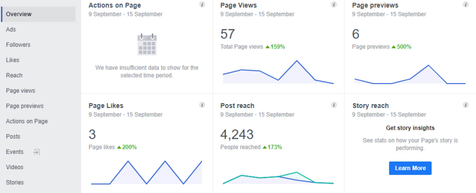
Facebook Insights visualizes the stats for your posts, audience, and engagement on your page. You can also set up the ‘Pages to Watch’ option which provides you with competitive insight about the performance of other Facebook pages. Understanding your page metrics will ensure that you post the right content for your Facebook audience.
Page Likes
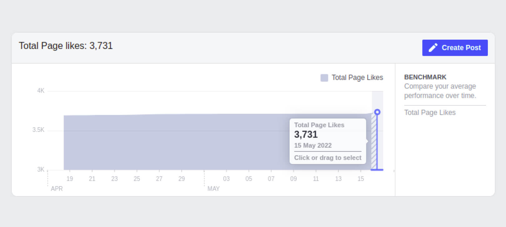
The Page Likes section is excellent if you want to track followers and whether your likes come from your organic or advertised posts. You can also concentrate on specific periods by selecting a date range on the graph. This can help you understand the effects of a particular campaign or posts on your page.
Post Reach
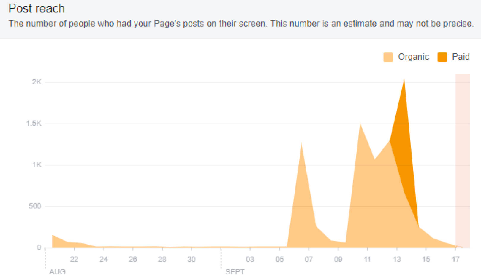
This section lets you connect your posts to different graph trends. If you notice an increase in activity, you can click or drag to select to learn what posts were on the page during that period. This will help you post the content that resonates with your audience the most.
Page Views
This section lets you analyze how many users land on your Facebook page and the source from which they’re coming from. It’s split into two categories:
- Page and Tab Visits: The overall number of visits to your pages or tabs.
- External Referrers: The number of times visitors landed on your page from a website excluding Facebook. If you want to see how the referrers have performed, you can select areas of the graph and compare different periods.
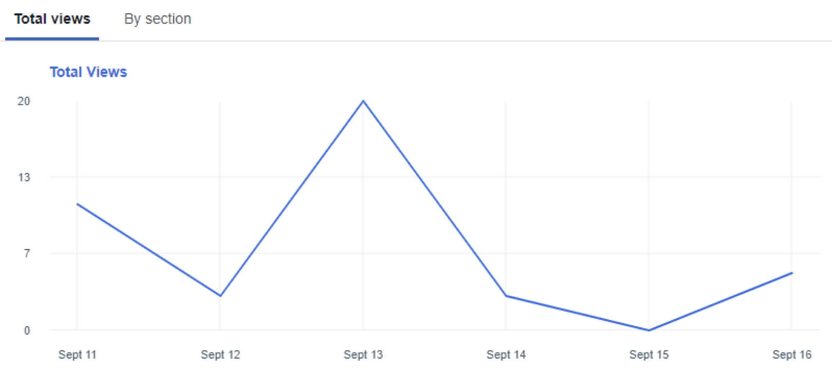
Posts
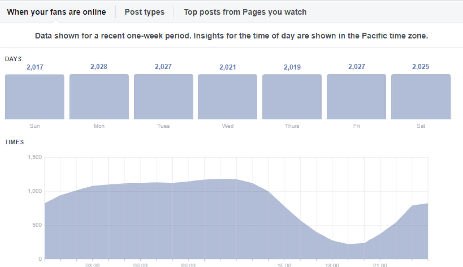
The Posts section provides you with a scope of metrics that you can use to offer the content that resonates the most with your audience. Do they enjoy the articles? Pictures? Videos? This can help you get more interactions and improve your advertisements.
You can also discover what is the best time of day or the week to post your content. Providing the right content at the right time is one of the best ways to improve your social media campaigns.
Videos
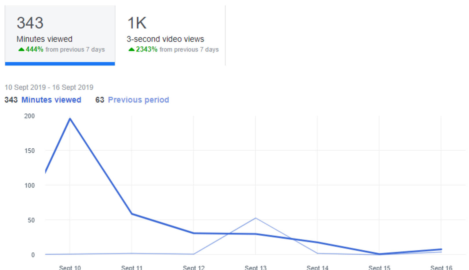
This videos section utilizes three different metrics to help you grasp the best type of videos for your pages:
- Video Views: The number of video views for a minimum of three seconds.
- 30-Second Views: The number of times that your page’s videos are viewed for at least 30 seconds.
- Top Videos: The most popular videos on your page that were watched for over three seconds. Knowing which videos are resonating the best with your audience will be vital to your social media success.
People
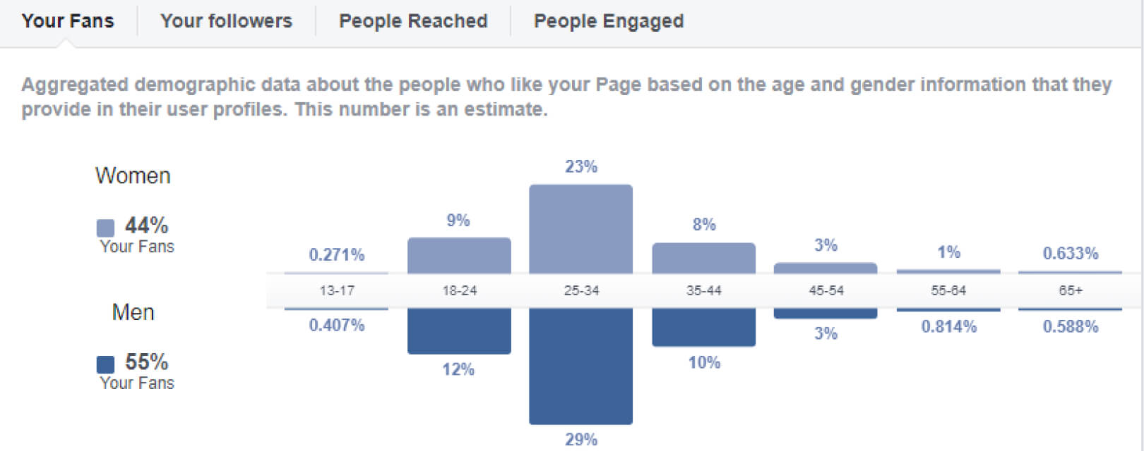
The People tab will help you figure out your audience better by observing the following metrics:
- Your Fans: Who is liking your page (gender, age, location, language).
- People Reached: Posts reach stats for the last 28 days.
- People Engaged: Who interacted with your page over the last 28 days (likes, comments, shares).
When you know which is your most engaged audience, you can post the content that will increase that interaction even further.
LinkedIn Analytics
With LinkedIn Analytics, you can track and visualize the engagement of your page updates as well as numerous metrics about your followers and visitors.
There are three main data dashboards that you need to focus on when it comes to LinkedIn analytics:
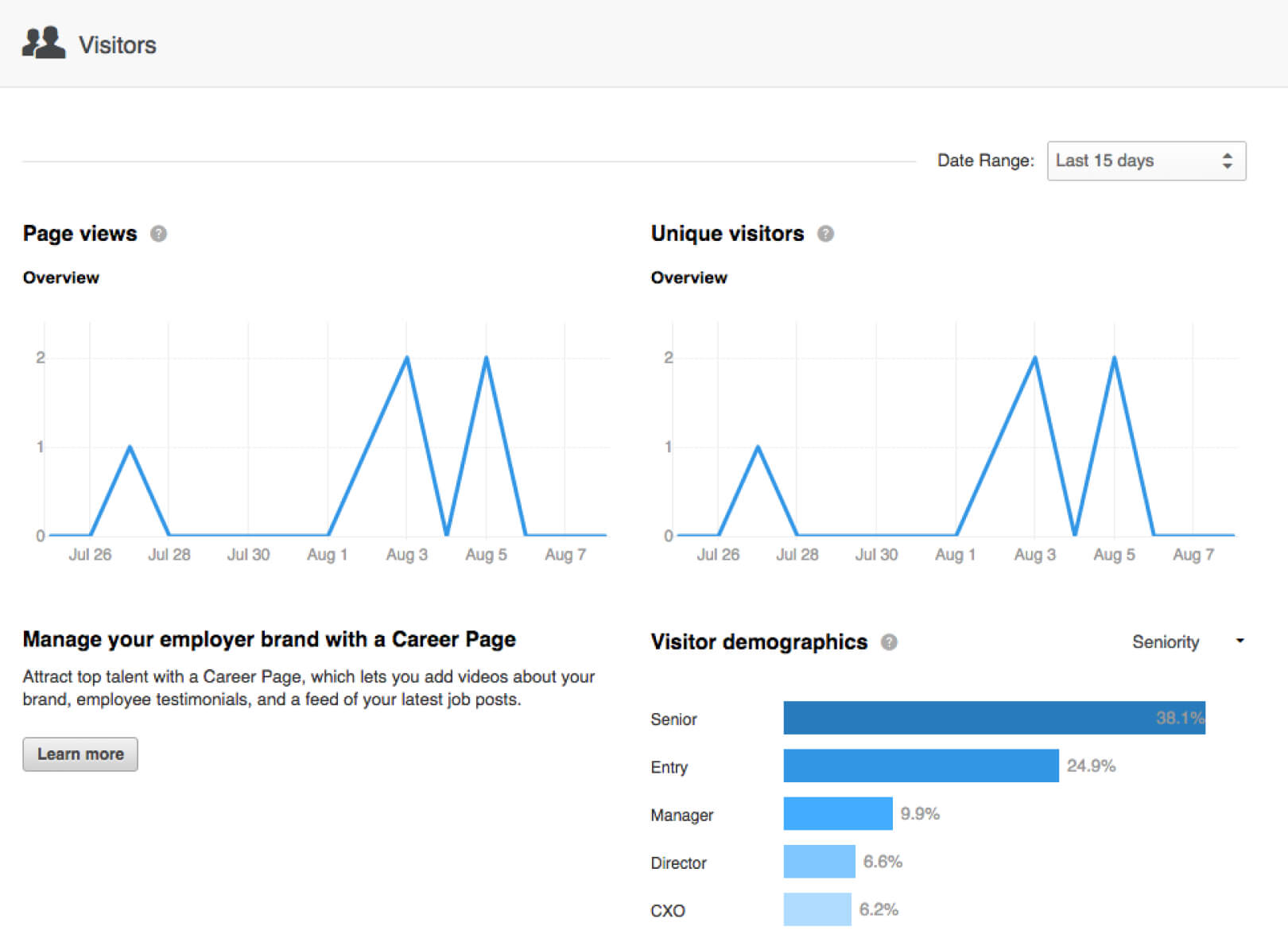
Visitors
A general overview of your page views and unique page visitors. Adjacent to each metric is a percentage that reveals how much it has increased or decreased compared to the same time last month.
Traffic
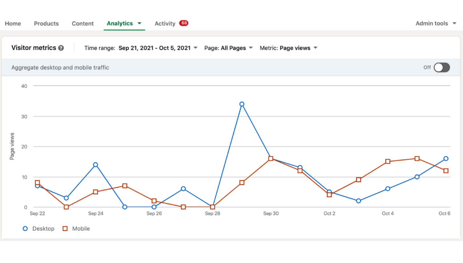
This graph shows you the aggregated traffic statistics for the past two weeks.
Focus on your Pageviews when you need to assess the content performance on the LinkedIn page. Look at Unique visitors to gauge how many individuals are visiting your page during a defined period!
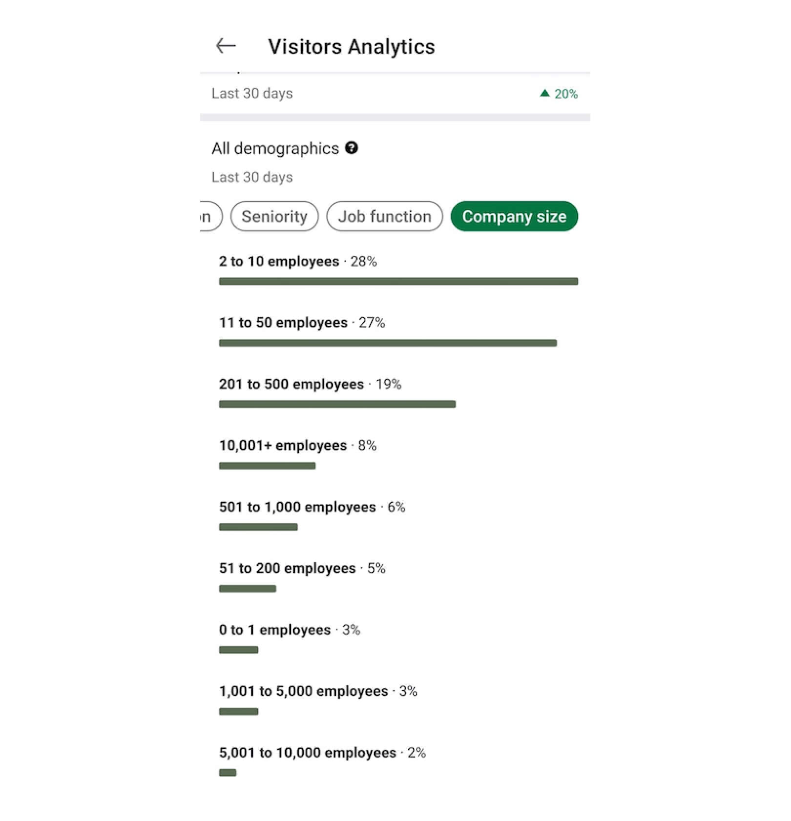
Visitor Demographics
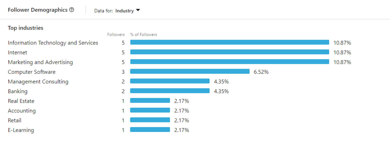
This section provides you with in-depth information on the people that look at your LinkedIn company page. You can filter them by:
- Job function
- Location
- Seniority
- Industry
- Company size
Being aware of your audience demographics is crucial for your LinkedIn marketing success. The data above can improve your content strategy so you can reach the right decision-makers, especially if you want to hire someone for your team through LinkedIn.
Instagram Insights
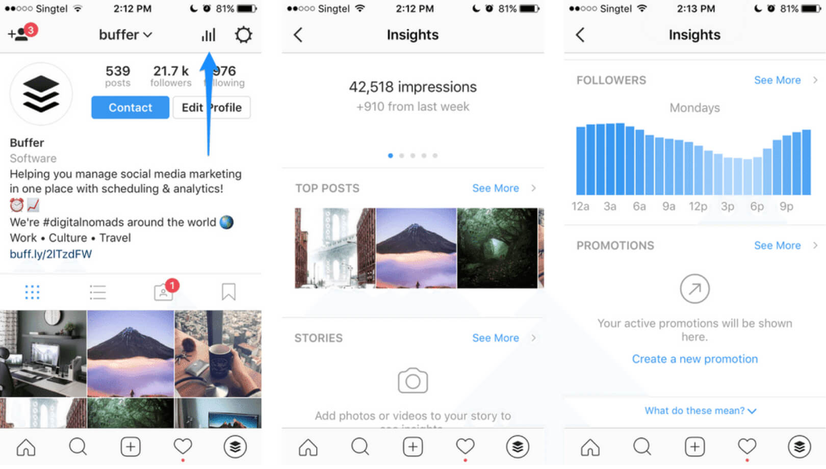
With an Instagram Business Profile, you’ll get access to Instagram Insights. It provides you with charts that include a complete data overview of your posts, profile, stories, and advertisements. Instagram Insights also provides you with the time and day when your followers are most active on your account.
Gender and Age Range
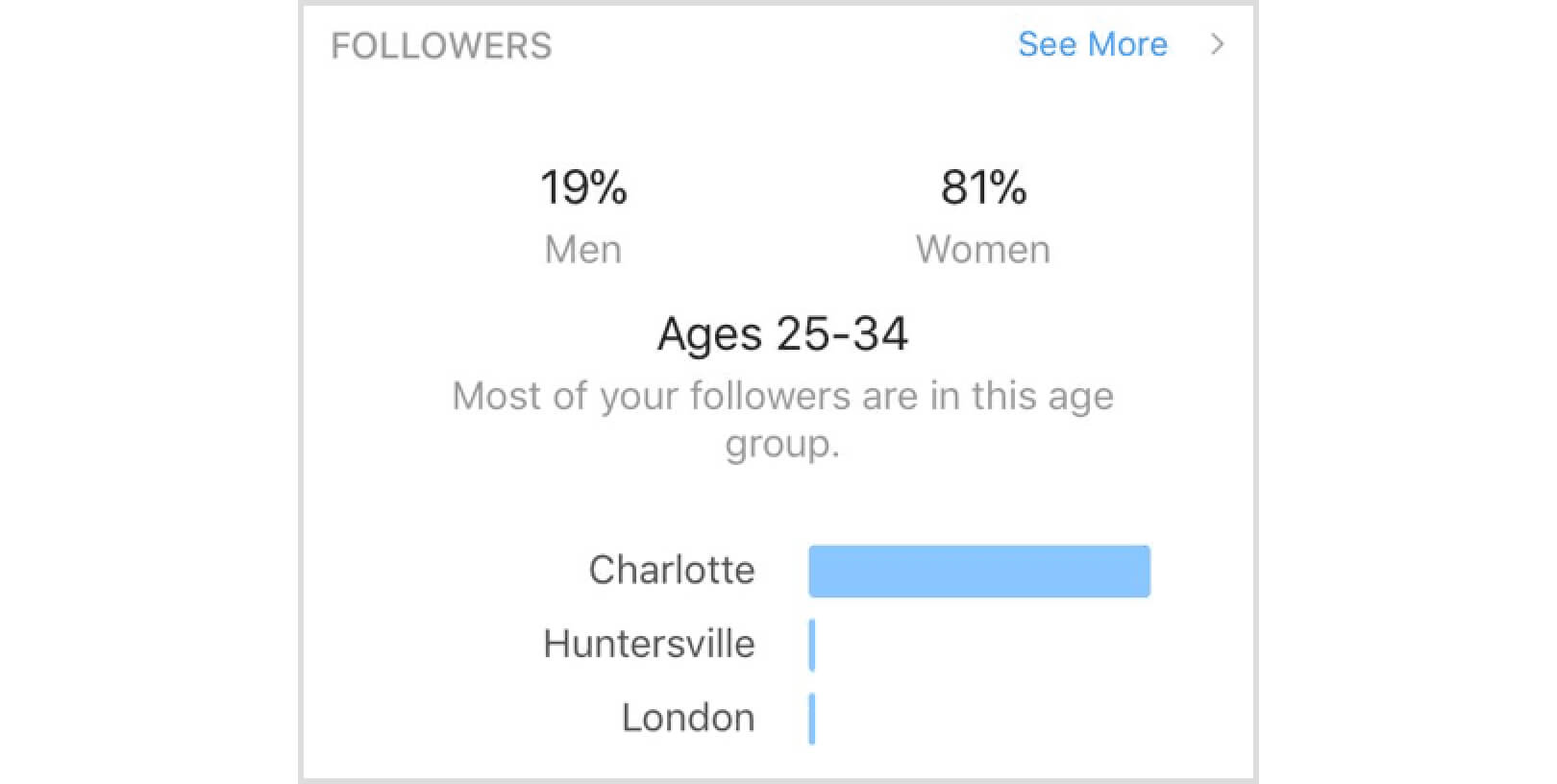
It’s always beneficial to know the age range and gender of your target audience, especially on Instagram. For example, if your audience is younger, you might need to post more often as younger people tend to be very active on Instagram.
Top Locations

Like the gender and age range charts, knowing your audience’s location can help you improve your posting schedule and the content itself. By viewing your top cities, you’ll learn what time zones most of your users are in, which can help you find your best time to post your content.
Reach
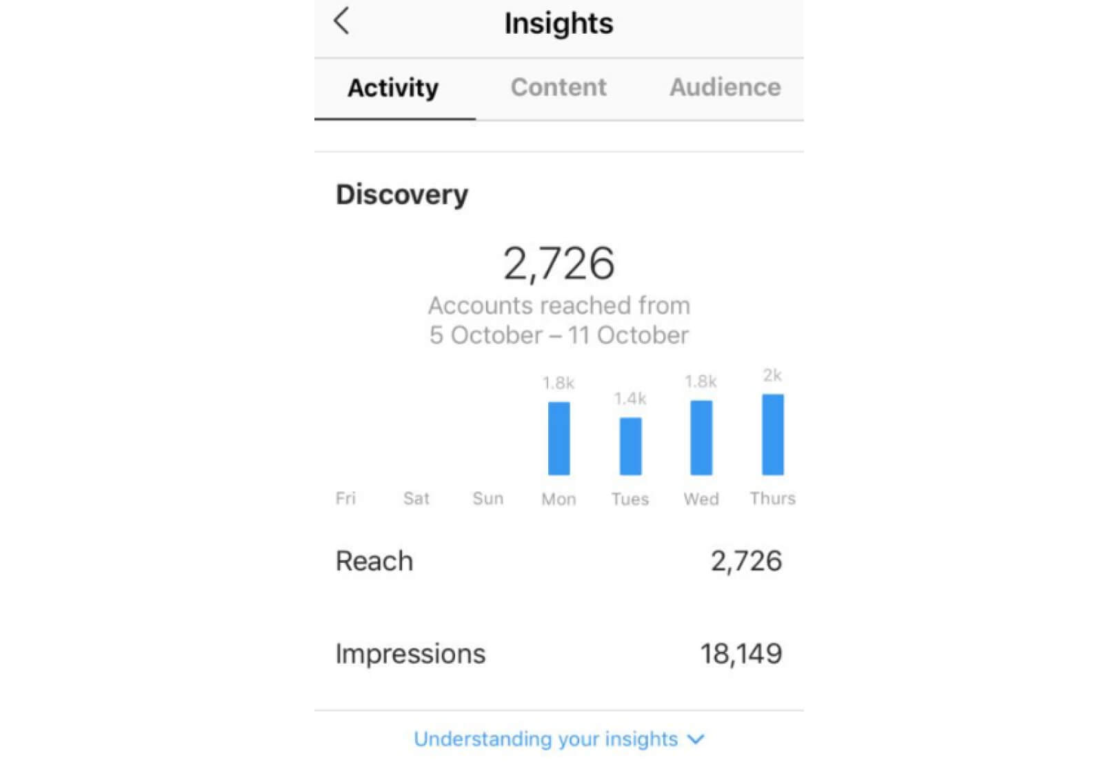
The reach tab shows you the number of views for your Instagram account, filtered by unique users.
Stories Analytics
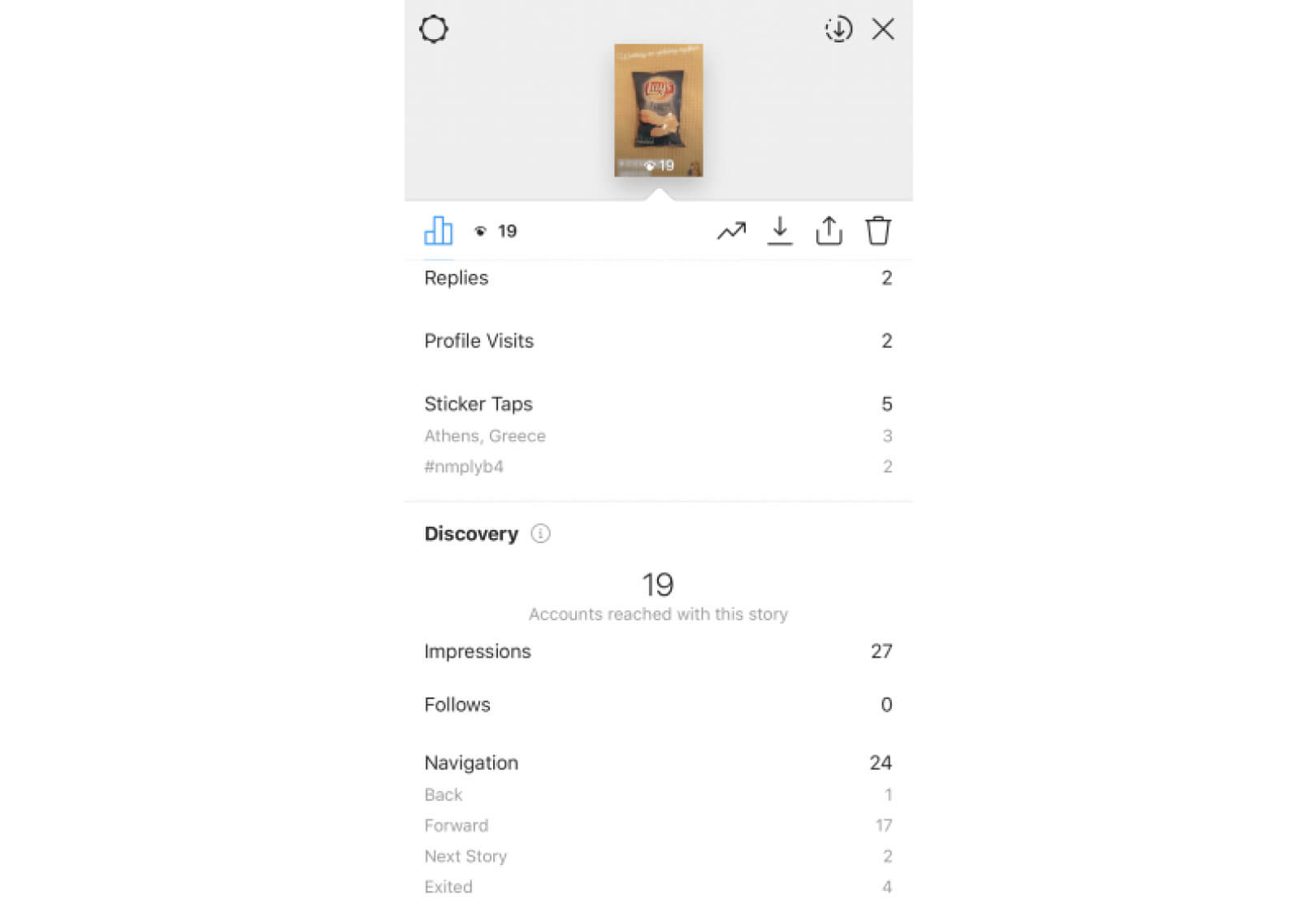
In the same manner as with Instagram posts, through Insights, you can also find data on the reach and impressions of your Stories. You’ll find the following important metrics:
- Exits: Exits are the number of times a user has swiped out of your story. This metric can be incredibly useful in showing you where you need to improve in your stories so you can retain users until the story is over.
- Replies: Much like the engagements with your photo and video posts, replies are a direct interaction from the users with your story. But contrary to comments on your posts, story replies go to your inbox and are not public.
Video Engagement
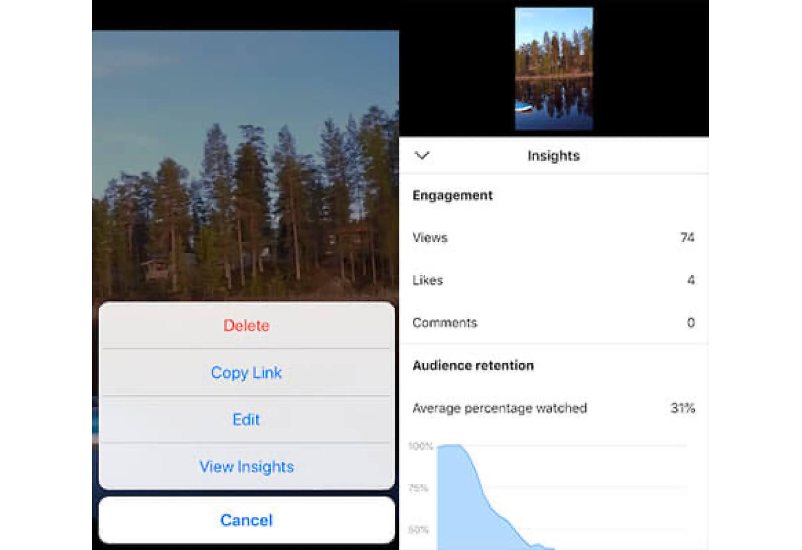
Similarly to your Instagram Stories and posts, you can see how many times your IGTV videos have been viewed, liked, and commented on. Here, you need to focus on your Audience Retention. A “view” on IGTV is made every time a user watched a minimum of three seconds of the video. If the views are high, it doesn’t mean that someone watched the whole video.
On the other hand, the Audience Retention data lets you see how long you’ve retained your audience’s attention.
You need to also concentrate on your Average Percentage Viewed rate. That metric tells you whether viewers watched an entire video, or they skipped forward.
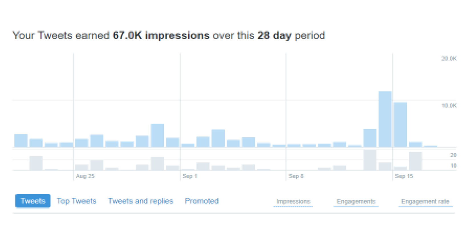
Twitter Analytics
Twitter provides you with a 28-day overview of your profile performance. This summary involves profile visits, follower, impressions, and mentions. You can export the data and visualize the report further.
Audiences
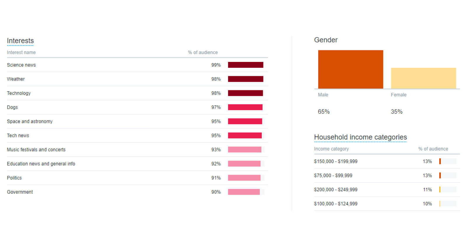
In the Audiences tab of Twitter Insights, you can find the interests of users that viewed or engaged with your tweets and landed on your website. You can also see data for various personas, such as Millennials, and users with defined annual incomes.
With this information, you’ll be able to develop content that resonates with your audience.
Demographics
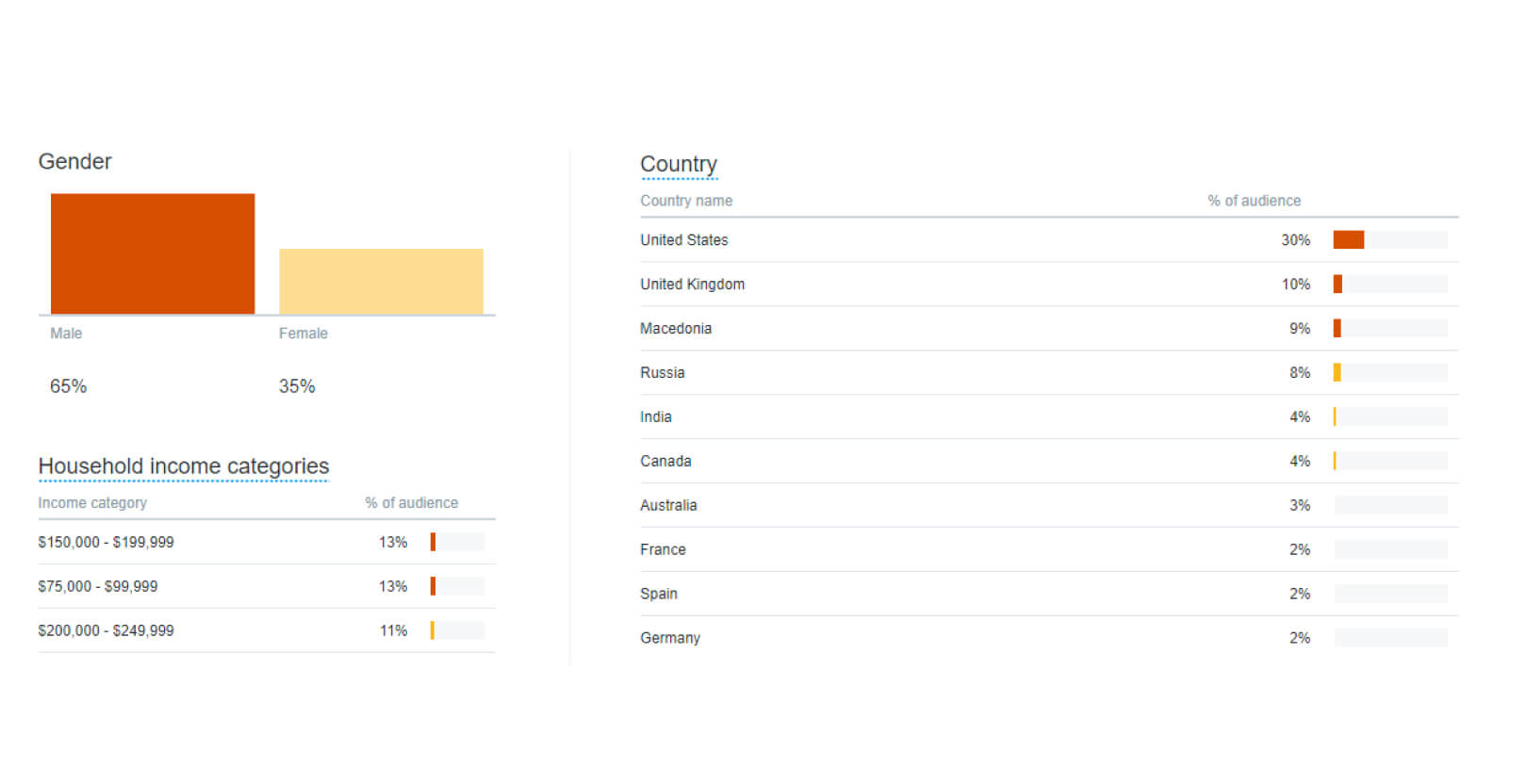
The Demographics report gives you an overview of your audience’s gender, location, net worth, etc. Pay attention to the Country and Region stats. Inspect this data for audiences you want to aim for.
Impressions
Evaluate the impressions of your best tweets, search for commonalities. Ask yourself the following:
- What is the general tone of your best tweets?
- What hashtags are in the tweet?
- Did you include videos or images?
- Is there a CTA?
- If there’s a link, is it included at the beginning or at the end of each tweet?
- At what time of the day was the tweet posted?
Pinterest Analytics
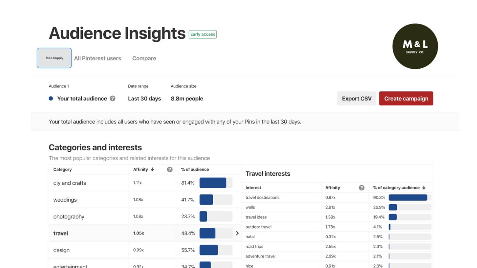
The Pinterest Analytics dashboard displays impressions, audience, and web interactions. You can get more detailed reports for each of them and gauge exactly which posts or boards bring you the best results.
There are seven metrics that you need to track on your Pinterest visual dashboard to evaluate how well your content performs on the platform:
- Impressions: Pinterest impressions include the number of times your content shows up in the user’s feed. Examine which categories and keywords bring you the most impressions. For instance, if you notice that an infographic performs well, you might want to focus on producing more of that type of content.
- Repins: Repins are the number of saves that your pin gets. They’re similar to retweets on Twitter. It indicates that users like your pin and they want to share it. A repin is more important than an impression.
- Clicks: Clicks determine whether you pin bring traffic to your website. This metric is fundamental if you’re aiming to increase traffic via Pinterest.
- Top Pins: Your Top Pins are an excellent way to establish your best-performing content. If you’ve posted a series of pins that resonate with your audience, you can use the data from your Top Pins to create similar posts for your next campaign.
- All-time Stats: These stats include your most repinned pins, pins that performed best in searches, and your most interactive pins. You can use this information to enhance your new content and give your audiences exactly what they want to see on your boards.
- Audience Affinities: An overview of the categories that your followers interact with and the top boards where your content is pinned. This will help you grasp how and why your content attracts audiences.
- Saves: A save indicates that users love your content and are endorsing it. Saves boost the reach of your pins and are also a sign that users want to continue interacting with your content.
Using Data Visualization Outside Social Networks
There comes a time when you need to present your data in front of your sales team, the board of investors, or the marketing agency that you want to work with. The following tips will help you visualize your social media data better and extract as much as possible from it.
Determine Your Goals
Before you develop your social media campaign dashboard, you need to keep your marketing goals in mind. Ask yourself the following:
- Will the data help me make better decisions?
- What questions can I answer with this data?
- Is this data important for my ROI?
- What types of graphs or charts will fit my data?
- What are the goals that I need to achieve with my data?
Understand The Graphs and Charts
When it comes to data visualization in digital marketing, you have a broad range of options. There are various types of charts, graphs, diagrams, and other forms of visualizing data. Every graph displays data in a certain way.
Here’s what you need to be familiar with about graphs and what they can be utilized for.
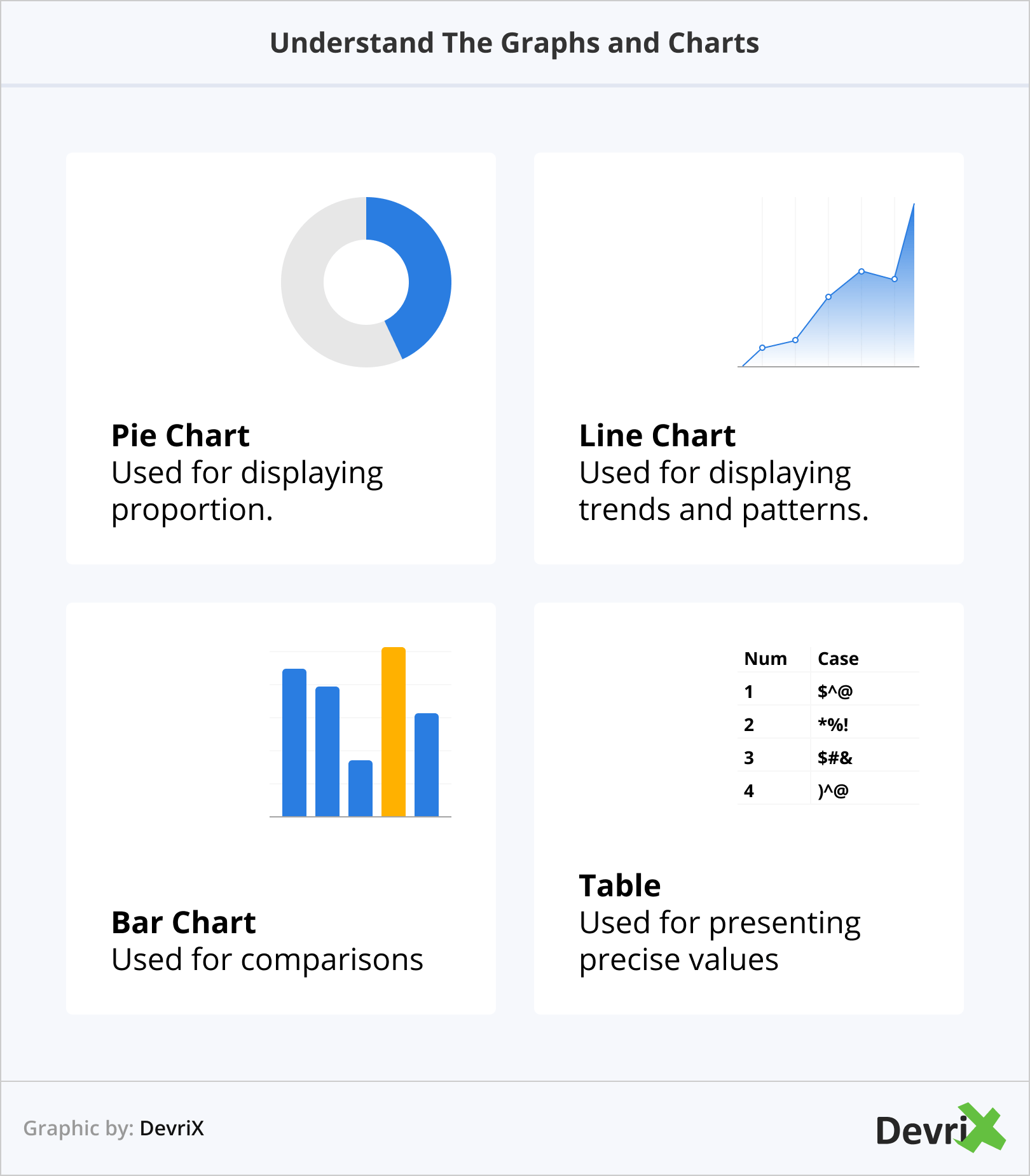
- Pie chart – Used for displaying proportion.
- Line chart – Used for displaying trends and patterns.
- Bar chart – Used for comparisons.
- Table – Used for presenting precise values.
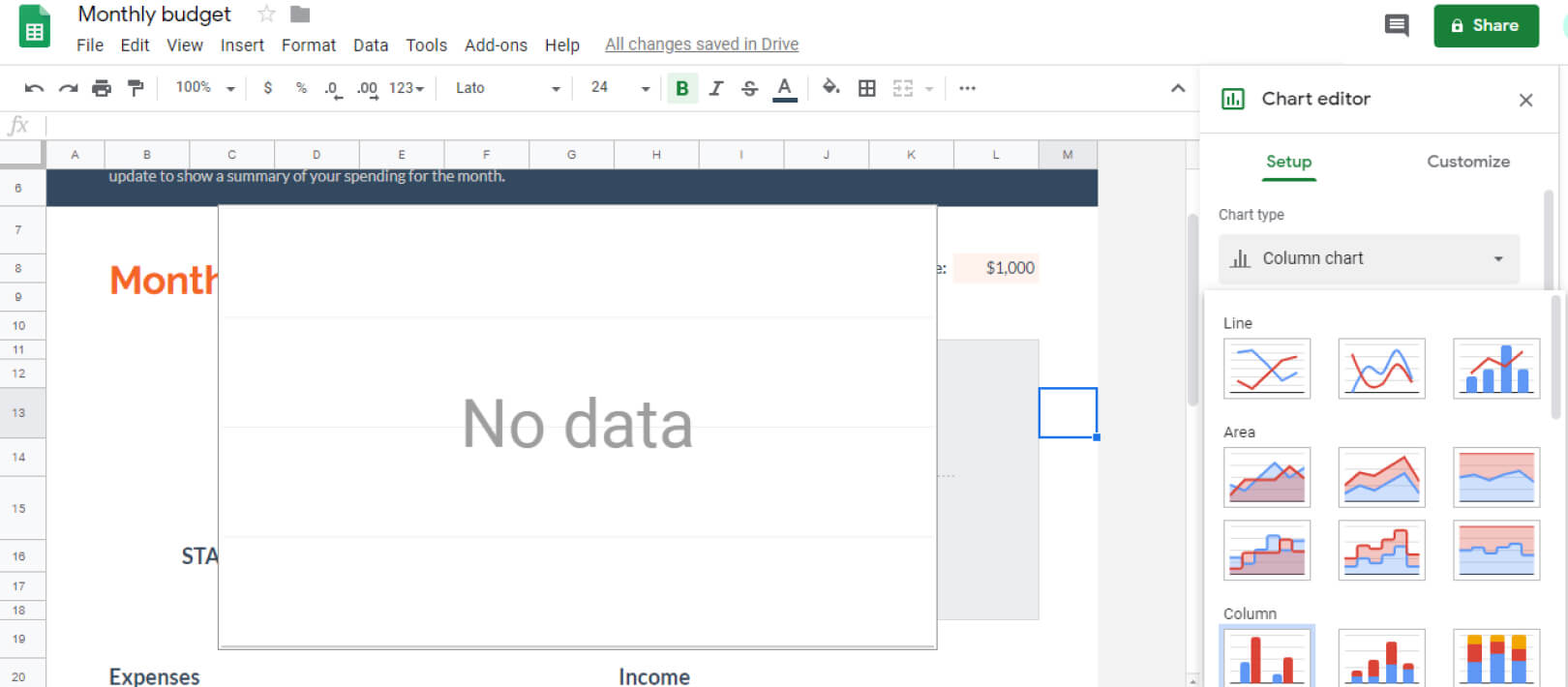
The easiest way to create a graph or a chart is to use spreadsheet software such as Microsoft Excel or Google Sheets. Both of them provide you with numerous visualization methods, and Google Sheets also allows you to create maps and timelines.
Keep color in mind
Even though it’s enticing, using too much color in your graphs and charts is not advisable. Too much color can be distracting. It can prevent your audience from understanding the information that you’re trying to convey.
Here are some useful tips on how to incorporate color into your data visualization strategy.
- Use Color Gradients: For example, using a shade from lightest to darkest can illustrate how data from a previous period became unimportant today.
- Highlight: A strong shade can accentuate a particular metric that you want your audience to focus on.
- Give Each Color a Value: This is useful if you want to utilize colors to illustrate values in a given range. For example, blue could represent a metric over 70 percent and yellow for anything below 20 percent.
- Group Data Together: For instance, you might use dark blue for Facebook, light blue for Twitter, and pink for Instagram.
- Use Brand Colors: This will guarantee that you don’t overdo it with too much color.
Know Your Audience
Knowing the audience to you will visualize your data to is key. Personalize your presentation to the audience. Use their language to explain the data.
Keep in mind that people are busy, you shouldn’t overload them with too much information. Also, make sure that the values in your charts are precise, particularly when you need to convey decimal points.
To use and present data effectively, it must be concise. Keep things simple and stay away from anything that will clutter your data visualization design. The data should speak for itself with effective digital storytelling techniques.
Wrapping Up
Social media data visualization works! It brings more context and preciseness to your marketing decisions. From analyzing your audience to choosing the right KPIs for your social media marketing campaigns, it’s important to learn how to interpret and visualize data that conveys your detailed marketing insights.
Make sure that your analysis leads to a better engagement, more brand awareness, and ultimately, bigger ROI for your company.
Team DevriX
This article is crafted by DevriX's seasoned marketing team, boasting over four decades of collective expertise in crafting sophisticated marketing funnels, devising comprehensive content frameworks and pillars, implementing engaging email campaigns, and creating impactful social media content designed for scalability.
Our marketing experts specialize in the complete spectrum of inbound marketing strategies. As an accredited HubSpot Agency Partner and a Semrush Partner, we engage in meticulous research, blending our extensive experience with the unique insights of our highly skilled team.
We set benchmarks in content creation by incorporating cutting-edge marketing trends, leveraging in-depth industry research, and utilizing state-of-the-art AI tools for data segmentation and captivating content hooks. Our proficiency extends across a diverse range of sectors, including working with SMEs, Fortune 1000 companies, global B2B brands, major publishing entities, WooCommerce platforms, business directories, and affiliate networks.