In today’s digitized world data visualization technologies and techniques are crucial for analyzing huge amounts of statistics and making evidence based decisions. These enable professionals from many fields to present information and data in a graphical format and pull insights from it.
Data visualization enables businesses and organizations to communicate information in a universal manner. It makes complex findings look easy to comprehend and interpret.
With the help of different elements like charts, graphs and maps, supported by data visualization tools, it is easy to identify trends and patterns.
In this article, we will dive deeper into what makes data visualization so important. We will also discuss the benefits of presenting data graphically and walk you through the different techniques you can use to showcase this information in the most effective way.
So, buckle up and prepare yourself to learn some hot tips to visualize data like a pro.
Why Data Visualization Really Matters?
Graphics make statistics and raw information more easily comprehensible by almost anyone, regardless of their analytical skill level.
Practically every industry uses data in some form and benefits from making people more aware of it. Fоr example, governments use it for making critical socio-economic decisions, teachers use it to track student performance, businesses make sense of it to improve their strategies and processes. Publishers can also use data to analyze ads performance and improve revenue.
All these fields accumulate massive amounts of raw data on a daily basis which provide a source of abundant knowledge. So, displaying findings visually can give numbers context and can help any person – noob or pro, the ability to wrap their heads around it. It could also win them over as your followers or brand ambassadors.
Additionally, data visualization can be used for modern day storytelling. It combines both the technical and creative aspects of presenting facts and can help us make a valuable point. It can give us a pretty clear idea of the exact impact and outcome of an event, so we can precisely inform others about the when, where, how, who and what we have discovered.
The Benefits of Good Data Visualization
Effective visualization is an elegant act of combining data, functionality and form. It’s a bit more complicated than simply adding numerical values onto a graph. So, getting it right has some benefits.
It’s a visual art that keeps our eyes on the message
Our brains process visual information more effortlessly compared to written information. Using a graph or a chart helps to better summarize complex data and communicate it effectively, thus improving the decision-making process.
It reflects changes in a timely manner
Data visualization tools help acknowledge real-time changes as they happen. For example, this is incredibly helpful to businesses when it comes to responding to rapid market changes and identifying new opportunities. What is more, the reports from these tools can encapsulate complex information on a single or multiple graphs, thus enabling decision-makers to more easily interpret their elements.
It clearly showcases trends to spot new opportunities.
Another benefit of visualizing data is that it allows to make connections between operations and business performance. Such insights are essential for linking market performance and business functions to improve how a company navigates in a competitive environment.
The data collected can uncover many opportunities for companies and visualizing it can help with monitoring key performance indicators as well as spotting market trends and shifts in large data sets.
Common Data Visualization Techniques
Making good sense of data begins with visualizing it adequately. There is a wide range of techniques to translate and present information and make correlations between different data sets in an effortless way.
Picking the right approach is very important to ensure that the information is understandable as well as allowing you to unlock its full potential and make it relevant.
The most important factors that lead such a choice include:
- Knowing your target audience.
- Being aware of the type of data you’re dealing with.
- Recognizing the context that it would be used in.
- Understanding how the data changes.
- The purpose of the graphical representation.
Keeping the above in mind, here are a few of the most common data visualization techniques.
Plots
Data plots allow for the distribution of two or more data sets in a 2D or 3D space. These help demonstrate the relationship between various data sets and their parameters. There are different types of plots – bubble plots, scatter plots, box plots.
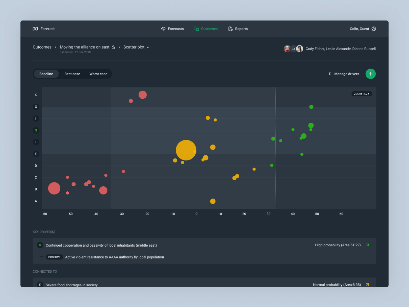
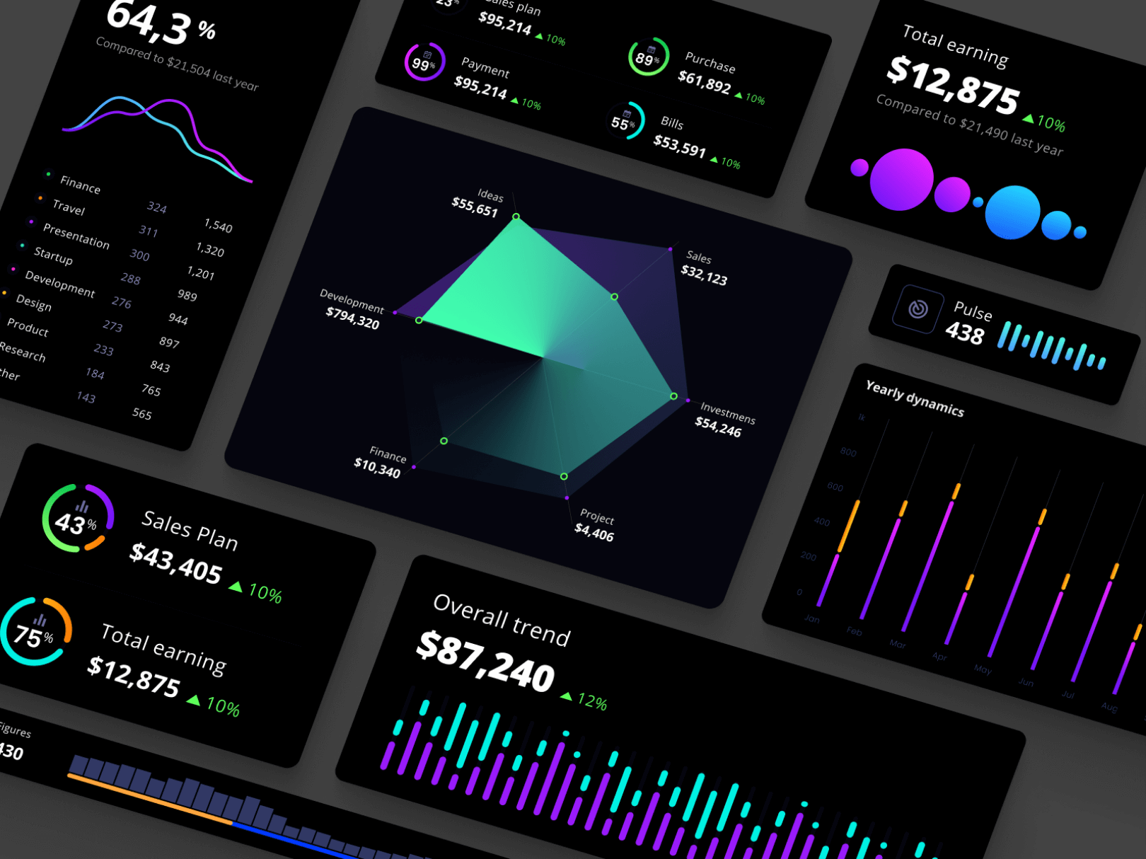
Charts
Visualizing data with charts is the easiest way to show the development of one or multiple data sets. Charts can vary from line charts, which show the relationship between elements over time, pie charts, which show components of elements as part of a whole and bar charts, which compare data as part of a whole and over time.
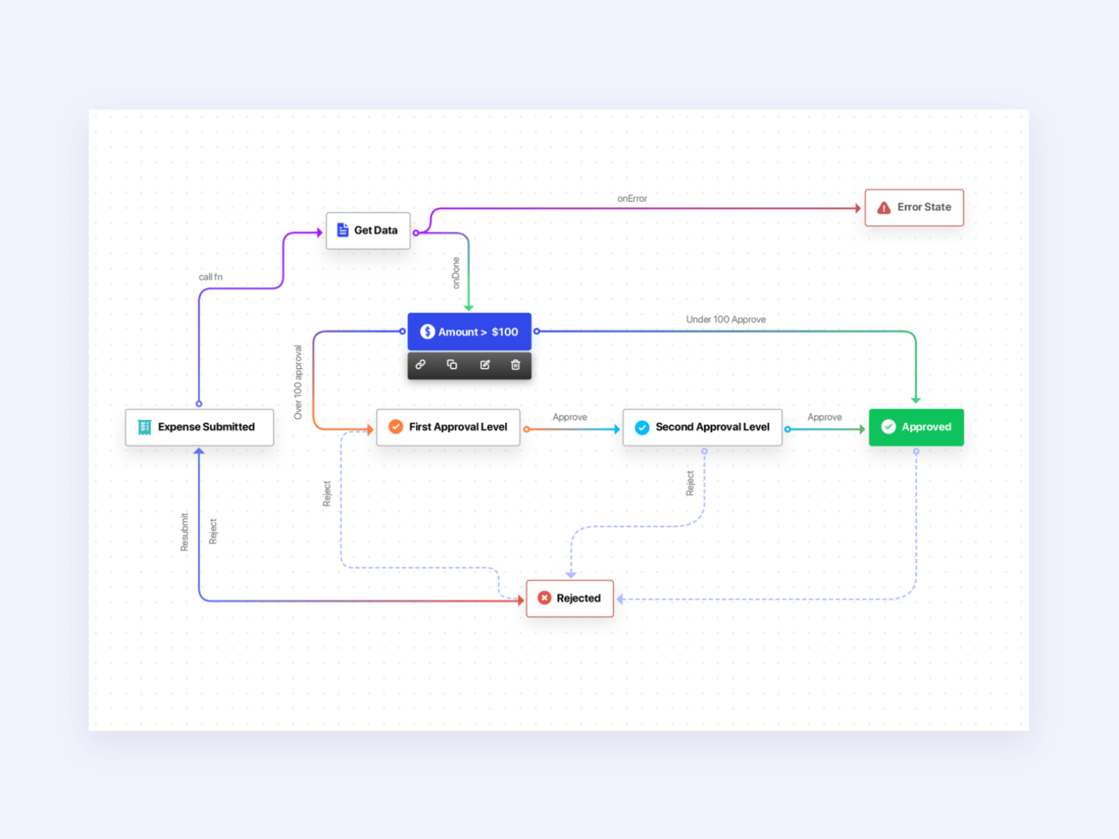
Diagrams
Diagrams are often used when demonstrating complex data relationships and links. These can combine various data types in one visual, and can be multidimensional, hierarchical, tree-like.
Maps
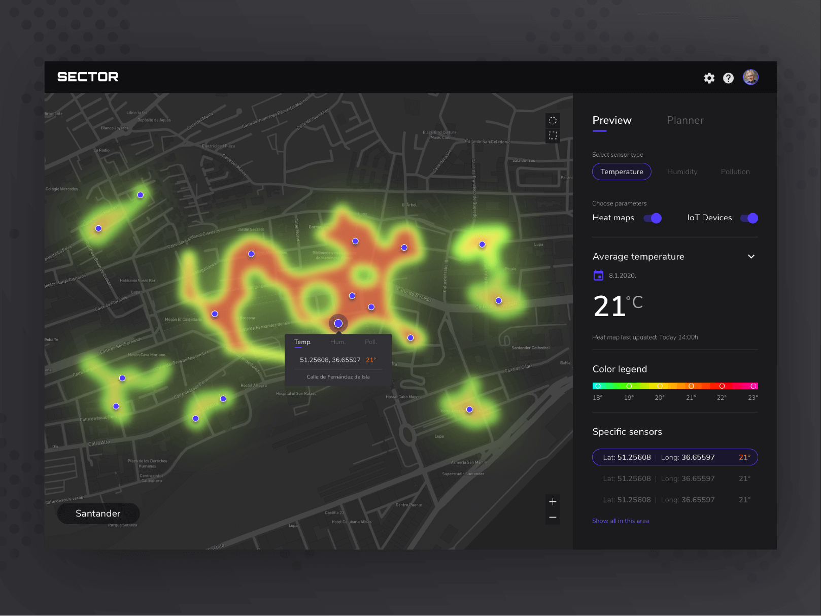
Data maps are used to locate elements on relevant object areas. They are used in many industries and can take the form of geographic maps, website layouts, building plans, etc. The most popular types are dot distribution maps, heat maps, and cartograms.
Matrices
Using a matrix is a very advanced way to visualize data. This technique helps determine the correlation between multiple data sets that are constantly updating. It’s often used to identify problems, machine specifications with requirements, allocating resources depending on needs or competencies, comparing possible solutions, reviewing how well requirements are met, identifying areas for improvement.
Some Data Visualization Tools to Check Out
To help you make the most out of your data, here are 5 visualization tools you can use.
Tableau
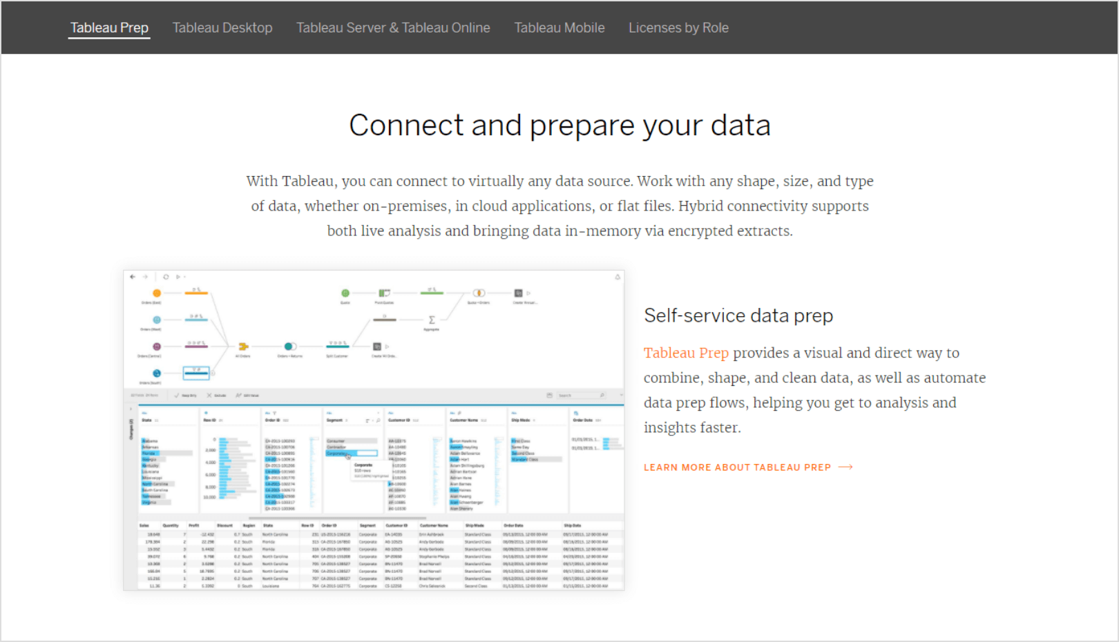
Tableau is a good tool for enterprise data visualization. It provides a comprehensive cloud-based analytics solution, designed to help the users extract and communicate meaning from data in the most efficient way.
Pros:
- It’s easy to use and mobile friendly.
- It allows connecting of multiple data sources.
- It offers high visual quality
- It enables structuring data into comprehensive, fully functional and interactive data boards.
Cons:
- It can be a bit too expensive for small and medium businesses because if they want to use all functionalities they have to purchase the extended license.
- It requires proper implementation, deployment, maintenance and staff training. It offers limited after sale-support and maintenance.
- It doesn’t provide the centralized security that companies need for their confidential data.
It has a limited capacity to act as a sophisticated business intelligence tool.
What’s it good for: wholesale and retail, education, marketing, healthcare, insurance, and manufacturing.
Google Charts
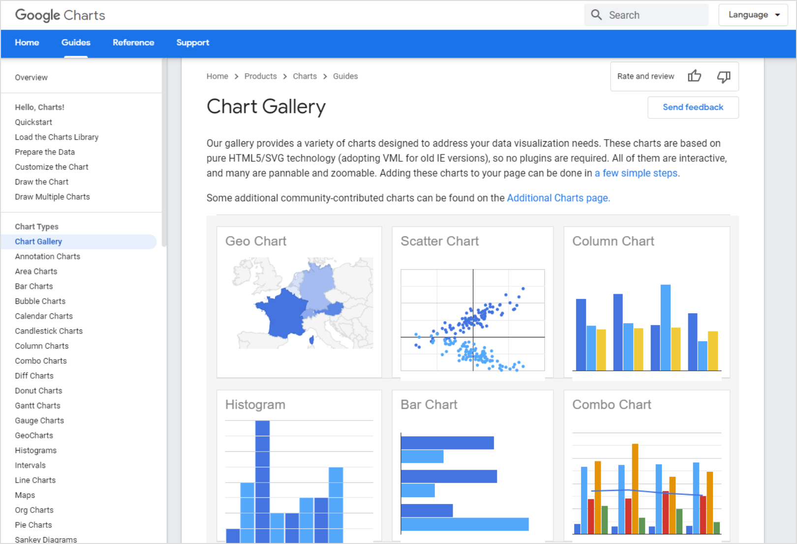
Google Charts is completely free. It can be used across platforms and enables both embedding graphics and downloading them.
Pros:
- It is highly customizable and easy to use.
- It boasts an active community that can provide support.
- It allows you to use data from various sources.
- It’s completely cloud-based and can be used with any device.
Cons:
- It doesn’t provide very advanced chart types, so the graphs are rather simple.
- It requires continuous web connection and can have problems when working with one collaborator at the same time.
- It doesn’t provide training sessions and when trying to work with large data sets the process speed is low.
What’s it good for: marketing, retail, media, and for personal use.
Infogram
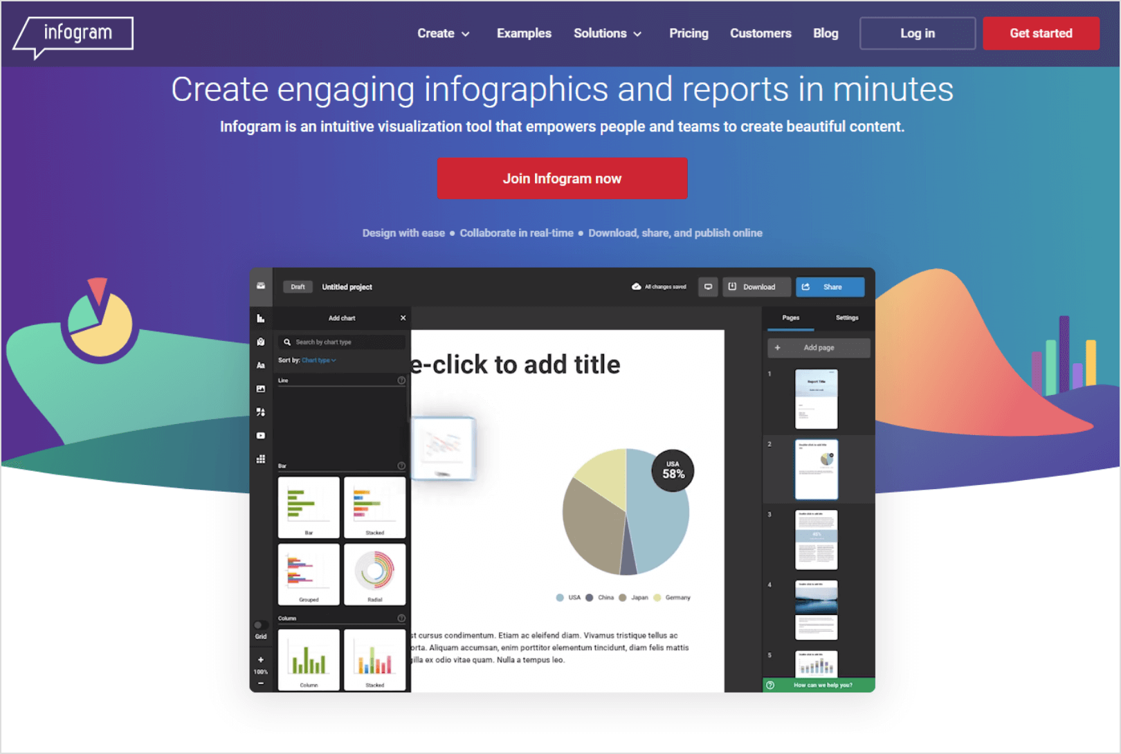
Infogram allows you to connect data visuals to live data sources such as Dropbox or Google Analytics. It also allows you to search through public data, like the UN or the World Bank.
Pros:
- It has a library of over 200 maps and 35 charts to choose from to represent your data.
- It allows you to make interactive designs with embedded videos or toggled data sets.
- It enables you to embed graphs on a webpage or download them.
- It has various plans that can be tailored to the needs of a company and offers training and live support.
Cons:
- It doesn’t enable you to produce the most visually elaborate infographics.
- The basic package doesn’t allow rich text editing.
- It only supports desktop devices.
What’s it good for: healthcare, marketing, retail, media, and real estate.
ChartBlocks
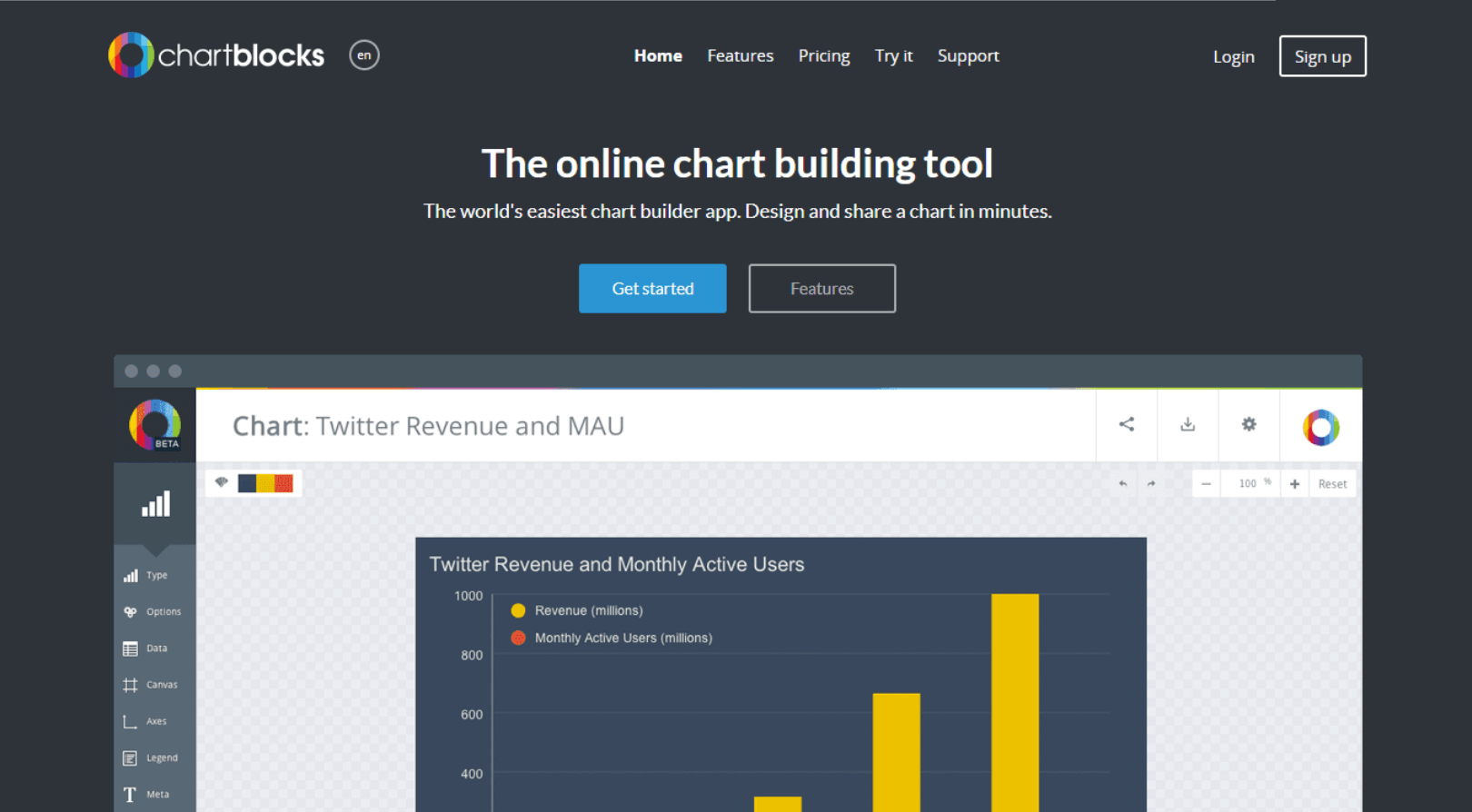
ChartBlocks is appropriate for small, medium and large enterprises with flexible pricing and good customer support.
Pros:
- It offers various chart types as well as pre-made templates with editable fonts, colors, sizes, grids and legends.
- It allows users to create personalized charts that can be optimized for different screens and print materials.
- Your charts can be linked online or downloaded similar to Infogram, and you can integrate them on social media as well.
Cons:
- You cannot upload large amounts of data.
- It’s only web based, so it doesn’t support mobile or desktop devices.
- The charts created are rather basic and sharing them requires an embedded code.
What’s it good for: marketing, retail, media, and for personal use.
Databox
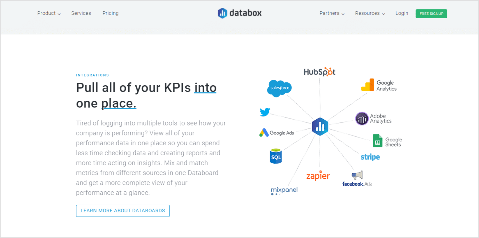
Databox is easy and simple to set up. It allows you to connect various data sources and stores that data in a centralized system.
Pros:
- It supports different devices and has responsive customer support.
- It has flexible pricing, making it appropriate for small and medium enterprises.
- It has easy to read dashboards, and allows you to set a reporting structure that works best for you (Daily, Weekly, Monthly) and can track your goals.
Cons:
- It doesn’t have a notification system to warn you about changes.
- The pricing although flexible can be costly for some users.
- It has limited customization options.
- It requires you to take time to learn how to operate on it.
What’s it good for: marketing, retail, media, and for personal use.
Conclusion
So there you have it! We’ve covered the most important aspects of data visualization – why it matters, what are its benefits and which are its best practices. We touched upon the most common techniques to use when displaying data graphically. And finally, we’ve listed five tools you can use to help yourself visualize trends and patterns, and communicate your findings in the most efficient way.
We hope you give data visualization a try. In case you already have, may our suggestions inspire you to improve your processes so you can visualize data like a pro.
Team DevriX
This article is crafted by DevriX's seasoned marketing team, boasting over four decades of collective expertise in crafting sophisticated marketing funnels, devising comprehensive content frameworks and pillars, implementing engaging email campaigns, and creating impactful social media content designed for scalability.
Our marketing experts specialize in the complete spectrum of inbound marketing strategies. As an accredited HubSpot Agency Partner and a Semrush Partner, we engage in meticulous research, blending our extensive experience with the unique insights of our highly skilled team.
We set benchmarks in content creation by incorporating cutting-edge marketing trends, leveraging in-depth industry research, and utilizing state-of-the-art AI tools for data segmentation and captivating content hooks. Our proficiency extends across a diverse range of sectors, including working with SMEs, Fortune 1000 companies, global B2B brands, major publishing entities, WooCommerce platforms, business directories, and affiliate networks.