With time and technology flowing by our side, launching an online store has become easier than ever. People tend to take their businesses online and give it the form of an eCommerce website in pursuit of attracting online visitors and improving sales. In order to boost conversions on your online store, there are a few factors to track.
Make sure you are aware of the multiple components of a successful eCommerce website with website design being an indispensable part. The presentability of your online store including your products, landing pages, offers, etc. is a critical factor.
In this article, I’ll be sharing some eCommerce website design tips to boost your conversions. But before that, let me tell you why focusing on a unique website design is essential.
Boost Conversions On Your Online Store With Attractive Website Design
Did you know 94% of people don’t trust outdated websites, and at the same time, 28% of small businesses still don’t have a website at all?
This confirms the direct impact of website design to boost conversions on your online store. You have very little time for laying your first impression on your website audience. Not only this, but a good website design also aids your SEO and ranks your website on the SERPs. And we all know this is one thing that we cannot afford to ignore.
People will always judge you and your business according to their browsing experience. In the digital business world, your website design is your customer representative.
When you run an eCommerce business, customers perform transactions on your website. If they don’t trust you, they will not buy from you.
Yes, you heard it right.
For converting your visitors, it’s necessary that they believe you, and website design plays a crucial role in doing so.
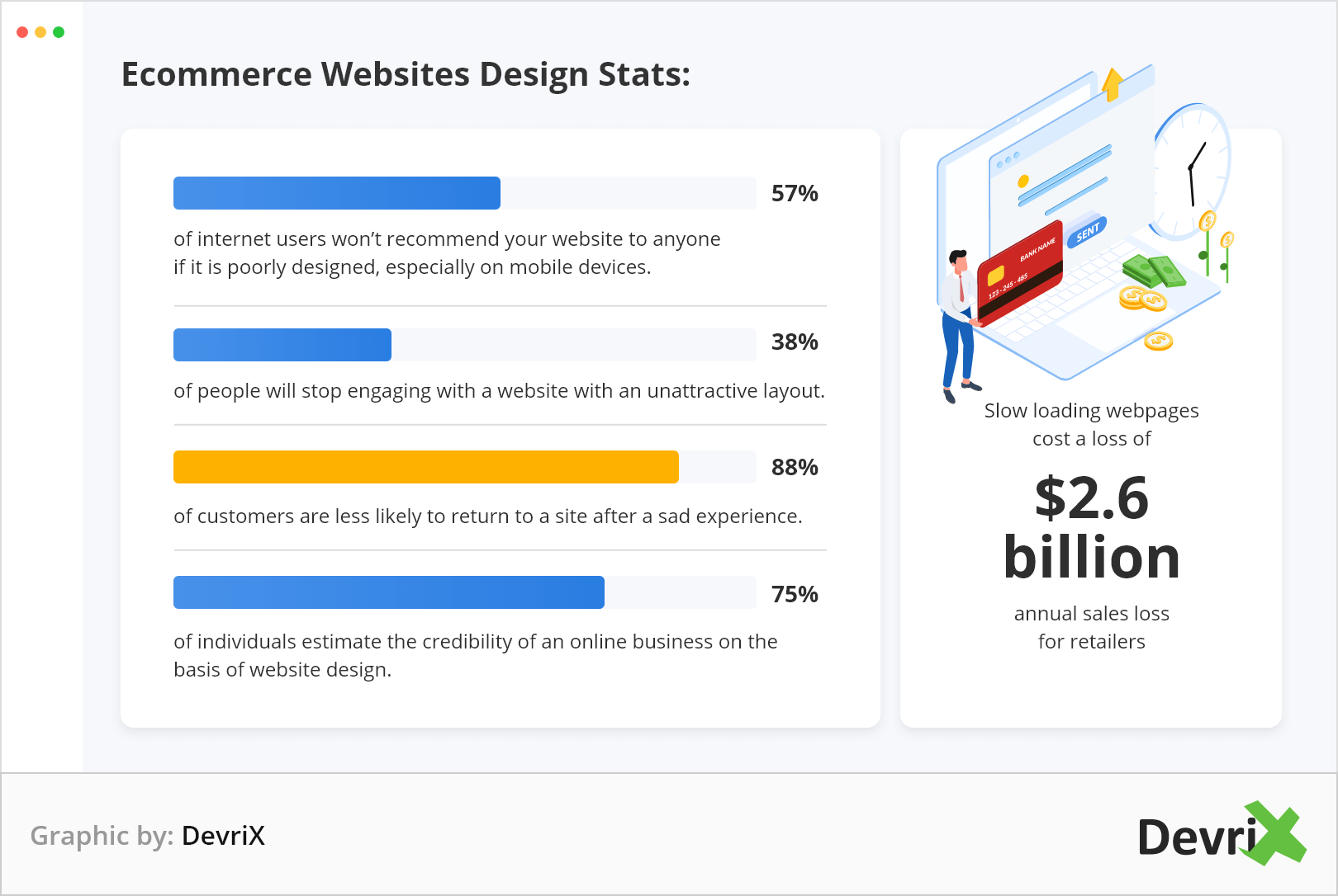
Let me share some eye-opening eCommerce websites design stats:
- 57% of internet users won’t recommend your website to anyone if it is poorly designed, especially on mobile devices.
- 38% of people will stop engaging with a website with an unattractive layout.
- 88% of customers are less likely to return to a site after a sad experience.
- Slow loading webpages cost a loss of $2.6 billion annual sales loss for retailers.
- 75% of individuals estimate the credibility of an online business on the basis of website design.
Until now you must’ve understood how important it is to optimize website design. All this is to make you understand that it is the design of your eCommerce website that will decide how users will perceive your business. Bad website design can become a potential enemy for your business credibility.
Tips to Create an Attractive eCommerce Website Design in 2020
Now coming to the most important part of the article. Let’s check some really important eCommerce website tips to boost your conversions and grab those leads:
1. Keep Your Branding Consistent on Your Website
Branding highly influences your website conversions. Let’s check out the brand that has mastered the fine art of branding, Apple.
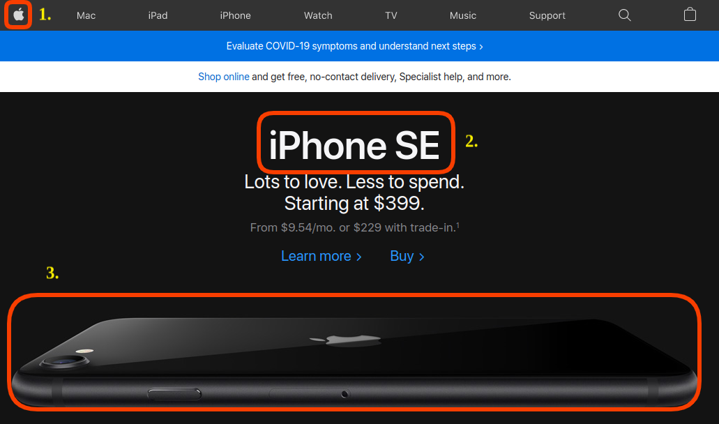
Apple has sparingly showered the branding all over their page. If you’ll explore their site you’ll find that they have presented branding elements on the landing pages subtly, without making it overwhelming for their users.
So here the key points that I’ll like to bring to your attention from Apple’s example:
- A unique logo at the perfect spot that’s visible and at the same time not overwhelming.
- A brief text describing the goals and objectives of the organization and conveying the message to their audience.
- Combined with a sleek product image.
Building a brand is like telling a story that is often misunderstood. Branding is not just your logo, design aesthetics, or company objectives; rather it’s a combination of all the three elements. Thus, evolving your business into a brand requires telling the audience the right story, something that your audience wants to listen to and read.
2. Give Room to Your Site Elements
Negative spaces play an important role in making your website look clean. But you shouldn’t implement white spaces in a manner that makes the pages look awkwardly empty. Instead, focus on giving your site elements some room.
Check out the example below from MakeWebBetter’s home page:
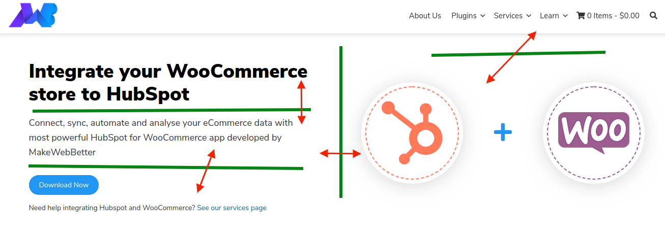
You can see negative spaces are used such that the site elements are distinctly visible to the visitor. While designing your eCommerce website, make use of margins and padding and let your on-page elements breathe visually.
Here are some points for considering negative spaces as an important part of your winning website design strategy:
- White spaces allow visitors to explore your page as they create a break in the page.
- With negative space, the users can hone specific items of a website. You can also highlight the centralized message of your website.
- Negative spaces let the site owner subtly control the flow of a page.
- Last and most important, white spaces make your important site elements like CTAs look well-defined.
In an eCommerce website design, white spaces or negative spaces play a significant role in shaping the user experience and should not be an afterthought.
3. Never Overwhelm Your Users With Too Many Options
When a user visits your website, you want them to take quick actions. But many site owners overwhelm their users with a lot of options.
Let’s understand this theory with the help of the Hick-Hyman law that describes the time taken by a person for making decisions as a result of possible choices.
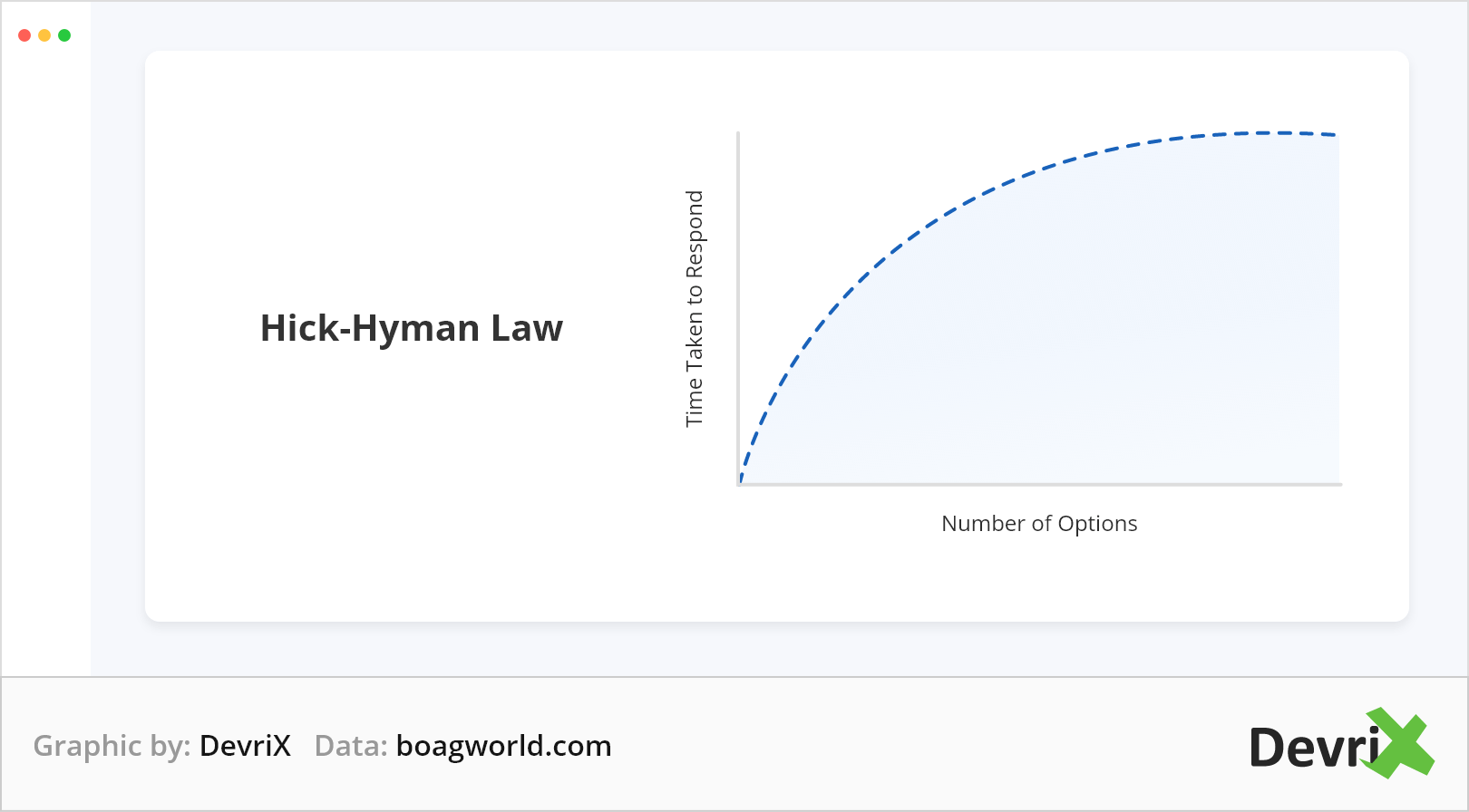
According to the law, the more choices we offer a user; the longer it will take for them to decide. Consequently increasing their chances to abandon the site. There’s another fact we can conclude from this law:
People can give up.
Yes, you read it right.
When people become overwhelmed by the choices on offer, they tend to give up and this is known as Analysis Paralysis. If you don’t want to put your visitors into this situation, then follow the following techniques:
- Limit the number of options.
- Give distinct choices.
- Personalize recommendations.
- Encourage fast decision-making strategies.
4. The Rule of Thirds – A Technique from Fine Arts
The Rule Of Thirds is an age-old technique in fine arts and photography for composing visual content like images, films, and photographs. But nowadays these techniques have become extremely popular among web designers.
It all starts with overlaying two horizontal and two vertical lines that are evenly spaced when designing your site.

The dots refer to the points at which the eye of a user drifts organically when looking at a scene, whether a landscape or a website. Now you know where to place your important site elements so that they can be used at their full potential.
Thus, you can implement this compositional strategy on any type of website.
The composition is an important element in website design. It doesn’t matter how creative you are with your fonts and images if it is presented to users in a messy form. Thus, the Rule of Thirds acts as a supporting theory in organizing the overall layout of your web pages.
Let’s take a look at Adamas:
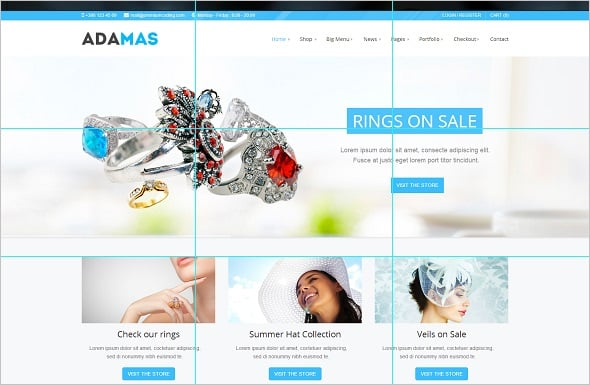
In the above example, the home page and part above the fold are key areas where the rule of third is valid. The reason behind this – the part above the fold is where the main info of a site is.
5. Slow Loading Pages Can Cause Sales Drop
Creating an awesome website design is just not enough. You not only have to create an impressive site but also focus on its performance. Fast loading pages are important for avoiding bounce rates and allow visitors to stay on your website.
People hate slow-loading pages and the audience loses interest in such sites. Thus, making them responsible for your sales drops. You can get an idea of your page performance from Google’s Page Speed Insights.

The main objective of an eCommerce website is to boost conversions and for that, you need to reduce the page load time. Basic stuff like compressing images can be a great savior.
Some other page loading optimization techniques are:
- Invest in a fast and reliable hosting service.
- Distribute your content load with the help of a Content Delivery Network (CDN).
- Use minimal popups on your website.
- Minify your codes by removing poorly coded HTML, CSS, and JavaScript on your web page
- Reduce the number of redirects and broken links.
Always compress images prior to uploading and keep them no larger than what the screen demands.
You can choose any free or premium lightweight plugin for the purpose.
6. Breadcrumbs for Showing Proper Directions
Have you seen signboards in mails or in metro stations, saying “You are here”? Breadcrumbs act as signboards for your website visitors.
A breadcrumb is a navigation scheme used by site owners for revealing the visitor’s location within the website.

The breadcrumbs give the visitors the flexibility to land on any page based on how they arrived thus, avoiding the feeling of being lost. Ecommerce sites generally have dozens or even hundreds of nested categories hence, increasing the possibility of your visitors getting lost.
The breadcrumbs also help the users in efficiently browsing products and finally making a purchase. Breadcrumbs let the customers traverse seamlessly by making giant hops across different web pages.
7. Choose Colors and Contrast to Stand Out From the Rest
Color and contrast play an important role in making your websites distinct from the others. Contrast does justice to your important site elements like CTAs or logos or even important content pieces.
Check out the example below:
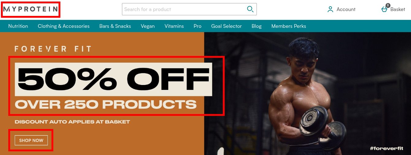
MyProtein has used the combination of colors and contrast to highlight the important elements like the brand’s logo and important offers on the products.
8. Apply the Gestalt Principle For Similarity
The Gestalt principle is also known as the principle of grouping. The law accounts for the argument that the mind has an innate disposition to perceive patterns in the stimulus based on certain rules. It simply means that the human brain tends to automatically group similar objects.
According to the Interaction Design Foundation:
The human eye tends to perceive similar elements in a design as a complete picture, shape, or group, even if those elements are separated.
We perceive elements in a relationship thus, separating them from other design elements. Hence, humans are great at filling “gaps” or connecting “dots”.
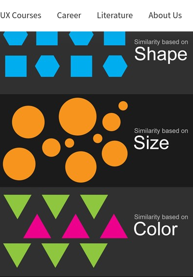
The ability is influenced by size, shape, and color. The principle applies to eCommerce websites quite easily. Let’s see how.
The Gestalt Principle For Ecommerce:
Before starting let me tell you Gestalt is German for ‘forms’. The Gestalt Principle is based on how the human mind perceives visual components on your website and letting the brains create the imagery of the perceived visual.
To apply this principle to your eCommerce website we need to take a closer look at each category of the Gestalt principle:
1. Ground And Figure
A figure is an object that is visually separable from the ground. The idea behind the figure and ground principle is to make both visually distinguishable to avoid perpetual confusion.
Let’s understand this through a real example. Seriously Unsweetened, has followed the principle correctly for separating the figure from the ground.

For highlighting their products and content they’ve painted them bright and kept the ground white. By keeping the background subtle and highlighting the important elements can make your online store’s USP noticeable.
2. Proximity
Nearness in time or space is known as proximity. In the eCommerce context, we’ll be talking about the grouping of different elements for creating a bigger association. Grouping of elements is important for building a seamless relationship between the elements and visual experience.
Proximity comes very handily when designing the navbars or your website, something that Mashable has done in their navbars.
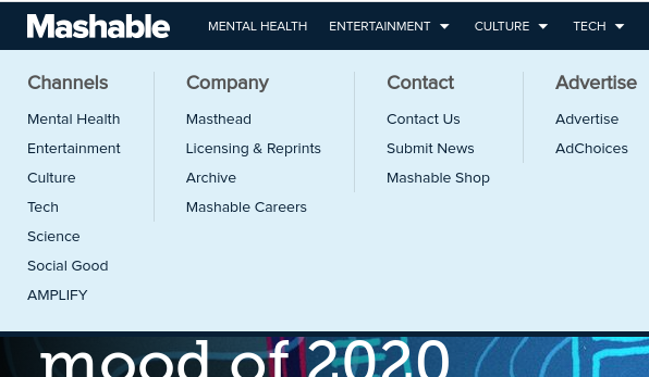
In the snapshot above, you can see just by grouping how elements of the same category are placed in close proximity within the menu.
Amazon is another perfect example that groups it’s elements in correct proximity.
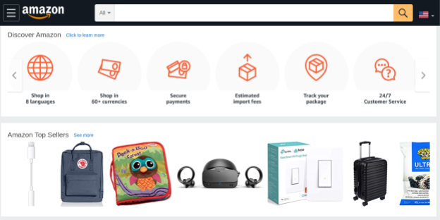
Amazon lists its product in a grid frame in which narrow white spaces, subtle yet profound separate the products.
Proximity is of great importance for navbars, listing products, and even grouping information from lowest to highest importance or vice-versa.
3. Symmetry
Humans find symmetry aesthetically pleasing. Adding symmetry to your website elements creates harmony and makes it comfortable for the guests while viewing your objects.
Here’s a great example of the symmetrical arrangement of the website, HvD Fonts:
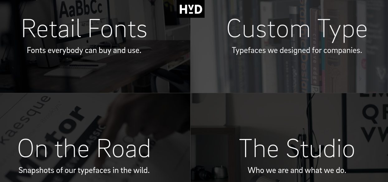
The page dissected the features of its business into equal halves that are written in the same font using the same greyscale theme. Not only this the page has also incorporated the figure and ground principle.
Although symmetry is a perfect and simple way of pleasing the viewers, you can also grasp users with asymmetry. Many websites use asymmetry as an element for balancing all the white spaces. Something like what Xplode Marketing has done:
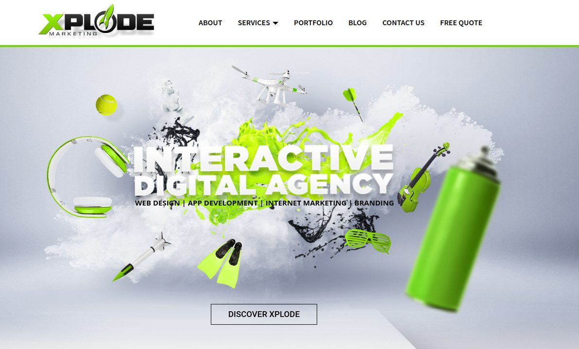
Xplode has used asymmetry in a unique way that shows the aesthetics in a very pleasing manner.
4. Similarity
Proximity works closer to the principle of similarity. Either it is for shape, colors, size, orientation, or any other property. Connectivity should prevail among the objects in the same proximity.
Check out this example of Influenster’s landing page:

The similarity can be easily seen through clearly aligned boxes. I know, the products in each box are different but the conception is conveyed by consistent text fields on the overall page.
5. Closure
The human brain is trained to fill the gaps in incomplete objects thus, visually completing the figure and seeing it as a whole. This is what is called the principle of closure. The positive and negative space close to one and form a whole bigger picture.
Let’s understand the concept with an example, Cult:

Even though the text does not spell clearly but the human brain can easily perceive what is written. Due to the arrangement and alignment of text in a closure has made it easy to decipher even though the letters are incomplete.
6. Continuity
The final Gestalt principle is the principle of continuity. The continuity is necessary for generating a pattern that can be followed by the naked eye that leads to a consistent path.
Let’s take a look at OscilloScope website:
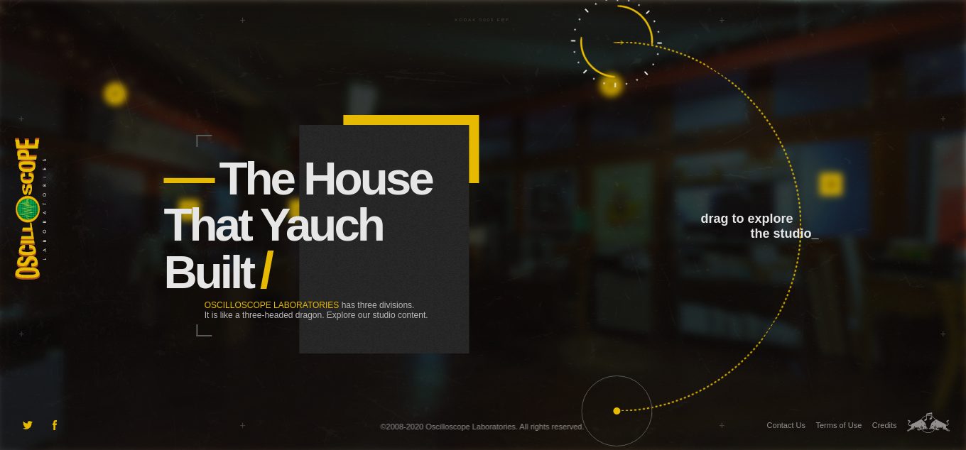
It uses the principle of continuity for giving the web visitors a 360-degree view so that the visitors can navigate their way to the section of their interest.
9. Stay True to Customer Expectations
We as humans have expectations. Also, sometimes we’ve some obvious expectations in certain situations or at certain places. For example, when you visit a restaurant, you expect to get some good food to satiate your hunger.
Similarly, consumers expect certain page elements of your online store. Something as simple as a “Buy Now” button or prices on product pages.
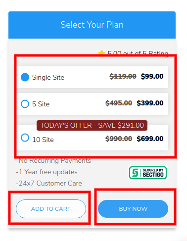
It is a good practice to experiment with your CTAs but sticks to the basics when it comes to maintaining the relevancy of your web pages. It influences the purchase decision of your visitors.
10. Create Different Landing Pages for Paid and Organic Audiences
When creating a landing page, the very first thing that should come to your mind is:
“What is the user context and its objective?”
Every internet searcher is different and has different search intent and goals. They might be searching for the same product on the web but one might have a goal to buy it and the other wants to explore and read about it.
It is advisable to target your paid visitors and organic visitors with different landing pages.
Let me show you an example of an insurance company:
The first screenshot that you’re seeing below is a landing page created for visitors as a result of the search ad.
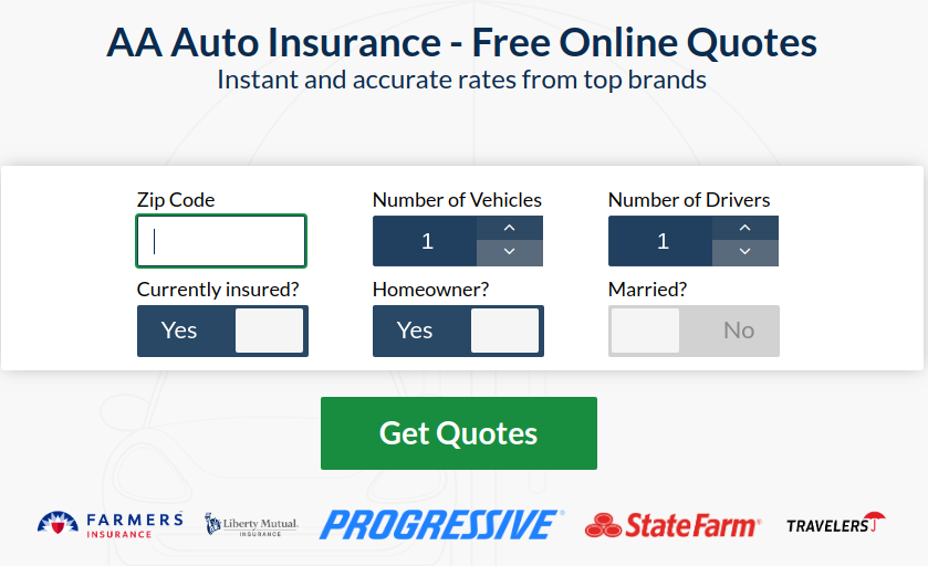
Now here’s another screenshot from the same domain but for a different set of audiences.
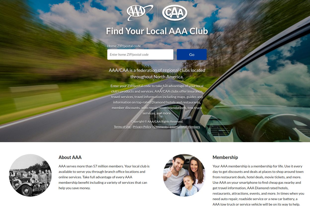
The content for the paid audience is kept short and to the point, with the goal of direct conversion. While in the second example, you’ll see the number of words has increased, intending to rank the page and lure organic visitors.
Remember: Set different landing pages for each campaign you initiate. This will create a unique context for the target users.
11. Leverage Website Visitor Behavior
Creating a winning website design strategy is incomplete if you don’t manage to satisfy your visitors. For boosting conversions, you need to give the audience what they want.
The above points are just the starting steps towards creating web pages that do not break any rules. But you can only determine success when you test it with real visitors.
For creating a user-friendly page, start learning from your visitors and their behavioral data. Basic tools like heatmaps can give you an idea of how your users are consuming the content.
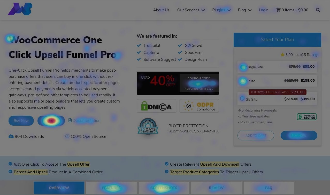
With the help of tools like HotJar, you can very easily collect visitor data such as clicks, scrolls, and moves. You can even visually see what activity a visitor performs when they visit your eCommerce store.
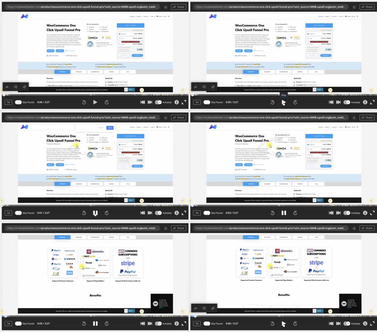
Remember, your eCommerce checkout design and flow are also very critical. You should stick to the best practices of eCommerce checkout optimization for the best results.
Final Words
So these were some basic tips on creating an eCommerce website design for boosting conversions in 2020. These tips can help you know the quintessential of web designing that you shouldn’t ignore. But remember these are generic steps; for creating a specific strategy that goes best for your online store, you have to start analyzing user behavior.
The tips can give you a starting point but to cover the rest of the journey, regular testing has to be done. In my experience, observations made through testing and learning can help in validating your gut instinct and boost conversions exponentially.
