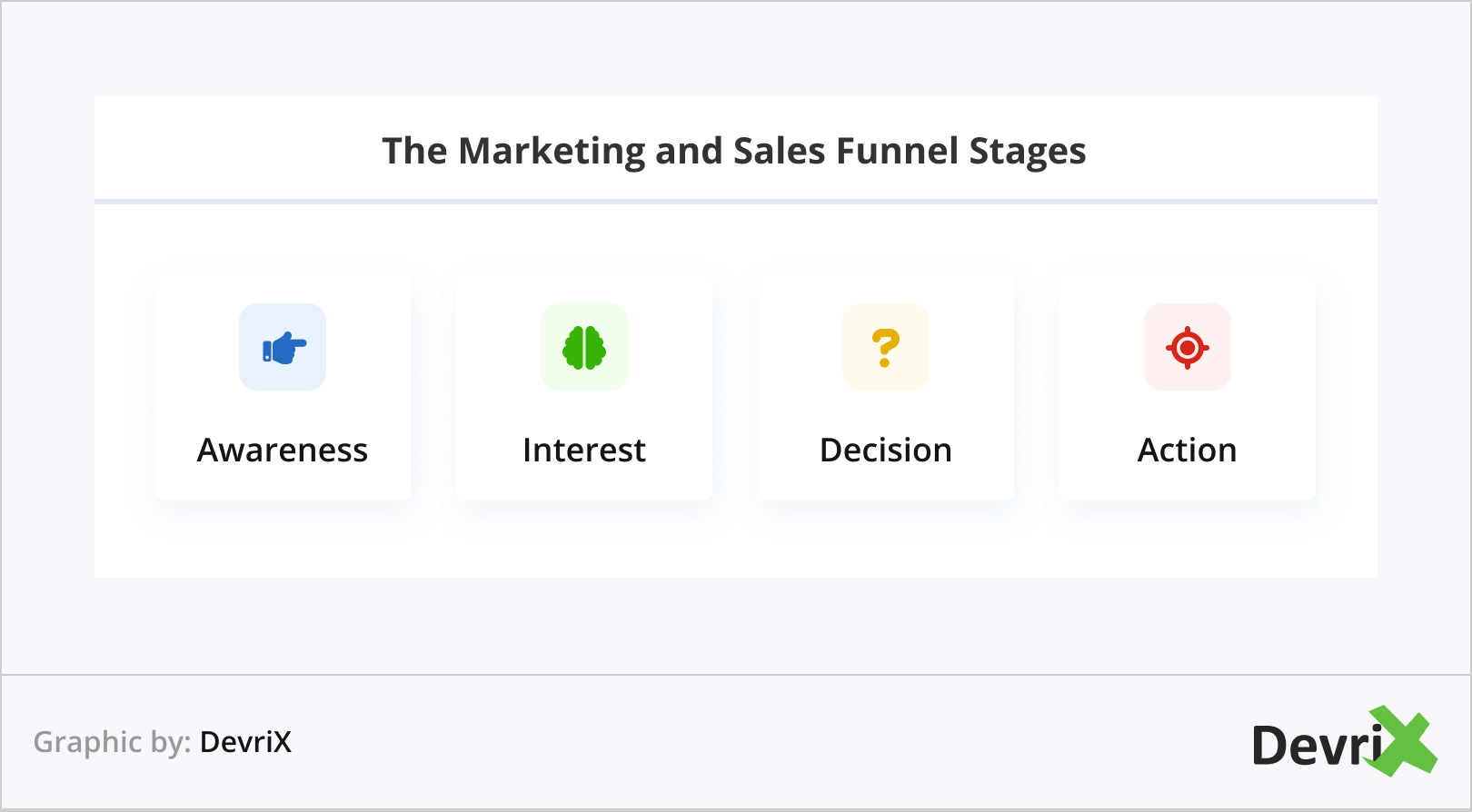
Keeping an ever-flowing digital marketing funnel is essential for all businesses today. It allows you to efficiently nurture leads, convert them into customers, and strengthen your brand.
But how do you know that you’re on the right track, and that your goals are being met? This is where the Google Analytics funnel report comes in.
Funnel reports are the key to understanding user behaviour and the inner workings of your business. They provide detailed information of the customers’ interactions along the stages of their journey, allowing you to monitor the number of new leads, analyze sales cycles, and improve how deals are negotiated, and finalized.
The main purpose of funnel reporting is to help you keep an eye on your customer’s touchpoints and interactions with your business, and ensure that you don’t run out of leads and, in turn, sales. This way, you can evaluate the effectiveness of your marketing and sales efforts, spot any inconsistencies in your strategy, and understand how these impact your conversion rates.
In this article, we will delve deep into what a Google Analytics funnel report is, how to create one, and what insights it can provide. Read on to learn more!
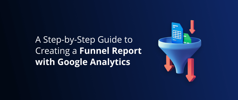
What Is a Google Analytics Funnel Report?
The Google Analytics funnel report maps out the URLs in the journey taken by the customer from when they first become aware of your brand until they complete a purchase. It informs you of how people discover your brand and what motivates them to continue through the funnel or drop off at some point along the way.
The reports show how successful your customers are in accomplishing the goals you’ve set for them. As a result, it also informs you of which areas are in the most need of optimization, and why many do not complete the sales funnel.
With the Google Analytics tool, you can also automate and compare the completion rate of your customer goals, then break down these findings by device, source, session length, etc. Furthermore, for better accuracy, you can use different filters and create custom funnels for a specific target market.
Read also: 4 Effective Google Analytics Tips for WordPress Publishers
Types of Funnel Visualization Reports in Google Analytics
A funnel visualization report in Google Analytics is a navigation path that consists of a series of web pages, which you expect your visitors to follow in order to achieve a set of goals.
Here is an example:
- Goal 1. Land on the website and start browsing.
- Goal 2. Go to a category page – e.g. Services.
- Goal 3. Choose a particular service and read the details.
- Goal 4. Select that service.
- Goal 5. Provide your business details.
- Goal 6. Send your request.
- Goal 7. Get a confirmation.
By creating a funnel for a process like in the example, you can analyze the user journey in detail. Leveraging this information, you can optimize your website performance as well as your marketing and sales efforts throughout.
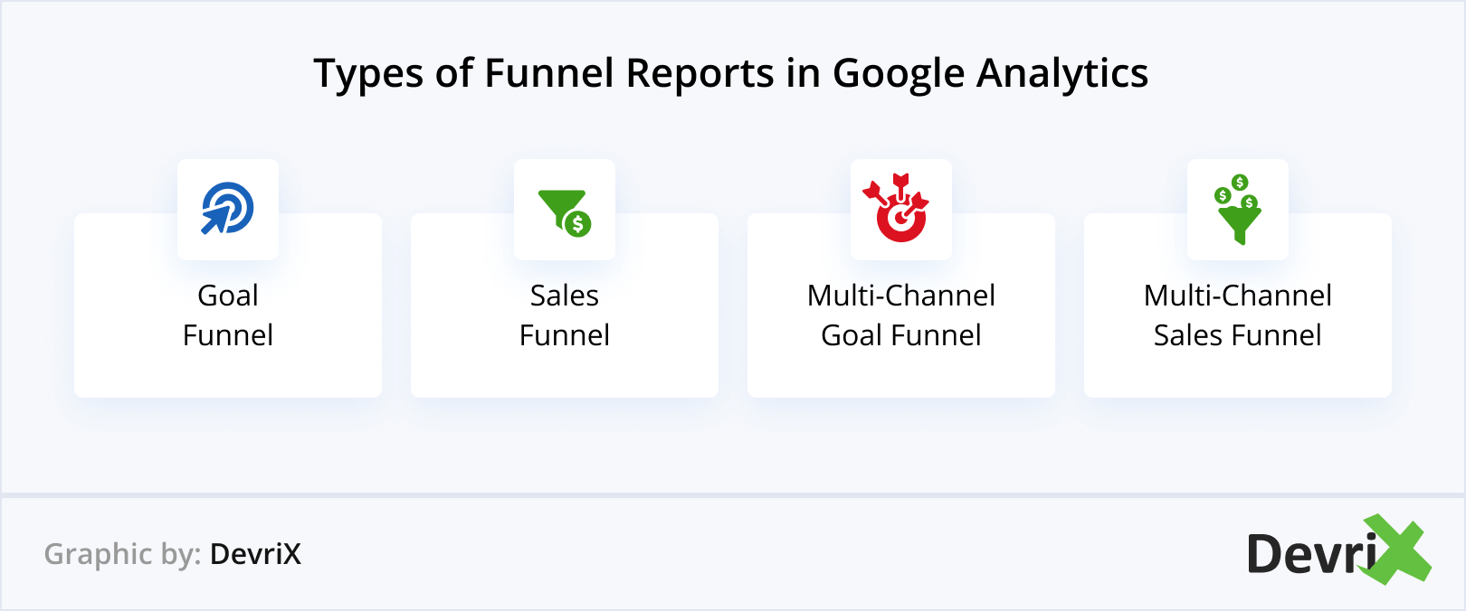
There are four different types of funnel reports you can create:
- Goal Funnel. The pathway you expect users to follow to complete a non-transactional goal such as ebook download or newsletter signups.
- Sales Funnel. The pathway you expect users to follow to complete a transactional goal like placing an order, or purchasing a subscription.
- Multi-Channel Goal Funnel. A goal funnel which includes all marketing channels that play a role in the conversion path.
- Multi-Channel Sales Funnel. A sales funnel which includes all marketing channels that play a role in the conversion path.
Read also: Your B2B Guide to Google Analytics
Steps to Creating a Funnel Report
Now let’s take a look at the process of creating a funnel step-by-step:
1. Creating a Conversion Path
The first step of creating a funnel visualisation report in Google Analytics (GA) is to consider the path the URL takes for each stage of the customer journey. To define these steps you need to input all the customer data including how many users visit your website, the number of finalized sales, and everything in between.
This might seem like a lot of information, but you needn’t worry, as you should already have it in your GA account. All you need to do is sync the data with the stages it applies to.
2. Defining Your Data Variables
Once you’ve input all the data you need, define the variables to ensure you’re using the most relevant information.
- Date Range. Customize however you see fit – e.g. last 7, 10, 30, 60, of 100 days.
- Segments. You can choose a suggested segment or create a custom one to compare how different groups of users behave.
- Dimensions. Define the attributes that describe the user journey – e.g. transaction ID, product category, the user pricing plan, etc.
3. Adding Filters
As mentioned, there are different types of funnel reports that you can create. To ensure that each report includes the most relevant data, you need to narrow it down by using the necessary search filters.
Fillers work like a magnifying glass. They enable you to see the funnel from a particular angle for maximum accuracy. For example, you can set a filter to:
- Exclude the internal traffic from your funnel report.
- Track the activity of your subdomains (if you have any) in separate views.
- Create separate reports on the activity in specific directories.
Read also: Your Complete Data Analytics Guide to Help Improve Your Business
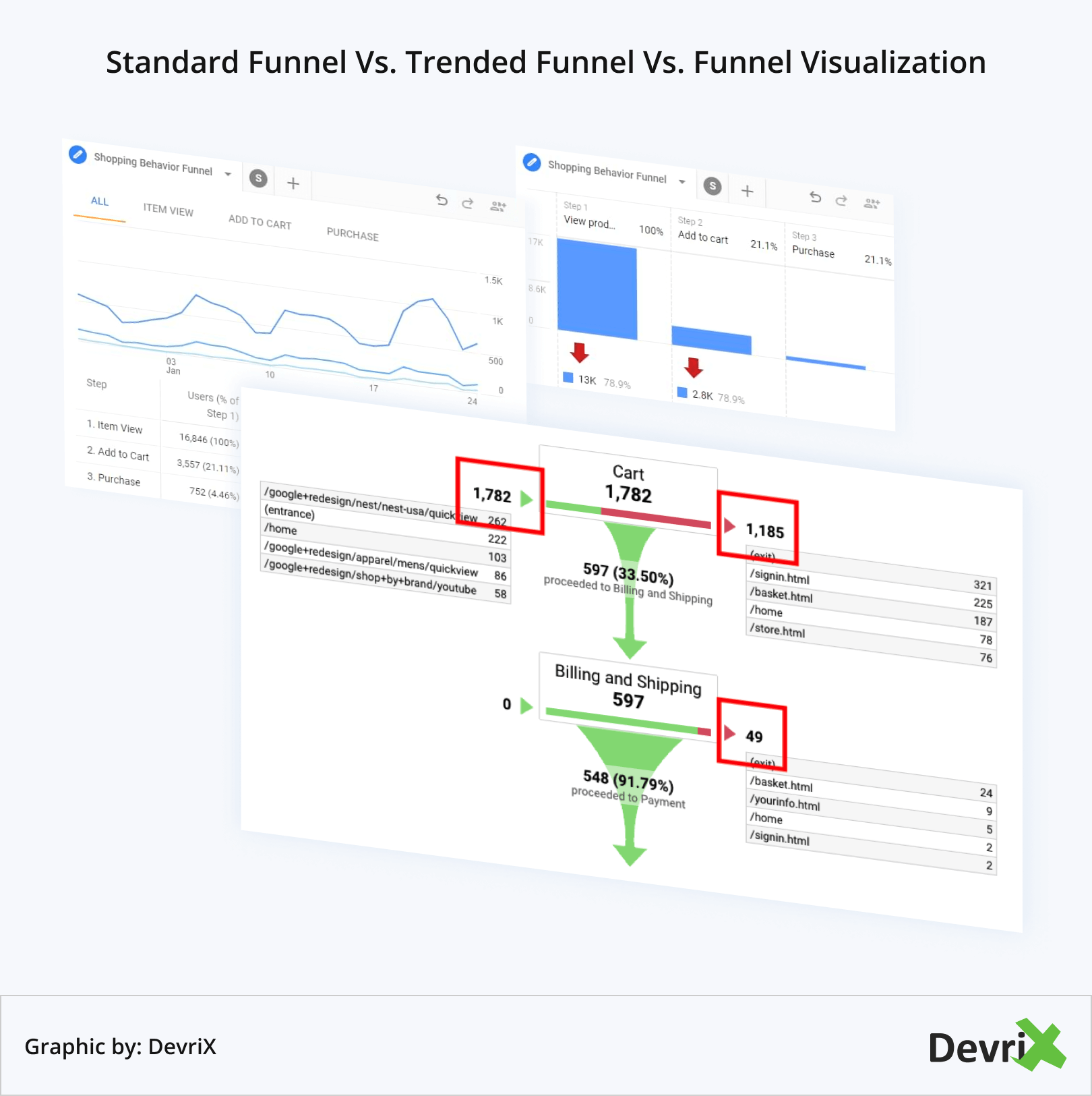
4. Visualizing Your Funnel Report
Now that you have set your requirements, it’s time to visualise your report. There are two options to choose from.
- Standard Funnel. A bar chart that shows the number of users who completed their goal, and who didn’t. It only gives you a brief snapshot.
- Trended Funnel. A line chart that demonstrates how user behaviour has changed over time.
- Funnel Visualization. This shows how many customers move to the next step of their customer journey.
Understanding Funnel Reports
As you can see, creating a funnel report is fairly straightforward. However, reading and analysing it requires a little more skill and effort. Funnel visualisations do resemble a funnel, as the name suggests, and are packed with important information which, in order to be usable, has to be interpreted correctly.
At every section,you can see the percentage of users who continue to the next stage, and at the bottom of it, you can check how many of them converted.
There are two important metrics to differentiate between:
- Funnel Conversion Rate. The percentage of users who entered the funnel and completed a specific goal.
- Goal Conversion Rate. The percentage of all visitors who completed some or all of the goals set out for them.
Knowing this difference will help you understand how successful your efforts have been at driving conversions.
Let’s have a look at an example funnel report by Megalytic, It shows a shopping cart checkout process. At the top, we can see that 1,133 people entered the funnel (added items in their cart), but only 682 (60.19%) completed it – i.e. made a purchase.
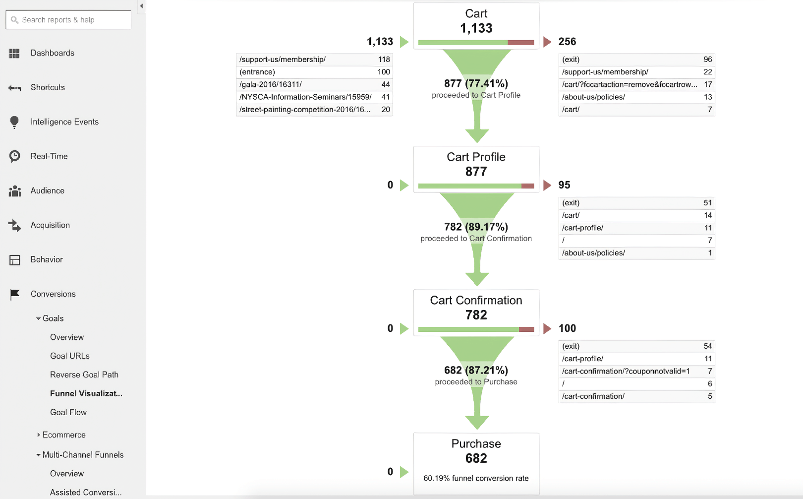
The report tells us how many customers completed the goals set out for them and at what stage some of them dropped off. This allows us to investigate the reason why they abandoned their carts.
For example, we can see that almost 23% of the shoppers left their carts at the first stage where they had to log into their customer profile.
Now, this could be because they didn’t have the option to checkout as guests, or the process of setting up a profile was too complex and/or time consuming. It could also mean that there’s a malfunction with the system, or that shoppers don’t trust you with their data.
To pinpoint the exact reason and reduce your attrition rate, look at the pages these shoppers went to after abandoning their cart. These are listed next to each stage of the funnel visualization. Maybe users are going back to a previous page, or they want to visit your terms and conditions or FAQ page.
Understanding why site visitors did or did not convert will give you a lot more context as to why your sales process or marketing approach was successful or not. Furthermore, you can identify any technical and performance setbacks that could have been holding you back without your knowledge.
Wrapping Up
Funnel reports are invaluable for spotting the gaps in your customer journey and discovering opportunities to increase your sales. Learning how people navigate on your website and what leads them to convert or leave can help you strengthen your marketing strategy and, ultimately, create a better user experience.
Team DevriX
This article is crafted by DevriX's seasoned marketing team, boasting over four decades of collective expertise in crafting sophisticated marketing funnels, devising comprehensive content frameworks and pillars, implementing engaging email campaigns, and creating impactful social media content designed for scalability.
Our marketing experts specialize in the complete spectrum of inbound marketing strategies. As an accredited HubSpot Agency Partner and a Semrush Partner, we engage in meticulous research, blending our extensive experience with the unique insights of our highly skilled team.
We set benchmarks in content creation by incorporating cutting-edge marketing trends, leveraging in-depth industry research, and utilizing state-of-the-art AI tools for data segmentation and captivating content hooks. Our proficiency extends across a diverse range of sectors, including working with SMEs, Fortune 1000 companies, global B2B brands, major publishing entities, WooCommerce platforms, business directories, and affiliate networks.