There are a number of ways how a website could help your business grow. But having a website alone does not guarantee more customers. Well-established companies know that their websites should be turned into sales machines to attract and convert customers. According to the latest survey by HubSpot:
The first five seconds of page-load time have the highest impact on conversion rates. Website conversion rates drop by an average of 4.42% with each additional second of load time.
There is no second chance for a first impression, they say. And it is the design of your website that should grab its visitors from the very first second and never let them go until they convert. But how would you make your website “work” for you this way? Let us show you the design basics.
Click to view in full size. Scroll down to read the whole article.
Key Terms You Need to Know
First things first, you need to understand a few key terms discussed in this tutorial so you will have a better understanding of the topic.
A/B Testing or Split Test is a scientific process of comparing two versions (A and B) of a web page to know which one converts better. You can test your headings, images, call-to-action buttons, and colors to name a few.
Call-to-Action (CTA) is a button or a line of text that urges your visitors to take an action. It tells them what to do when they are visiting your website. Some examples of this are, a “Sign up” button on a web page, a “Buy me” button on an e-Commerce shop and the “Download” button on an app.
Conversion happens when a visitor or a lead completes the desired action. It means that the visitor successfully signed up to your website or checked out an item in your shop.
Conversion Rate is the percentage of visitors who take a desired action on your site. You can get your conversion rate by dividing the total number of conversions by the total number of visitors on your website.
Conversion Optimization or Conversion Rate Optimization (CRO) is a systematic approach of refining your website so it will increase the number of visitors to your site who take the desired action. If your goal is to increase your email subscribers, then you will want your visitors to sign up for your newsletter. Or if you want to increase your sales, then you should make them hit that purchase button.
The Landing Page is usually the home page of a website, but it can be any page on your site where the visitors would land to convert them into leads or customers.
Multivariable or Multivariate Testing (MVT) is the process of testing multiple variables on a particular page at the same time. It involves creating different elements in order to find out which combination converts the most.
Elements of Web Design That Convert
If you want to create or redesign your website, here are the things you should consider in making a visually-appealing website that converts:
1. Images
Images play a prominent role in every website. They are used to easily attract and engage visitors, although that is not always the case. You should know how to use images properly to maximize its potential.
Here are some tips on using images effectively on your site:
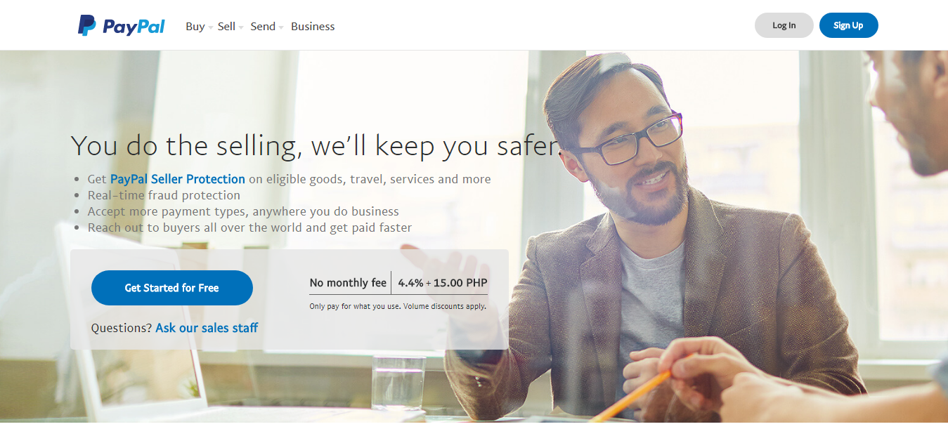
- Pick Images with Human Faces
When you use an image of a person on your site, it gives your visitors empathy and strong connection.
“When we see a face, we are automatically triggered to feel something or to empathize with that person. If we recognize content on a website — such as a problem, dilemma, habit or whatever else — we feel connected and understood.” (Not Just Pretty: Building Emotion Into Your Websites by Sabina Idler)
Take a look at how PayPal use this technique on their landing page:
- Optimize The Images
When creating a website, it is important to optimize the images that you use so they will not affect the loading speed of your site. Moreover, studies have shown that even a one-second delay in page response can reduce your conversion rate by 7%.
The idea of optimizing images is to make your images light by compressing them without affecting their quality. Some of the image optimization tools that you can use free are:
- Tiny PNG
- Compressor.io
- JPEG Optimizer
- Optimizilla
- Kraken.io
- Ranking Easy
- Resize Photos
- Compress Photos
- Convert Image
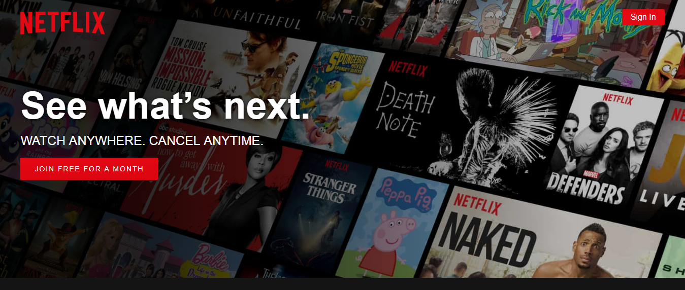
- Use Hero Images
To make things clear, hero images are not images of a superhero. A hero image is a big web banner image placed at the top of the website. They are commonly placed in the background with a line of text or call-to-action buttons.
Here’s an example:
Bonus Tip: Make sure that the images you use are responsive to provide a good user experience to your visitors.
2. Typography
According to Wikipedia, typography is the art and technique of arranging type to make written language legible, readable and appealing when displayed. It involves the use of typefaces, point sizes, line lengths, line-spacing, and letter-spacing, and adjusting the space between pairs of letters.
This video explains how typography has evolved from paper to screens:
Do you know how many fonts are there? The answer — no one knows. This is the reason why choosing the right font combination is not an easy task.
So, here are some font pairing tools to help you decide which combinations should you use:
- Type Connection
- Google Type
- Font Pair
- Type Genius
- Type Wolf
- Beautiful Web Type
- Fonts in Use
- Just My Type
- Typ.io
- Blender
- Font Combinator
- Typotheque
- Adobe Typekit
- Matcherator
- Typespiration
3. Whitespace
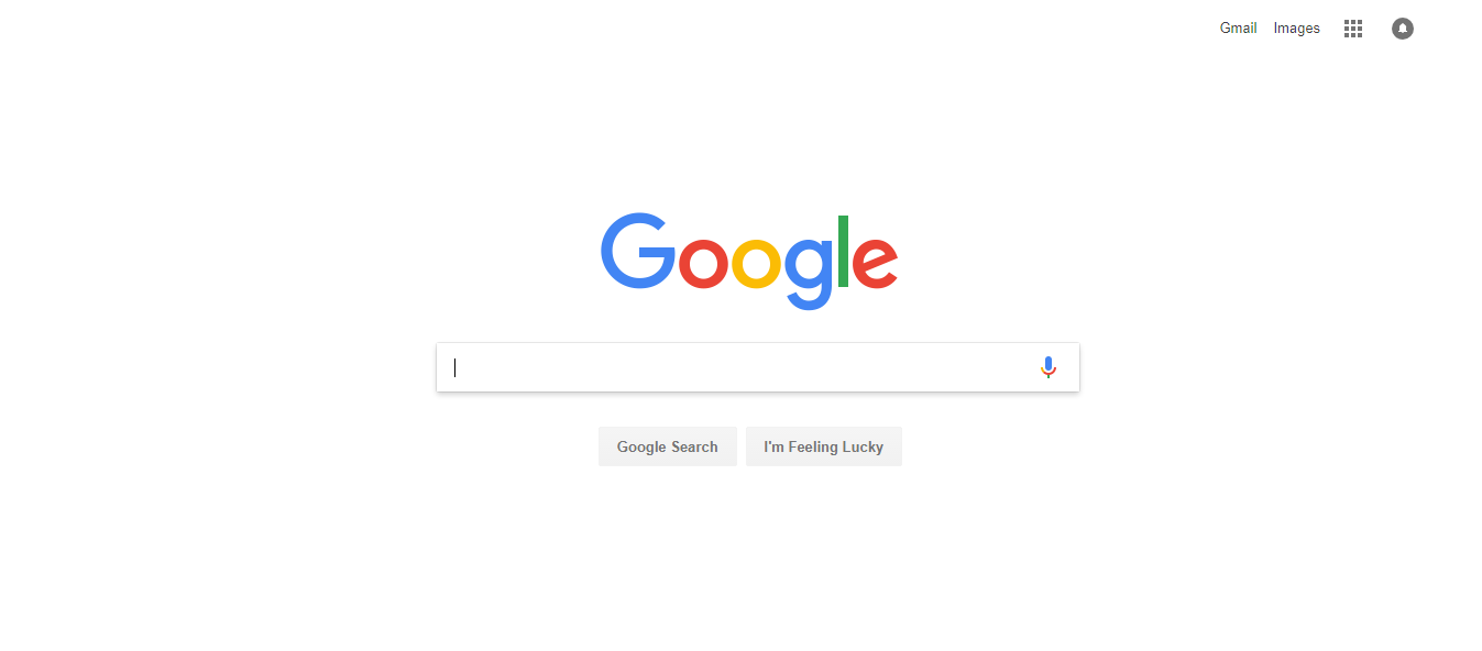
Did you ever wonder why Google doesn’t maximize the space of their website? That is because they are using the power of whitespace.
Whitespace also called negative space, is a part of a website that is left blank or empty. You can use this on your landing page so visitors can focus on the call-to-action and increase your conversion. A whitespace does not necessarily mean that your site’s background should be white. You can play with colors or even use an image as a background. The goal is to make it simple yet give the best user experience.
Remember: A clutter-free website catches your visitors’ attention. Browsing a neat and well-organized site is a pleasurable experience for them.
4. Colors
Another important element to consider when creating a website is color. Keep in mind that colors have meanings so whatever colors you choose should reflect the message that you want to convey to your audience.
For example, most of the banks in the United States use the color blue as it signifies trust.
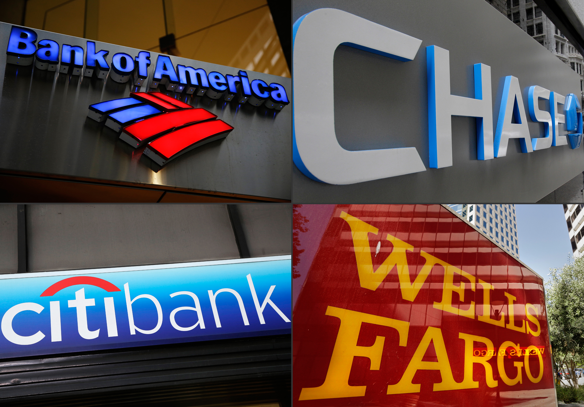
Image credit: The Epoch Times
Take note of some of the positive and negative feelings that a color represents when choosing the right color combinations.
- Black – In physics, black is not a color, although it also has a psychological effect on a person. It symbolizes power and strength but it can also represent death, unhappiness, and evil.
- White – Generally, white represents purity and innocence. Hospitals use white to create a sense of sterility. However, it may also represent something cold, bland and isolated.
- Red – This color arouses our emotions. It can be associated with love, excitement, and confidence. On the negative side, it symbolizes aggressiveness and anger.
- Blue – It is the color of the sky, an ocean and is most preferred by men. The color blue symbolizes calmness, serenity, stability, and reliability. However, it may also represent sadness hence the term “feeling blue.”
- Green – It is the color of the forest and often represents nature. Green means tranquility, optimism, and good luck.
- Yellow – Just like the sun, yellow represents brightness and warmness. It is the most-attention getting color and that is why it is commonly used in road signs. However, it can also create eye strain due to the amount of light that it reflects.
- Purple – It is the color of lavender. Purple symbolizes royalty and wealth, though some may interpret it as exotic or artificial.
- Brown – It is an earthy and natural color. It signifies resilience, dependability, and safety. It can also mean sadness and isolation.
- Orange – Similar to the color yellow, orange is also used to draw attention. It represents warmth, excitement, and energy. It is often associated with Halloween.
- Pink – This color has a calming effect. It is associated with kindness, nurturing, and femininity. You should avoid using this color if you do not want your brand to look too feminine.
Bonus Tip: When you cannot decide which colors would be best for your web design, you can use A/B Testing or Multivariate Testing. It will help you to know which color converts better.
5. Mobile Friendly
In order to maximize the conversion on your website, it is very important that it should be mobile friendly. Due to the rise of the use of smartphones, people nowadays access websites in multiple screens –desktops, tablets, and mobile phones. Keep in mind that 8 out of 10 people use the internet thru their smartphones.
Use the following tools to know your website’s responsiveness for different screen sizes:
- Mobile-Friendly Test by Google Search Console
- MobileTest.me
- Mobile Friendliness Test Tool by Bing
- MobiReady Mobile Friendly Checker
- Mobile Friendly Test by Small SEO Tools
- Browserstack
- RankWatch
- PageSpeed Insights by Google
Remember: Mobile-friendly websites rank higher than those that are not.
Conclusion
When conducting conversion rate optimization, you should keep in mind that web design plays a big role in turning your traffic into profit. Follow the tips that we’ve provided above to prevent a high bounce rate on your site.
Team DevriX
This article is crafted by DevriX's seasoned marketing team, boasting over four decades of collective expertise in crafting sophisticated marketing funnels, devising comprehensive content frameworks and pillars, implementing engaging email campaigns, and creating impactful social media content designed for scalability.
Our marketing experts specialize in the complete spectrum of inbound marketing strategies. As an accredited HubSpot Agency Partner and a Semrush Partner, we engage in meticulous research, blending our extensive experience with the unique insights of our highly skilled team.
We set benchmarks in content creation by incorporating cutting-edge marketing trends, leveraging in-depth industry research, and utilizing state-of-the-art AI tools for data segmentation and captivating content hooks. Our proficiency extends across a diverse range of sectors, including working with SMEs, Fortune 1000 companies, global B2B brands, major publishing entities, WooCommerce platforms, business directories, and affiliate networks.
![Website Metrics That Matter [And You Should Track]](https://devrix.com/wp-content/uploads/2019/12/Website-Metrics-That-Matter-And-You-Should-Track-380x160.png)