A company website homepage is the face of your brand online. We all know how important it can be for the success of any business, and yet we don’t pay enough attention to it. Even developers are, at times, guilty of this. In this article, we will walk you through some of the most common home page mistakes and how to avoid them.
The Internet is fast becoming the place where you’ll find most of your clients. Just in case you’re wondering, there are over 5 billion internet users spread across 1.97 billion websites.
With so many websites out there, it’s hard to remain unique and plan for new website homepage design for better user experience. Moreover, web developers and designers need to be on their toes at all times to make the necessary improvements.
Consistency is key when it comes to good user experience practices. Hence, your web developer can never achieve that if they don’t watch out for the following:
- Low rankings
- High bounce rate
- Drop in user experience
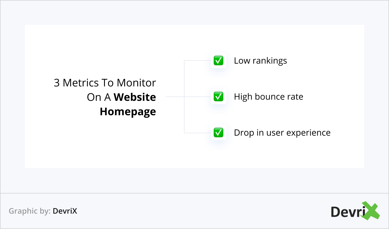
The place where it all starts is the website homepage design. You can compare its analytics to the other landing pages.
The homepage views should be high as it is one of the most important pages on a website. Usually, it is the first impression people have of your business. In fact, your homepage has the potential to make or break your reputation.
What Are The Most Common Company Website Homepage Mistakes?
Here are some of the most common company website homepage mistakes that damage user experience and rankings:
1. Avoiding Hick’s Law
Hick’s Law states that the more options you give your customers, the more time they will take to make a choice. That’s also true for a website homepage design, especially when you’re competing in “Mobilegeddon”.
Users often find it hard to process 10 to 20 different messages as well as graphics to get to the next step in the customer journey. So, if your homepage is clustered with information, will they come back to the same page again? Probably not. They will most likely skip the site entirely.
On the other hand, if you give them less options, they can easily process information. This results in an increase in page views and a lower bounce rate.
2. Use of Carousel or Slider
Wrong or excessive use of sliders is also among the top website design mistakes. A slider is a handy way to communicate more information to the user, but inappropriate use of this feature can annoy the visitor.
Here are some of the main reasons not to have a slider on the homepage:
- Fast sliders frustrate users, because they cannot read all the information completely.
- Fast sliders also make it difficult for the users to click on the information they want.
- Non-native speakers have a language barrier, so they read and understand the information slowly. But sliders don’t wait for them.
- If information is displayed one at a time, users often lose the chance to find it.
- Some users tend to take sliders as advertisements, and don’t pay attention to them.
- Sliders are by and large annoying for the users.
Once again, you have to stick to Hick’s Law and avoid giving more information than needed to the user.
3. News Feeds
Another common homepage mistake is the use of news feeds. Only sites like Yahoo are suited for them.
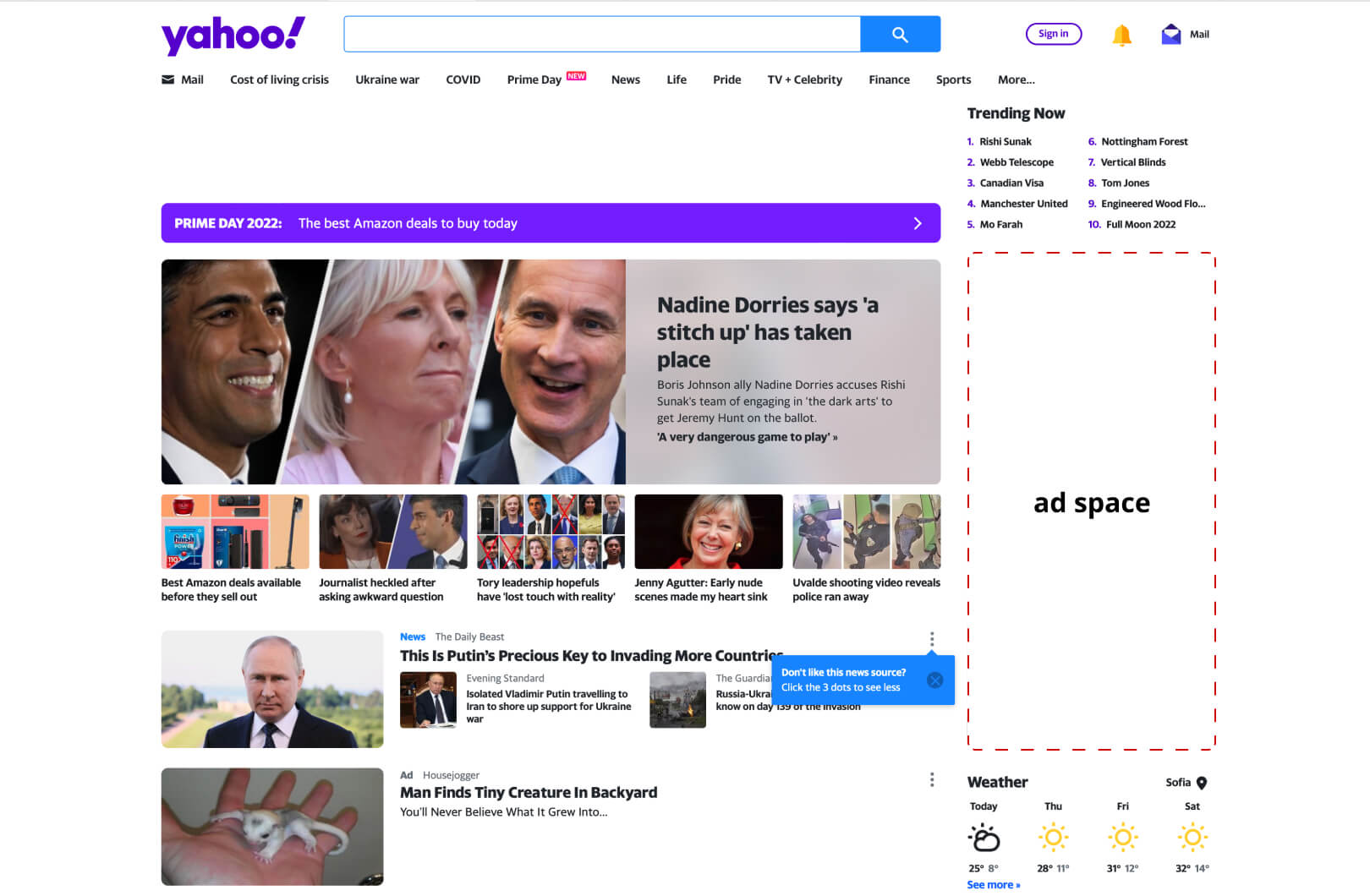
Users seldom pay attention to news feeds on the homepage. If you care about a big brand promotion, that’s for your own benefit, not the visitors’. Most of the time business owners keep news feeds without any logical reason. They tend to do it because they have seen someone else doing it on their website.
4. The H1 Tag
H1 normally has the biggest font on the homepage. At the same time, you should keep it short enough to help readers understand the message.
Here are two things to remember:
- If you keep your H1 tag within 8 words, you’ll maximize chances of delivering all the information.
- Avoid using all caps as it makes it difficult for an average human brain to process. It increases the time it takes to understand the message. If you keep the sentence lowercase, the message is transmitted quickly.
5. No Target Keyword in the Title

The lack of target keywords in the title is also among the most common website mistakes on a homepage. Your SEO and PPC will pay off when your page is SEO optimized.
Obviously, you have to make keywords fit naturally. This will make your homepage and website more crawlable and improve your ranking and traffic.
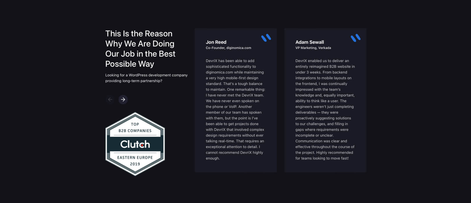
6. Failing To Establish Trust
If you want people to do business with you, they need to trust you. Your homepage is the perfect place to start building that trust by including testimonials, customer reviews, or even just some information about your company’s history and experience.
When potential customers land on a company website homepage, the first thing they’ll often look for is customer reviews or social proof that the company can deliver on its promises. This is why it’s so important for businesses to promote content that highlights their happy customers. Satisfied clients are like brand ambassadors, and positive reviews and testimonials demonstrate to potential new hires that the company is trustworthy.
Additionally, third-party review sites like Trustpilot and Clutch can also play an important role in building up corporate branding. Once reviews are gained from these platforms, they can be used internally and externally to show potential customers that the company is reliable and trustworthy.
7. Not Being Mobile-friendly
In today’s world, it’s more important than ever to make sure your website is accessible on all devices. If your homepage isn’t optimized for mobile, you’re likely to lose potential customers who are trying to view your site while on the go.
A company website homepage is important because it is typically the first page that a prospect will see. Therefore, it has to be mobile-optimized and provide all necessary relevant information. Otherwise, visitors are likely to move on to a competitor’s site.
There are many different factors that can affect the user experience on mobile devices. Hence, it’s important to regularly split test to ensure that your website is responsive.
8. Not Having a Clear Call to Action
What do you want people to do when they land on your company website homepage? Make it clear with a strong call to action. Whether you want them to sign up for your newsletter, download a free ebook, or simply learn more about your business, make sure your call-to-action is impossible to miss.
Creating an effective call to action (CTA) can seem like a daunting task. However, there are a few best practices you can follow to help ensure your CTAs are successful.
First, make sure you design them so that they stand out from the rest of the page. A brightly-colored button or link that contrasts with the page design is excellent for attracting user attention.
Second, place your CTAs in an obvious location on the page. The CTA should be the most visible element on the page and should be placed in a location that commands attention.
Third, make sure your CTAs are benefit-oriented and highlight the advantages a user will access by completing a specific transaction. Action-driven text like “Start Your Free Trial” that is short and to the point is more likely to promote conversions.
By following these best practices, you can create effective CTAs that will help increase conversions on your website.
9. Not Tailored To Your Buyer Persona
Your company website homepage should be tailored to your target audience. That means using language, images, and calls-to-action that will appeal to them. If you’re not sure who your target audience is, take some time to create a buyer persona.
A buyer persona is a helpful tool for understanding your customers. It helps you personalize content, website development and marketing efforts to meet the needs of your ideal client.
Make sure you use market research insights from surveys or interviews with real people who represent the right demographic (i..e., they’re buying what we sell). Also, monitor your web pages performance on tools like Google Analytics and Semrush to track user behaviour and tweak your marketing efforts.
10. Too Many Banners And Pop-Up Ads
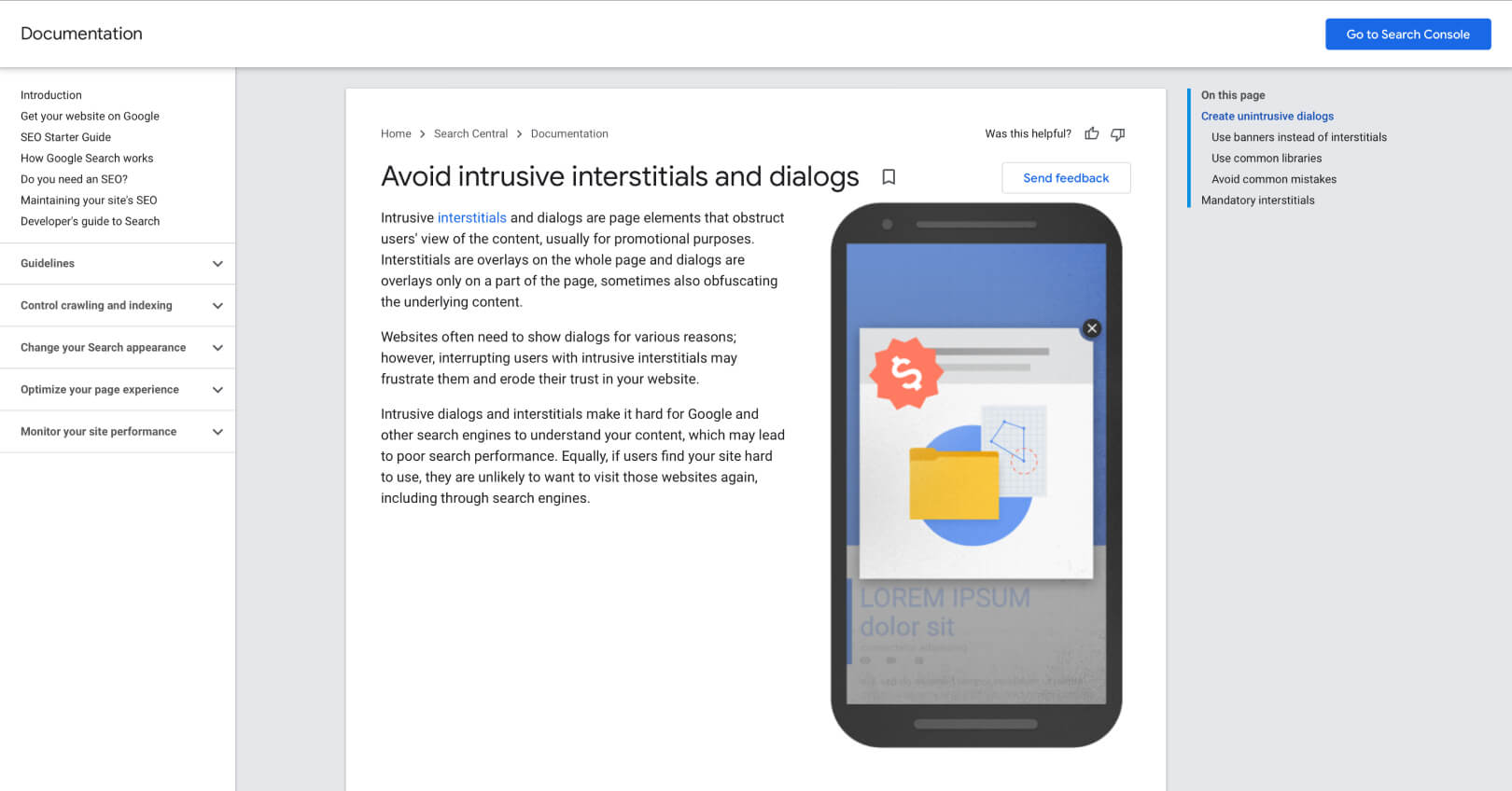
Your potential customers are bombarded with advertising everywhere they go. As a result, they’re likely to tune out any annoying pop-ups on your company website homepage. If you must include them, make sure they’re relevant and not too intrusive.
Losing on potential customers is not the only problem with banners and pop-ups. You need to also be mindful of Google penalties and adhere to the guidelines.
For example, imagine the following: a user clicks on your search engine results after typing in their query. However, they see a pop-up before having a chance to browse through the content they were initially looking for.
They will just search elsewhere and end their session on your site. Multiply this by the number of visitors who typed in such a search query. That’s a lot of lost traffic, a suspiciously growing bounce rate and a red flag to Google.
Final Thoughts
The above issues might be keeping you from getting the traffic and ranking you actually deserve. Look over your homepage, fix any problems, and see the difference!
We’d love to hear from you, so don’t forget to comment below on ways that you use to improve your homepage.
Team DevriX
This article is crafted by DevriX's seasoned marketing team, boasting over four decades of collective expertise in crafting sophisticated marketing funnels, devising comprehensive content frameworks and pillars, implementing engaging email campaigns, and creating impactful social media content designed for scalability.
Our marketing experts specialize in the complete spectrum of inbound marketing strategies. As an accredited HubSpot Agency Partner and a Semrush Partner, we engage in meticulous research, blending our extensive experience with the unique insights of our highly skilled team.
We set benchmarks in content creation by incorporating cutting-edge marketing trends, leveraging in-depth industry research, and utilizing state-of-the-art AI tools for data segmentation and captivating content hooks. Our proficiency extends across a diverse range of sectors, including working with SMEs, Fortune 1000 companies, global B2B brands, major publishing entities, WooCommerce platforms, business directories, and affiliate networks.