
User experience can account for millions in sales, or for the failure of your business. Did you know that 88% of clients are less likely to return to a website that has a bad UX?
That’s right. You might have a bulletproof business strategy and top-notch professionals working towards your goal. However, all this might be in vain if your user experience is not up to par.
So, how do you avoid common UX mistakes? How do you fix any issues before they start to negatively impact your business?
To answer these questions, we turned to the professionals. We asked our design team to share some of the most common user experience mistakes, and how to fix them.
Enjoy.
Top 22 Common UX Mistakes – Designers Advice
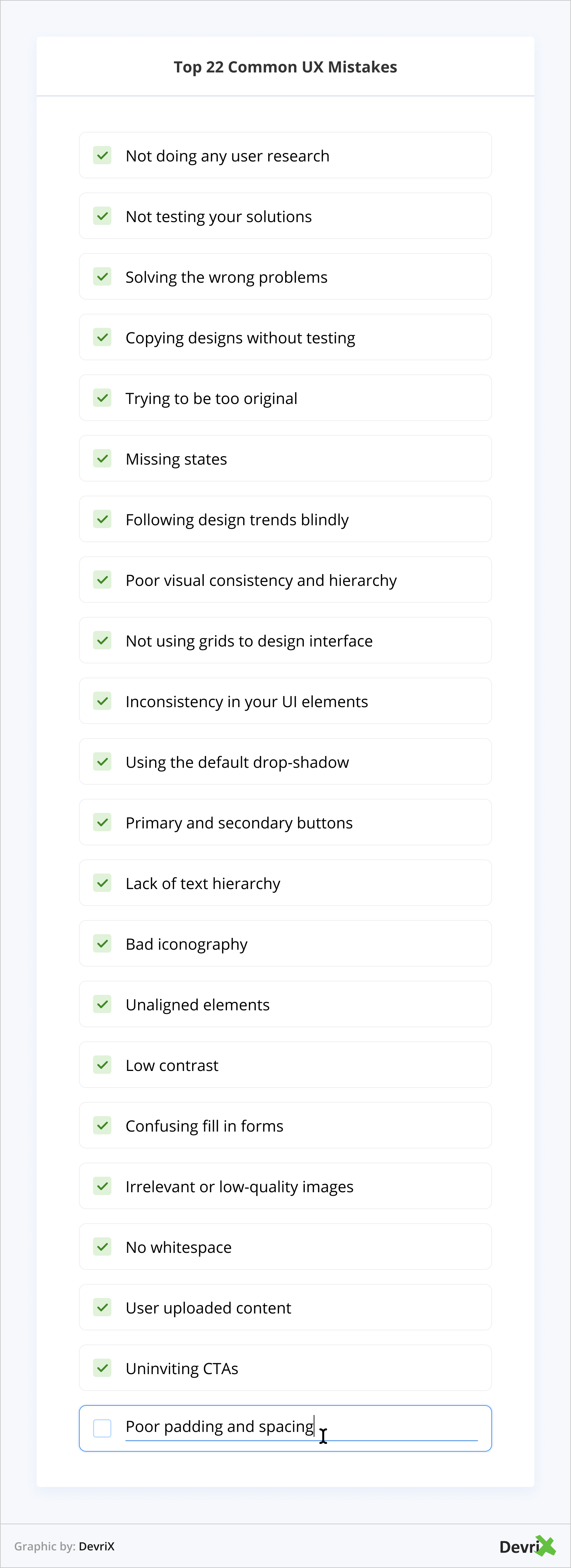
- Not doing any user research.
- Not testing your solutions.
- Solving the wrong problems.
- Copying designs without testing.
- Trying to be too original.
- Missing states.
- Following design trends blindly.
- Poor visual consistency and hierarchy.
- Not using grids to design interface.
- Inconsistency in your UI elements.
- Using the default drop-shadow.
- Primary and secondary buttons.
- Lack of text hierarchy.
- Bad iconography.
- Unaligned elements.
- Low contrast.
- Confusing fill-in forms.
- Irrelevant or low-quality images.
- No whitespace.
- User uploaded content.
- Uninviting CTAs.
- Poor padding and spacing
1. Not Doing Any User Research
User research is not only about knowing your users, but also understanding them. Good research can actually give you qualitative, behavioral insights about what your users do or how they use your products.
For instance, you can create an entrance poll. This is a common way to approach and understand why users are visiting your site or app, and what are they trying to achieve.
Ex: Did you find everything you needed on this page? If the user answers with “no”, you should then ask what was missing and how you might improve or make it better?
What’s more, you can use Google Analytics to look at browser usage, traffic conversion, acquisition channels, funnels, and most popular pages. All you have to do is to be added to your client’s GA account.
Hotjar is also an awesome, free tool that can give you a lot of insights quickly (user polls, user recordings, surveys and heatmaps).
2. Not Testing Your Solutions
We would recommend testing your solutions and asking your users about their experience on the site: i.e., was everything on the website functional, did they find what they were looking for, etc.
You could even use the same questions or methods used during your initial research.
3. Solving the Wrong Problems
As designers, we often focus on UI, and not on how things are behaving. This leads to an unusable product.
Ask yourself, what is the (user) problem we are trying to solve? The best solution would be to find and solve the correct problem.
Readers Also Enjoy: How to Optimize Your WordPress Website’s UX for Success – DevriX
4. Copying Design Without Testing
Needless to say, you should always test your solutions on your audience, build prototypes, etc. Don’t rely on a design you haven’t tested before, or you might end up delivering a very bad user experience.
5. Trying to Be Too Original
You can’t always reinvent the wheel. There will inevitably be similar designs to yours, and that’s not the end of the world.
However, it can only get worse if you try to design something new that doesn’t measure up. Originality is good, but you need to know the basic rules. To spare yourself the headaches, follow the proven design concepts.
Remember: it’s better to have a functional design than a stunning design that doesn’t work.
6. Missing States
You must think about the full user experience and the start-to-end solution. Do not miss or skip a screen. For example, when a user is filling out a form, it’s important for the user to receive an error message.
Likewise, if fields are filled in incorrectly, like using a #, instead of @ in an email address, or a symbol in an alphanumeric field.
7. Following Design Trends Blindly
Among the most common UX mistakes is following design trends just because you saw them on sites such as Dribbble, Behance, or because an influencer was using/writing/promoting them. In fact, several designs on Dribbble can be completely unusable and only cause you problems.
When to follow a trend?
- When it is platform-specific.
- If the trend can pass the usability or sustainability of the product.
8. Failing Visual Consistency and Hierarchy
This unspoken rule and fundamental principle is of a big importance.
- Consistency eliminates confusion and helps your users to learn faster.
- Following the visual hierarchy makes the interface feel more comfortable to the human eye.

Give more attention to size, contrast, alignment, proximity between elements and the whitespace. Follow the two most common hierarchical patterns – Z-pattern and F-pattern.
Readers Also Enjoy: Design for Content Heavy Websites: Approaches for Digital Publishers – DevriX
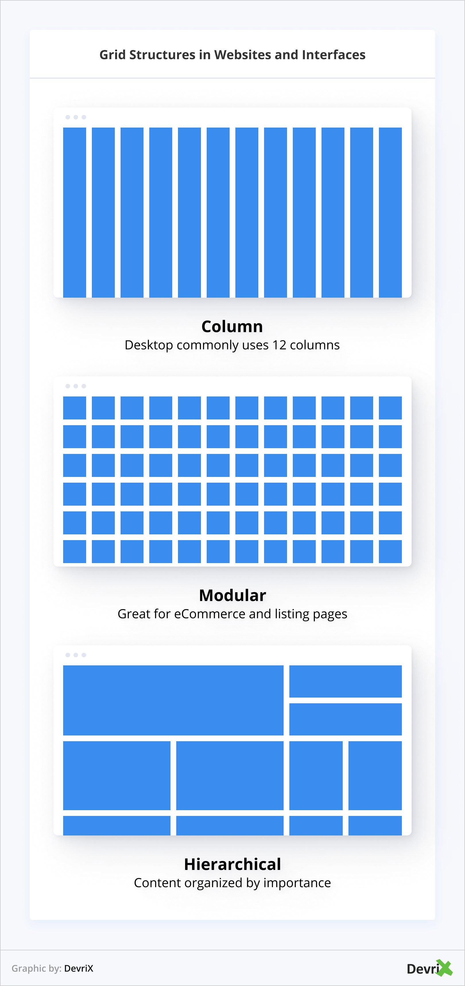
9. Not Using Grids to Design Interface
Using a grid is like using invisible glue that will help you to hold elements together. Grids will also allow you to design interfaces that are clean, clear, and effective.
There are three types of grids in the design interface:
- Column
- Modular
- Hierarchical
10. Inconsistency in Your UI Elements
One of the most common UI design mistakes is not making sure that your elements are consistent. To avoid inconsistency, keep an eye on the following elements:
- Color palettes for elements like buttons, text, links, header, footer, hover states, etc.
- Font styles for titles, paragraphs, links, etc.
- Using rounded or squared corners in your website/app for elements such as: icons, cards, buttons, etc.
- Line thickness: for icons, dividers and any other lines you use.
- Any element that deviates in any way from the established needs to have a reason to do so.
11. Using the Default Drop-Shadow
For those who don’t know, drop-shadows are the dark overlay of a section of text or a graphic that makes the object appear three-dimensional.
Therefore, less is more when it comes to drop-shadows. Don’t limit yourself to the default drop-shadow, as it is meant to be adjusted.
A few tips might be to make it very subtle. Don’t use black as it can be a very harsh color, instead use a darker version of your background color. This will make everything look more natural.
12. Primary and Secondary Buttons
Use different visual weight for primary and secondary buttons. The button with the strongest visual weight will get more attention.
So use strong colors, bold text and size to give visual weight to primary buttons. Do the contrary for secondary actions.
13. Lack of Text Hierarchy
Text is the primary unit of informational content, which is exactly the reason it must always be legible and organized. Properly formatted text facilitates users’ perception of information.
After all, the design might be what visually attracts users to keep browsing your website, however, the text is what can make them do a specific action such as click, read more, subscribe, purchase, etc.
14. Bad Iconography
It is important to choose the right “symbol” that clearly communicates the element’s meaning. It can also be used to maintain a consistent style of icons throughout your design.
Not only is it one of the most common design UX mistakes, but it also confuses visitors. For example, having an icon representing a social media platform will lead to people expecting a link towards that when they click on the icon.
15. Unaligned Elements
Don’t intentionally misalign related items. Always try to keep related elements to the same side because it connects them visually. Having the title mid aligned and the context left aligned doesn’t look good.
16. Low Contrast
Contrast is everything in a visual composition. When you have low contrast between your interface elements, all the elements merge together, and you end up with a dull and hard-to-read interface because it all looks the same.
Low contrast is equal to bad usability.
17. Confusing Fill-In Forms
Fill in forms are a crucial part of the user journey. They are used to log in, sign up, check out purchases, etc. So it’s important to provide clear guidance before and after submitting the form. Avoid using only a color to indicate error.
Always give actionable feedback to ease the process of completing a correct entry. If the form is too long, consider breaking it up into logical sections, and show a progress bar to indicate what step the user is at.
18. Irrelevant or Low-Quality Images
Photos help to tell a story, so choose a strong image that will complement the story and the look of your design. Use high-quality images.
Placing random, low-quality images, or stock photos, will do you no good. Quite the opposite, bad quality images could make users leave your site for good.
Readers Also Enjoy: The Importance of Image SEO and How to Do It Right in 2021 – DevriX
19. No Whitespace
Some webmasters are wary of a minimal-looking webpage and therefore try to fill in any white space with larger fonts, bigger banners or more images. This practice often turns out a hard-to-navigate and ridiculous-looking site.
Be mindful of how you fill out the screen, some white space is good, just remember: balance is key.
20. User Uploaded Content
It’s not always a good idea to let your users upload graphic images or files to public web pages on their own. There are many reasons for this – from low-resolution images to inappropriate content.
That’s why it’s always better to have a filter that manually approves anything that users want to upload.
21. Uninviting CTAs
One of the common UX mistakes is the desire to minimize the number of CTA words on buttons and on other small format elements.
As a result, these calls to action can look unappealing and spammy, making them completely unattractive to users.
22. Poor Padding and Spacing
The worst issue is when web designers don’t bother with proper spacing and padding between interface elements.
This results in the following: in layouts being unusable, with the text and font being so microscopic that it’s impossible to read it without zooming out.
Summary
There you have it, folks.
22 of the most common UX mistakes as listed by our one-of-a-kind design team. Are there any other major user experience issues that you can think of?
Do let us know in the comments.
Team DevriX
This article is crafted by DevriX's seasoned marketing team, boasting over four decades of collective expertise in crafting sophisticated marketing funnels, devising comprehensive content frameworks and pillars, implementing engaging email campaigns, and creating impactful social media content designed for scalability.
Our marketing experts specialize in the complete spectrum of inbound marketing strategies. As an accredited HubSpot Agency Partner and a Semrush Partner, we engage in meticulous research, blending our extensive experience with the unique insights of our highly skilled team.
We set benchmarks in content creation by incorporating cutting-edge marketing trends, leveraging in-depth industry research, and utilizing state-of-the-art AI tools for data segmentation and captivating content hooks. Our proficiency extends across a diverse range of sectors, including working with SMEs, Fortune 1000 companies, global B2B brands, major publishing entities, WooCommerce platforms, business directories, and affiliate networks.


![0. Featured Image - Multilingual SEO_ Best Practices and Common Mistakes [2022]](https://devrix.com/wp-content/uploads/2022/07/0.-Featured-Image-Multilingual-SEO_-Best-Practices-and-Common-Mistakes-2022-1-380x160.png)
![Common Mistakes Content Writers Make [How to Write Better]](https://devrix.com/wp-content/uploads/2022/09/Common-Mistakes-Content-Writers-Make-How-to-Write-Better-380x160.png)