
You probably already know that mobile shopping isn’t just the next big thing; it’s already huge, with sales expected to top $719 billion in 2025, nearly double the $415 billion in 2022.
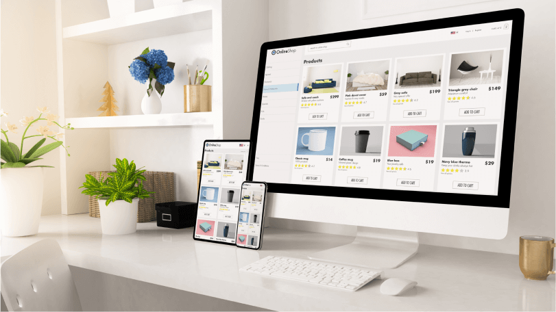
As an eCommerce business, to stay ahead, you have to ensure that your website presents its best face forward on mobile devices. Offer visitors effortless browsing and customer experiences that will have them singing your praises, rather than crying over their tiny keyboards.
Of course, shifting to a mobile-first approach, a.k.a. prioritizing design and optimizing your website for smaller screens, requires a lot of work. So, how can you craft one that wows? The secret is to blend slick design with high-powered eCommerce tools. Add some killer content, and you’re sure to inspire some ‘Add to Cart’ action.
Readers Also Enjoy: 7 Easy Steps to Launch a WordPress eCommerce Business – DevriX
The Pros and Cons of Having a Mobile Shopping Site
The tiny screens in people’s pockets may pack some serious purchasing power, but they come with some challenges too.
Pros:
- Instant Purchases: With just a few taps of their phone, people can complete their purchases.
- Personalization: The shopping experience can be personalized with product recommendations thanks to data-driven algorithms.
- Cost-effectiveness: The responsive design reduces the need for different interfaces, saving the company money.
- Better engagement: user engagement can be improved by using interactive features such as laptops, poles and social sharing.
Cons:
- Screen size limitations: Due to the screen size being smaller it can be challenging to display detailed product information and images, which potentially affects the user journey.
- Security concerns: Mobile transactions may raise security concerns, as users are more vulnerable to data breaches and fraudulent activities.
- Limited functionality: Some mobile sites may lack certain features and functionalities compared to their desktop counterparts.
- Connectivity Issues and slower downloads: Users with limited internet connectivity or download speed may face difficulties accessing sites, eventually leading to abandoned carts.
Prioritizing the Mobile Web Design
Shifting to mobile-first means sacrificing all those attractive elements and big chunks of text that look great on a desktop but can be confusing on mobile. Your design should meet three main criteria:
Mobile First Design
You should emphasize convenience, and utility while leveraging mobile contexts as much as possible.
Here is a small checklist to refer back to:
- Implementing push notifications (for cart updates, order statuses, sales, etc.) to re-engage users.
- Activating offline mode or caching. This allows users to browse a few basic products without connectivity.
- Enabling voice search allows for hands-free shopping.
- Integrating mobile wallets like Apple Pay or Google Pay makes taking out faster and easier.
- Personalizing product recommendations based on purchase history and browsing.
- Allowing saving payment details and customer info to enable faster repeat checkouts.
- Scanning barcodes and QR codes to pull up products.
- Augmenting reality to viewing products in the user’s environment.
- Saving cart preservation and synchronizing across devices.
- Dynamic font resizing for readability as needed.
- Touch optimizing for accurate and convenient tapping and navigation.
- Interactive visuals and animations for engagement.
- Social media integrating for UGC (user-generated content) and social influencing opportunities
Responsive Design
Responsive design allows sites to render well on any device, dynamically adjusting content to optimize readability, navigation, and usability across screens. This means:
- Flexible images and media that rescale without getting distorted on different viewports.
- Adaptive layouts with flexible grids/frameworks provide optimal use of space.
- Flexible navigation menus that adapt for space or convert to off-canvas items.
- Resizeable typography and dynamic fonts for better readability.
- Responsive content reordering to suit vertical or horizontal orientations.
- Touch optimization and larger tap targets for mobile visitors.
- Accordions and toggle-based content to minimize vertical scrolling.
- Holding aspect ratio of image and video embed containers when resized.
- Design breakpoints customized for your product catalog qualities.
- Detecting device capabilities to adapt selectively.
- Performance optimization through caching, compression, and lazy loads.
- Smooth degradation of features on less capable browsers/devices.
SEO Web Design
There is no point in having the best-executed mobile site if it is not discoverable and rankings-friendly. You have to optimize your content with search engine crawlability and indexation in mind. Here is how your site architecture helps discovery and natural traffic growth over time:
- Clean and semantic HTML markup using proper headings, lists etc for better crawling.
- Optimized page speed with good load times by minimizing HTTP requests, enabling compression and caching. This affects rankings.
- Clear page titles, meta descriptions and URL structure for search relevancy.
- Easy to read text through proper fonts, sizes, contrast and spacing especially on mobile screens. This aids usability.
- Effective internal site linking structure so search bots can better crawl connected content.
- Proper use of alt text/attributes for non-text content.
- Streamlined and intuitive site navigation for better user experience and search bot traversal.
Readers Also Enjoy: 10 eCommerce Strategies to Reach More Customers [Infographic] – DevriX
5 Tips on How to Optimize and Improve Your Current eCommerce Store for Mobile Shopping

Prioritizing user experience and strategic use of space puts you on the right path:
Go Minimal
Do more with less – try a minimalist vibe. A pared-down style removes clutter and lets your content shine. Focus on only the essential elements. Your customers will love how effortlessly they can find what they need. And do you know what else minimalism brings? Speed. Pages load faster.
Balance the White Space
As tempting as it may be to fill all the spaces on a tiny screen, embrace the power of a blank canvas. White space directs the focus onto what you want to spotlight.
White space also brings harmony, simplicity, and speed to a design, creating enjoyable browsing.
Use Grids
Grids bring order to layout chaos. On compact screens where space gets tight, they keep all the elements light and bright. Use rectangles, columns, and rows – they align and divide, simplifying how viewers take in visual info.
Craft an Intuitive Search Bar
Make finding products a breeze with a prominently and well-placed search bar. It should be adequately sized to allow for error-free tapping.
Don’t forget to add placeholder text in the search bar so users instantly know what to do. Auto-complete saves time by suggesting relevant terms as they type. Small touches that make searching a delight!
Unfold Intuitive Navigation
Organize an intuitive drop-down menu to simplify site exploration by clearly labeling essential navigational links. Enable easy access through recognizable “hamburger” menu icons that users can tap. Upon tapping the icon, display the dropdown options cleanly so choices are visible at a glance, ensuring a seamless and effortless navigation experience for users.
Facilitate Intuitive Product Browsing
Logically organize products into related groupings to facilitate seamless discovery of appealing items for users. Empower them to refine their browsing experience with filtering and sorting capabilities tailored to each product type. Additionally, consider incorporating personalized recommendations to delight users with relevant suggestions, further enhancing their shopping journey and satisfaction with the platform.
4 Mobile Commerce Trends in 2024
While strong foundations may drive success today, flexibility allows sites to flourish for years to come. Though future shifts are hard to predict, brands who balance consistency and adaptation will retain their consumer appeal.

Mobile Shopping Apps
Even if you don’t have a mobile app now you should start thinking about having one. People spend 90% of their mobile time using apps. Also 85% of customers prefer mobile apps to mobile websites because apps are “more convenient, faster and easier to navigate.” So building an app to your online store means you would give your customers what they want.
One-Click Ordering
Ordering online traditionally involves manually entering details such as names, numbers, and addresses across various fields, a process prone to frequent typos and user frustration, particularly on small mobile screens. This frustration often results in shoppers abandoning their carts. However, context-aware mobile apps offer a solution by prefilling checkout forms with user data automatically. By extracting data from user profiles, these apps can eliminate tedious data entry fields that hinder mobile commerce, providing a smoother and more efficient checkout experience for users.
Social Commerce
Historically, converting social traffic has posed persistent challenges. However, the landscape is changing as social media selling now mirrors real-world discovery and impulsive buying behaviors. Platforms like Instagram and Facebook have introduced frictionless buttons, allowing customers to purchase products directly from their feeds and stories. Since users already have these apps installed on their phones, you can meet them amidst their scrolling activities. By incorporating embedded cart flows and streamlined payment handling, social commerce removes obstacles, enabling you to capitalize on micro-moments of buying intent and drive conversions effectively.
Voice Shopping
Did you know that 43% of voice-enabled device owners use their device to shop? This statistic underscores the potential of a vocal future, where smart voice commerce promises to revolutionize eCommerce as we know it. To prepare for this shift, it’s crucial to optimize your website for voice search compatibility. Additionally, if you’re developing a mobile app, ensure it enables streamlined voice-activated shopping to cater to the growing demand for hands-free purchasing experiences.
Readers Also Enjoy: 11 eCommerce Business Ideas to Try – DevriX
Wrap Up
As mobile shopping continues its rapid growth and evolution, staying ahead of the curve requires your eCommerce business to adapt and innovate continually.
While emerging trends bring exciting opportunities to engage mobile users, navigating these changes isn’t always straightforward. Remember, we’re just a call away and ready to support you in seamlessly transitioning to a mobile-first approach.
Team DevriX
This article is crafted by DevriX's seasoned marketing team, boasting over four decades of collective expertise in crafting sophisticated marketing funnels, devising comprehensive content frameworks and pillars, implementing engaging email campaigns, and creating impactful social media content designed for scalability.
Our marketing experts specialize in the complete spectrum of inbound marketing strategies. As an accredited HubSpot Agency Partner and a Semrush Partner, we engage in meticulous research, blending our extensive experience with the unique insights of our highly skilled team.
We set benchmarks in content creation by incorporating cutting-edge marketing trends, leveraging in-depth industry research, and utilizing state-of-the-art AI tools for data segmentation and captivating content hooks. Our proficiency extends across a diverse range of sectors, including working with SMEs, Fortune 1000 companies, global B2B brands, major publishing entities, WooCommerce platforms, business directories, and affiliate networks.